
Sochi 2014 Olympics Look of the Games
A Too Busy Patchwork Quilt of Ethnic Imagery
By: Mark Favermann - Feb 07, 2014


Like discussing the character of the Russian people with their passion, poetry and dark history, discussing design at the Sochi 2014 Olympics is complicated.
The Sochi 2014 Winter Games arrived with a visual bang rather than a whimper. Little known outside Russia before its Olympic bid, Sochi is at a strategic location on the Black Sea at the crossroads of Russia’s oil and gas pipelines. It was a favorite vacation spot for Stalin and other politboro leaders.
Intertwined in geo-political politics, the Sochi Olympics are a reflection of Russia's desire for international prestige and their country's leader's Vladimir Putin's huge ego. These have been referred to as the Putin Olympics.
Problems with various aspects of the games have been reported by the Western press. These include poor hotel accommodations, lousy food and transportation glitches. Among other things, the Sochi Games' exceeded budget is estimated to be $51 billion.
By far, this is the greatest amount spent on any Olympics, Summer or Winter, in history. Chechen and Ukrainian terrorists have threatened to bomb and disrupt it. This has caused many fans, corporate executives and even politicians to cancel their trips to attend the 2014 Games.
Along the build up to the Games, Putin gave political sanctuary to Edward Snowden, the NSA tell-all whistleblower/secrets leaker and has also supported the Syrian regime. And then there are new Russian anti-gay laws that have angered many of the athletes and Western nations' governments and organizations.
In fact, President Obama sent an official delegation from the United States that included three vocal gay former world class athletes. So, tension and suspense built up to the Sochi Winter Games.
However, President Putin is not really responsible for the warm weather. Sochi is set in a sub-tropical area with the nearby mountains being much warmer than other winter resorts. The current environmental conditions are and have not been great for the World's greatest winter sports festival.
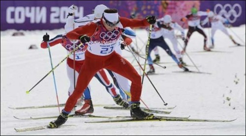
At great expense, snow had to be brought in to various venues. Various athletes and coaches have complained about the conditions. Apparently, 18 of 49 athletes crashed on the Downhill Slopes. This is a terrible percentage. Facilities were not right probably due to Sochi's geography. American skiers have not done well in these conditions and have complained.
But, the underlying corruption and payoffs might be laid at the Russian leader's regime. This caused the construction of the venues and roads to be at much, much greater costs than actually conceived of to be required.
But despite all of these things, the 2014 Games began on February 7. And it does have ice and snow venues in beautiful natural mountain settings, it has interesting and beautiful architecture at its Olympic Costal Cluster in Sochi, and it has a graphically complex if not significant "Look of the Games." And there was a dramatic Opening Ceremonies.
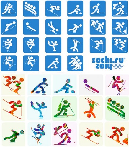
With that said, the Sochi organizers have shown great effort in making the 2014 Winter Olympics visually appealing. This is from venue decor to medals to athletes performance bibs. Their theme was to incorporate a visual brand that reflected a Russian multi-faceted etnicity and craft.
Initially, I thought it was too busy and too same old/same old. At the Olympic Games that I worked on in Atlanta in 1996, the design team created an elegant "Quilt of Leaves" as its thematic Olympic visual statement. Four years ago at Vancouver 2010, the "Look" was an extremely busy 50ish wallpaper motif of everything including the kitchen sink. And now Sochi 2014 has again created a very busy Russian themed "quilt."
However, on closer inspection, I think that the Sochi 2014 Look works rather well where Vancouver's didn't. Yet, to really understand it properly, you have to be a bit of a Russian art historian and a Slavic ethnologist! There is a density to the patterning and graphics that makes it hard to describe or contextually embrace.
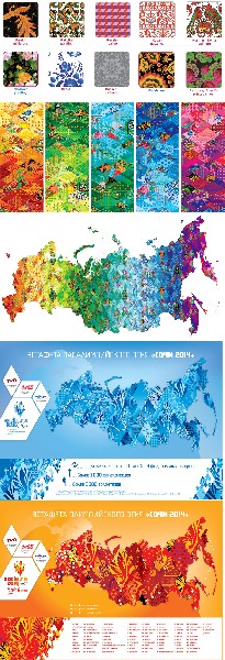
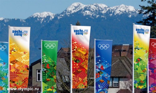
At the heart of the Look of the Games concept design is the principle of the "patchwork quilt" - a combination of 16 designs representing the most famous traditional Russian arts and crafts. The Sochi 2014 “Look of the Games” is a complicated interpretation of different cultures, traditions and ethnicities that together form a united visual identity.
This Look concept is intended to express the character of modern Russia while at the same time introducing guests from all over the world to Russian hospitality and tradition. It attempts to portray the Russian character's emotion and moderation, tact and expression--a large hard to reach goal at the very least.
The Look of the Games concept represents a unified design for sports venues, infrastructure facilities, city streets and squares. It provides a backdrop to the 2014 sports events and are a clear distinctive feature that creates a unified appearance for the Games.
This is in no small part due to International Olympic Committee (IOC) regulations requiring that images and videos of each Olympics need to be easily identifiable. This is done to reinforce "brand" and archival images.
As the norm for any Olympic Games, the Look also was created to help create the festive mood of the Games and will be the first and lasting impressions for millions of visitors and television viewers to/of the Olympic and Paralympic Games.
As suggested already, this Sochi concept was based on the principle of patchwork. Such patchworks were an indispensable part of Russian peasants’ homes. Over time, this technique became a widely acknowledged branch of traditional arts and culture. Supposedly, Catherine, the wife of Peter I, personally sewed a patchwork for her husband as a gift.
Sochi’s graphic and ornamental design elements are borrowed from many Russian regions and ethnic groups' craft and design traditions. These include Kuban patterns from Southern Russia, Gzhel pottery and dishes saturated blue ornamentation, Kubachi stylized floral motif patterns, Khokhloma painting with its distinctive juicy red strawberries and rowan berries decorative style, Zhostovo style painting with its applied bright colors onto a black background of large flowers in the village of Zhostovo near Moscow and Palekh style icon paintings.
In addition, there are ingredients of Pavlov Posad shawls design images dominated by lush flowers and garlands, Vologda lace patterns, Yakutsk ornamentation incorporating a stylized horse’s head or lyre along with symbolic colors, as well as Severodvinsk painting distinguished by the predominance of red colors and complex floral patterns, including images of imaginary birds and animals.
Included are also elements of Mezenskaya painting with its lack of bright colors characteristic of ancient Russian art and stylized paintings similar to ancient rock carvings found in the Northern Russian along with unique folk art in Rakulskaya and Uftyuzhskaya painting styles.
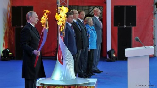
Added to the mix were other patterns. Trihedral champleve enamelling’s main patterns are made up of carved geometric shapes: rosettes symbolized the sun and tightly intersecting rectangles symbolized tilled earth. Russian print patterns of details from daily life were woven into the fabric included little fir trees, peas, flowers, etc. And the Firebird was a magical bird from Russian folklore, which embodies the dream about of well-being and fortune. The Sochi Olympic Torch represents the Firebird.
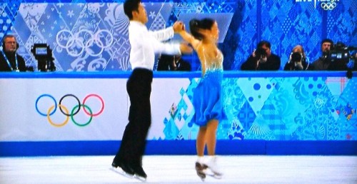
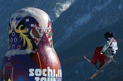
But, this complexity and extremely busy aspects works best when a monotone like the two blue backgrounds at the ice skating venue, less so when multicolor is used. The sliding and skiing venues are strongly enhanced by the scheme mostly in purple tones. The quilt of many colors works best, however, on athlete bibs and usher and other officials' jackets.
Somehow the Russian quilt design grows on you. The shear density of the images visually forms a neutral pattern when seen unless more thoughtfully arranged. Designers beautifully coordinated the venue decor that can be seen at various venues.
The venues at Sochi are in two categories: The Coastal Cluster in Sochi and the outlying skiing and sliding venues. The Coastal Cluster are major buildings of structural beauty. The outlying venue sites are from all accounts and especially television viewing quite stunning.
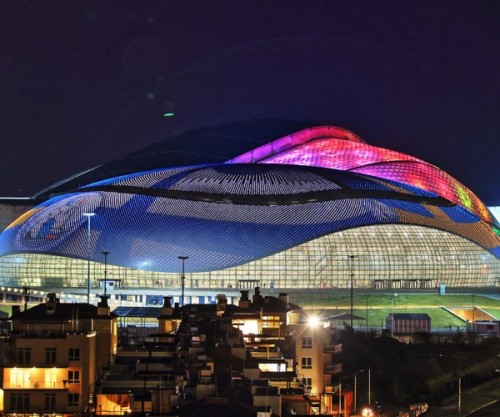
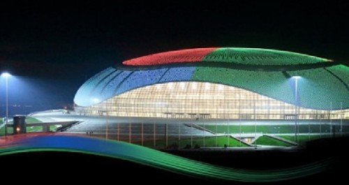
The Coastal Cluster is made up of the Fisht Olympic Stadium, The Bolshoy Ice Dome, The Shayba Arena, The Iceberg Arena, The Ice Cube Curling Center and the large flame structure for the torch. Each has a dynamic form and visual style even grace.
The Fisht Olympic Stadium was designed by the architectual firm of Populous. It was the venue for the opening and ceremonies and will host the closing ceremonies as well. The stadium features a shell-like polycarbonate roof visually suggesting mounds of snow or sails as well as a very Russian Fabergé egg. In 2018, the stadium will host the FIFA Soccer World Cup.
The Shayba Arena is the smaller of the two hockey rinks. Visually, it is the most literal—taking the shape of a swirling puck. It also sports an interesting angled window treatment and yellow striping. Shayba Arena’s architects were Central Research Institute for Industrial Buildings (CNIIPromzdaniy).
The Ice Cube Curling Center was created by Stroyproekt and Ural-Expert Architects. It the smallest venue in the Coastal Cluster, but the well-coiffed Ice Cube Curling Center is the largest curling-specific building in the world.
The Adler Arena was designed by Story International with Cannon Design. This speed-skating venue has an almost tame blue and gray glass entrance that is visually enhanced by lighting with visually strong bright color schemes that rival the Bolshoy’s LED roof treatment.
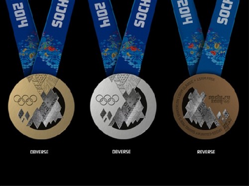
Sochi's Torch and Cauldron designs drew inspiration from the work of one of Mother Russia's greatest musicians. "The Firebird" first brought Igor Stravinsky to a wider audience. The Cauldron of the XXII Olympic Winter Games in 2014 was lit from the same torch that visited outer space as part of the 2014 Torch Relay.The basis for the design of the medals is stated to be reflections of the contrasts of Russia in which Europe meets Asia, nature and megacities coexist, and technological innovation blends with a rich cultural heritage. The medal design concept expresses the sun's rays deflected through a prism of snowy mountain tops and the warmer sea and ice.
The basis for the design of the medals is stated to be reflections of the contrasts of Russia in which Europe meets Asia, nature and megacities coexist, and technological innovation blends with a rich cultural heritage. The medal design concept expresses the sun's rays deflected through a prism of snowy mountain tops and the warmer sea and ice.
The medals of the Sochi 2014 Olympic Games have been engraved with the signature "Patchwork Quilt" of the Games. The unusual combination of glass and metal gives the artifact a lightness and uniqueness for Olympic medals.
Leading Russian advertising agencies, jewelers, clockmakers, vendor/licensees and designers took part in the competition for the design of the medals. From these, an expert panel chose the design that best illustrated and underscored the Sochi 2014 brand concept.
The obverse of the medal depicts the Olympic rings, the reverse has the competition name in English and the Sochi 2014 emblem inscribed on it. On the edge medals have the official name of the Games inscribed in Russian, English and French.
The Paralympic medals are designed in the same style as the Olympic medals. The obverse of the coin depicts the Paralympic symbol ("agitos"), and the reverse shows the emblem of the Sochi 2014 Paralympic Winter Games. The Paralympic medals contain inscriptions in Braille.
Like Russia itself, the Sochi 2014 Winter Olympics are a contradiction in many ways. The buildings/venues are beautiful, the outdoor venues are often spectacular and the Look of the Games is at times stunning, but yet the meaning of the Look design is just too dense, even overly academic. Less may have been more.
Sochi's weather conditions have been problematic--like a warm wet blanket, while threats of terrorism have been chilling. Paradox seems to describe it. Perhaps that is what the Sochi designers had in mind? Like the Russian character and environment, the Sochi design is too difficult to figure out, but has passion, poetry and history.