Massachusetts Museums Expand and Renovate
Designing Institutional Images of the 21st Century
By: Mark Favermann - Aug 03, 2008
Even in a fairly down economy, museums seem to thrive. Visits can last hours. Increased fees seem reasonable for the time allowed, while free admission allows for potential shop purchases or meals. Museums continually make major plans for improving physical plants, gallery spaces, climate control, education facilities and entrances. This is not in a series of isolated sites but almost in epidemic form throughout the museum community. There are museums being re-done or re-built throughout the United States. The Commonwealth of Massachusetts is in the midst of a museum building boom.
Recently, in an article about the new Stone Hill Center at The Sterling and Francis Clark art Institute by Tadao Ando in Williamstown, Massachusetts (2008-07-23), I wrote about how in the last few years, there has been a building boom for museums in Massachusetts. Star architects have been enlisted to create distinctive visual statements for a large number of museums.
Starting with The Peabody Essex Museum in Salem, Massachusetts (architect Moshe Safdie) in 2003 as well as the Institute of Contemporary Art (architects Elizabeth Diller and Ricardo Scofidio) in 2006 as well as the Boston Museum of Fine Arts (architect Lord Norman Foster), Harvard's Fogg Museum in Cambridge (architect Renzo Piano) as well as the Isabelle Stewart Gardner Museum (Piano, again) and Brandeis University's Rose Art Museum (architect Shigeru Ban) all have commissioned star architects to make major design changes. Museum buildings are now modern multiuse structures with great gallery spaces, gift shops, auditoriums as well as restaurants and cafes. These places are cultural and entertainment destinations with strong educational component a well.
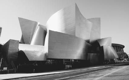
Most major and even minor museums have adopted a very smart attitude toward "branding." Reinforcing a sense of place through its "brand" identity and recognition. Museum logos are seen on buttons, bags, print materials and signs. Now new architecture is as much a part of the brand as its logo or graphic signature. Perhaps, starting with Frank Gehry's Bilboa Guggenheim Museum in Spain in 1997, the iconic building is the penultimate strategic museum statement of the 21st Century.
Moshe Safdie's design for the Peabody Essex Museum was about the integration of the old exhibition spaces and buildings with new greatly expanded gallery spaces. Founded in 1799 as the East India Marine Society, the Peabody Essex Museum, originally the Peabody Museum of Salem, Massachusetts is the oldest continuously operating museum in the US. It houses one of the major collections of Asia Art in the US including 1.3 million objects, along with twenty-four historic buildings throughout historic Salem. Safdie created new galleries, public spaces, an auditorium, and a renovation of older exhibit areas that underscore the museum's heritage and Salem's history. The 111,000-square-foot (10,300-square-meter) addition reflects Safdie's design method of working closely with the site.
Safdie's new wing has more than doubled the gallery space to 250,000 square feet allowing the display of items from its extensive holdings, which had previously been unknown to the public due to lack of previous exhibition capacity. The museum also opened the Yin Yin Yu Tang House, a late 18th century Chinese house from Anhui Province that had been removed from its original village piece by piece and reconstructed in Salem.
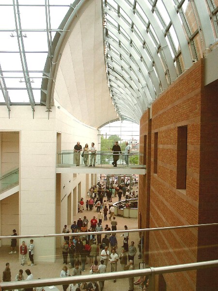
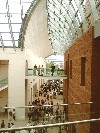
The downtown Salem site was tight. It extends between Essex and Charter streets, next to the museum's original 1825 East India Marine Hall, and the Dodge wing, a brutalist addition from the 1970s. The eastern part of the site was occupied by a row of houses, which meant that the new addition had to shoe-horn around them. Some existing museum facilities had to be demolished. The new building's main entrance on Essex Street is now the visual center of the museum complex. To enter the glass entrance, one moves through and into a large enclosed spine. It is crowned with a curved gable roof that is fabricated of half glass and half opaque material to provide sun control. The roof shapes are seemingly free-form, but are actually segments of a toroid or a donut shape.
Safdie's complex geometric shapes seem to mesh well together. Visual references can be made to expected nautical and marine themes like whales, sailing ships and sharks' teeth. There are also strong visual references to Salem's building as also along the spine are a series of "house galleries," two-story structures containing new exhibit spaces. From the exterior, these galleries appear as five brick house forms. Their shapes suggest themes found in Salem's built heritage including Federalist, Georgian, Victorian and industrial mill architecture styles.
Perhaps, the most striking space in the Peabody is the courtyard piazza. It is light filled from its curvilinear glass roof. Paved in small light pink granite pavers, the flooring suggests a nostalgic cobblestone street. Apparently, in the muiddle of the design process, Safdie modified his plan to accommodate the two-story late-Qing Dynasty Chinese merchant's house. It presently is now adjacent to the interior courtyard. All in all, Safdie did a rather brilliant job bringing rather diverse pieces together to form a coherent whole of a museum.
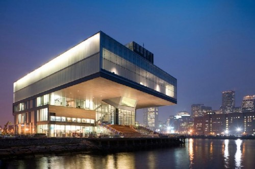
I wrote a major article on the Boston Institute of Contemporary Art new building in Berkshirefinearts.com, "Boston's New Institute of Contemporary Art, Building as Artistic Statement in 2006-12-06 discussing the architects' vision and the opportunities of the new spaces on Boston's waterfront. The architects, Elizabeth Diller and Ricardo Scofidio, have been much honored since designing their new museum building. In the over year and half since its opening, the artistic potential of the building's architecture has been recently met by the fabulous Anish Kapoor sculpture exhibition (Berkshirefinearts.com 2008-6-6). However, glaring problems still exist with the ICA's awkward entrance and ungainly lobby as well as with its less than exciting back of the building facing the City of Boston and its visitors.
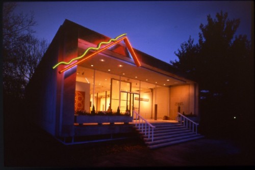
Brandeis University may be the most aesthetically displeasing and architecturally incoherent campus anywhere. There, the only flower in the weeds has been the Rose Art Museum. This has been more for what it has shown then where it has shown it. Over the years, the trustees must have confused the notion of taste with waste. Too bad. The Rose Art Museum in Waltham, Massachusetts was founded in 1961 and is housed in an International Style building designed by Max Abramovitz of Harrison Abramovitz. The original Rose building is a classically bland white box with a ubiquitous atrium on the main level and a reflecting pool on the lower level. In 1973 the original building was expanded with a utilitarian, brick-construction, support building. With its expanding program and art collection, The Rose inaugurated the Lois Foster Wing in 2001, designed by Graham Gund Architects, to provide additional gallery space to present regular displays of works in the Brandeis University art collections and to expand the contemporary art exhibition program.
Design has begun on a renovation and enhancement by the architect team of Shigeru Ban and Dean Maltz. Dean Maltz Architect is Ban's US collaborator on all projects. The project will address the Rose's needs for additional storage space for paintings, sculpture, and works on paper as well as a reception and administrative support spaces, program support space, a workshop, exhibition preparation space, a loading dock and flexible education space. The project will include creation of a new gallery space above the existing support building, reconfiguration of the support building, and renovation of the original Rose Art Museum. Fundraising is currently taking place with no completion date for final design and construction.
Shigeru Ban is a Japanese architect and uses many themes and methods found in traditional Japanese architecture and aesthetics.He also studied and worked in the West. Ban has become one of the leading Japanese architects who embrace the combination of Western and Eastern building forms and methods. Interestingly, Ban is famous for his innovative work with paper and cardboard tubing as a material for building construction. He was the first architect in Japan to construct a building primarily out of paper. Ban is attracted to using paper because of its low-cost, its recyclable, low-tech and ease of replacement. Another of Ban's influences is his attraction to ecological architecture. Sustainability is a key ingredient in all of his works. It will be a great addition to the Brandeis University campus if Shigeru Ban can implement his quality design there.
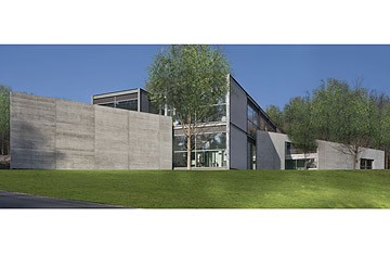
In a recent article, I wrote about the elegant Stone Hill Center newly completed at the Sterling and FrancIne Clark Art Institute in Williamstown, MA (2008-7-23). This new exhibition and conservation center is the first phase of a master plan by Tadao Ando. This is a geometrically appealing, two-story, wood and glass building that provides vistas of the beautiful countryside, a hallmark's of this gifted architect's. It has 2500 ft of beautiful, bright, contemplative gallery space, a 1000 ft studio art/meeting room, and 1200 ft designated for the Williamstown Art Conservation Center.
The spaces are light and airy yet literally grounded to the landscape. Tadao Ando's great ability to seamlessly weave architecture into a natural setting led the Clark to select him. Stone Hill Center reflects the quality of the choice of Ando and the quality of this architect's beautiful, but functional work. This is a beautiful structure in a beautiful setting. I anticipate Phase II of this project with pleasure.

