M.I.T.’s Memorial to Officer Sean Collier
Mundane Rather than Marvelous
By: Mark Favermann - Jan 11, 2016
Sculpture may take on symbolic meanings in layered ways. Often it represents an abstract idea, usually in the form of an allegory or personification. Examples of the latter would be the literal or stylized figures and graphic symbols that frequently adorn churches and civic buildings. Boston is well known for its masterful (Robert Shaw Gould Memorial and the 54th Regiment by Augustus Saint-Gaudens), bad (Irish Famine and Boston Women’s Memorials), and mostly indifferent bronze sculptures. The best modern examples of sculptural symbolism all tend to be abstract (yet subtle) renderings that express humanity’s deepest beliefs, dreams, or feelings.
Great examples of contemporary abstract homages would include the St. Louis Arch (Eero Saarinen’s The Gateway Arch, 1965), Maya Lin’s Viet Nam Memorial (1982), and Michael Arad’s Ground Zero National September 11 Memorial (2011). In each case an agile use of simple geometry creates an eloquent as well as elegant form that communicates a strong visceral message to almost everyone.
Though not as grand in scale, a recently completed memorial structure now at the Massachusetts Institute of Technology follows the modern convention of signifying remembrance through the manipulation of a simple form. The horrific 2013 Boston Marathon Bombings not only resulted in three deaths and the maiming of hundreds of people at the Marathon Finishline, but also in the death of Sean Collier, a well-liked young MIT campus police officer. Barely two years after his murder, M.I.T. chose to honor officer Collier on its campus.
An organic, elongated asterisk in shape, the memorial structure was created by architect and educator J. Meejin Yoon. She currently is the head of the M.I.T.’s Architecture program and is a partner in the award-winning Howler+Yoon, a firm that focuses on the integration of architecture, art, and media.
Yoon calls the Sean Collier Memorial “a place of pause and reflection.”
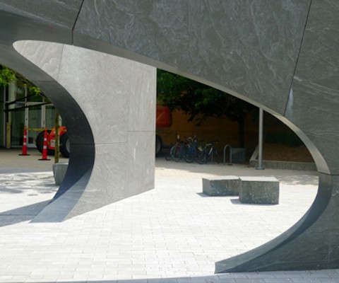
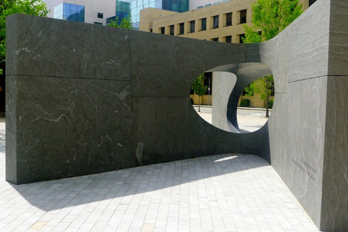
Composed of thirty-two solid blocks of polished granite forming a five-way stone vault, the memorial was inspired by the gesture made by an open hand. The structure’s shallow stone vault is buttressed by five radial walls. These stretch outward toward the campus; this posture represents a symbolic embrace of the M.I.T. campus. According to Yoon, the ovoid space at the center of the radial walls creates a passage or an aperture that reframes the site. On the various sides of the structure there are “windows” that change the visitors’ viewpoint.
The longest walls of the memorial both screen the site from Vassar Street and serve as an entry into the commemorative space. Poignantly, the two most acute walls are aligned with the location of the shooting which sadly took place just a few feet away. Etched into the south facing wall is an epitaph from Sean’s brother’s eulogy: “Live long like he would. Big hearts, big smiles, big service, all love.”
Honey locust trees have been planted to create a canopy above the solid stone structure. These serve as a means to mark the passage of time. In contrast to nature’s transience, small LED lights set into the pavers permanently inscribe the constellation of stars in the sky on the deadly night of April 18, 2013.
The Sean Collier Memorial is undoubtedly well intentioned and even thoughtful; there are some very compelling aspects to the structure. The beauty of the materials used and the craftsmanship employed are both exemplary. Still, its design and its execution seem more prose than poetry.
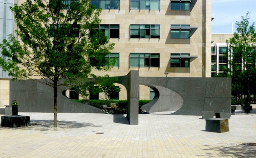
Only a birdseye perspective allows one to get a sense of the whole structure; it is the only way to visually take in the image of asterisk, open hand, or asymmetrical star. The viewer is strictly limited to what can be seen from the ground, and these views give only a partial idea of the intended visual narrative. The structure can only be seen in sections, so the strength of the memorial’s imagery is undercut, even obscured. The symbolism suggested by the designer cannot be easily recognized by visitors: it needs to be pointed out. The metaphorical statement that the memorial was shaped to make is undercut because it has to be explained rather than directly experienced.
Moreover, the space is awkwardly sized; it almost feels as if the memorial had to be shoehorned in. This impression somehow diminishes the piece’s importance. Visually disconnected from the imposing buildings surrounding it, the sculpture has not been placed on a planar plinth, either suggested or literal. Thus its significance is enigmatic; given the structure’s uncomfortable scale and placement, it comes off as a vague punctuation set on the concrete landscape between campus buildings.
Given the structure’s hard edges, aside from the pair of honey locust trees adjacent to the memorial, the environment seems to be more of a homage to M.I.T.’s institutional style than an act of remembrance. In truth, this sculptural form lacks artistic grace. Moreover, when the weather turns hot or cold, the granite blocks set around the structure for seating will become unwelcoming, to say the least: they will heat up in the sweltering summer and freeze during the winter.
It could be argued that more time and consideration were needed to make the Sean Collier Memorial great rather than just partially good. The problem is our speed-obsessed culture; we may be too quick to want to ‘put things away’ and ‘just move on’ after traumatic public events. Our society may need more time to think and muse in order to properly grieve. Our culture, as well as our art, needs to give itself permission to meditate on the past, to let the imagination ferment. Quick solutions to public mourning are not always the best answer. It appears that this project could not ask the appropriate questions because it was completed too rapidly. Vintage wine is always much better than Beaujolais Nouveau. And Beaujolais Nouveau is not a wine to sniff, swirl, and contemplate.
Unfortunately, though certainly completed for all of the right reasons and well made, the Sean Collier Memorial does not make a full-bodied artistic statement — it does not elicit a strongly felt aesthetic or visceral reaction. Instead of being marvelous, it is just mundane.


