New Gardner Museum Expands Isabella's Mission
Brilliant Architectural Addition By Renzo Piano
By: Mark Favermann - Jan 15, 2012
A few years ago, there was so much new museum expansion and additions in New England that it appeared to be an architectural boom. Most of these ambitious projects were commissioned to starchitects, the most notable practitioners in the field.
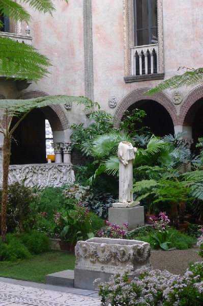
Arguably the most delicate addition to a museum was to be the substantial addition and expansion of services and activities of Mrs. Gardner's palace and private collection, the Isabella Stewart Gardner Museum in Boston. In the founder's will, it was clearly stated that nothing should be moved or changed.
Yet, after millions of visitors over a hundred years, the Gardner was showing great wear and tear. It was literally being loved to ill health if not death. This was burdening the museum's staff in terms of continuing existing services, expanding programs and adding new projects.
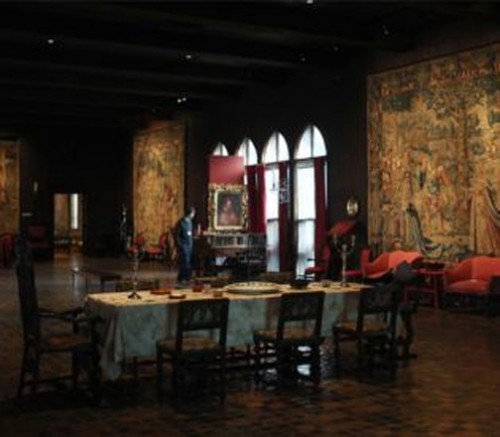
Concerts and recitals were primarily being held in the Tapestry Room which became terribly overcrowded. Contemporary art exhibits and lectures, teaching facilities and infrastructure were quite inadequate for a 21st century museum with serious programming aspirations.
With great courage and fortitude, Executive Director Anne Hawley took on critics and naysayers to make a creative argument for expanding the Gardner from its vintage palace to a new institutional form. She had to encounter and overcome historic societies, preservation groups, City of Boston agencies, some academics and often outraged citizens.
An original carriage house on the property had to be torn down. Though only used for decades for storage, this structure was an argument by preservationists and others to stop the project. Luckily, Ms. Hawley won the argument. Also, the economic downturn and Recession of 2008 didn't help with confidence or fundraising, but Hawley and her steadfast board persevered.
One of the world's architectural luminaries was commissioned to design the tricky and highly sensitive addition to the Isabella Stewart Gardner Museum--Renzo Piano, the Pritzker Award winning architect from Genoa, Italy. He is perhaps the most prolific museum designer in the world. Nearby, he is also redesigning Harvard University's Fogg Art Museum in Cambridge.
The Gardner Museum expansion project has spanned over 7 years in its planning, design and construction. The $118 million addition (it actually came in slightly under budget according to the project manager) includes a major new contemporay gallery, a state of the art performance space, staff offices, artist in residence apartments, a comfortable visitor orientation space, expanded classroom facilities, a new greenhouse and gardens.
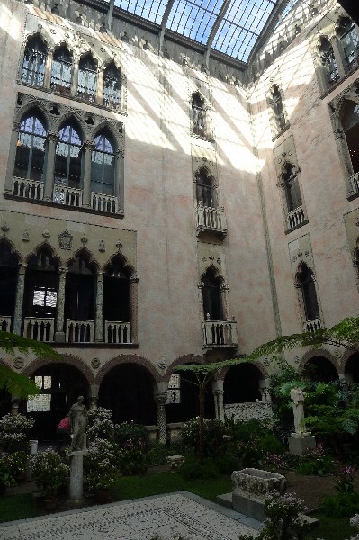
The resulting Gardner Museum expansion is brilliant. Carefully listening to Hawley and staff and studying the original palace and site, masterfully Piano and his staff designed the building with the museum’s original mission and vision very much in mind. He honored the original Venetian-style palace architect Willard T. Sears' 1902 design.
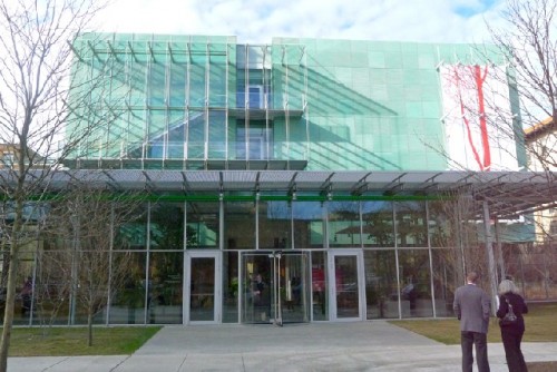
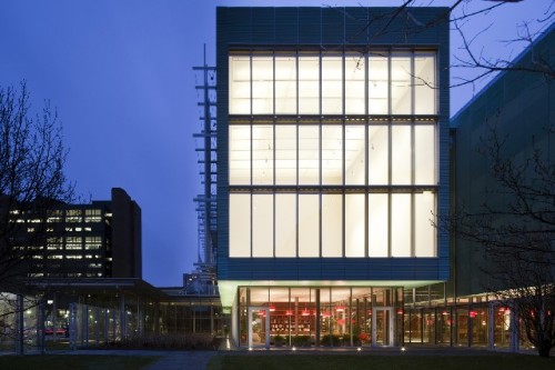
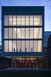
Strikingly modern architecturally, Piano has designed the new wing with reference and even reverence to the the museum’s original building. In the new wing's design, he has incorporated natural light and transparency.
Instead of trying to match the Renaissance Italinate Palazzo's facade with some sort of modern compound, the architect took a contrasting materials approach to the structure. The result is a contemporary building connected transparently to the old distinguished structure.
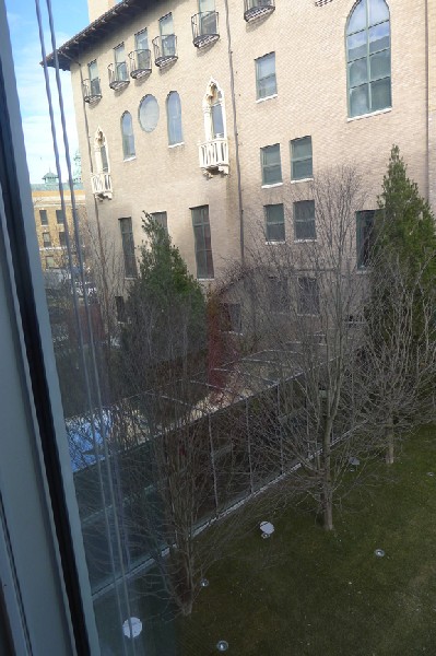
There is also wonderful visual tension and often architectural surprises between the older museum and its new components. Views of the old and new can be seen from each other in windows and glass expanses. This gives a continuous visual dialogue between the new wing and the historic palace.
Set 50 feet behind the historic buiding, the new wing is 59 ft high (the palace is 70 ft high) and includes 70,000 square feet of new space. The historic building includes 38,000 square feet of gallery space and 3000 square feet of garden courtyard.
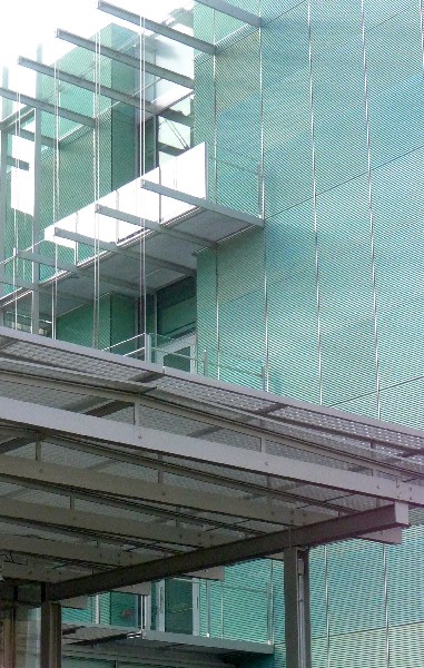
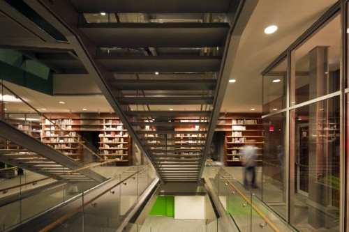
The new wing has a transparent first floor of glass. Above this are four "floating" volumes. These are clad in pre-patinated copper and are organized in an axial circulation system that includes a double grand staircase and quite clearly marked adjacent elevators.
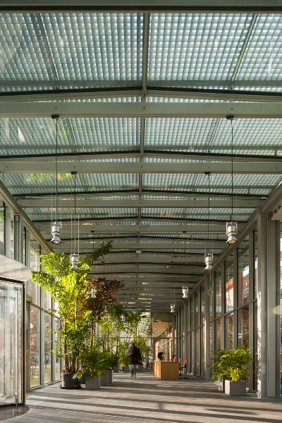
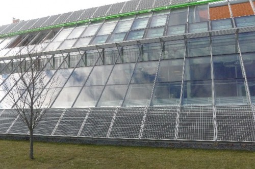
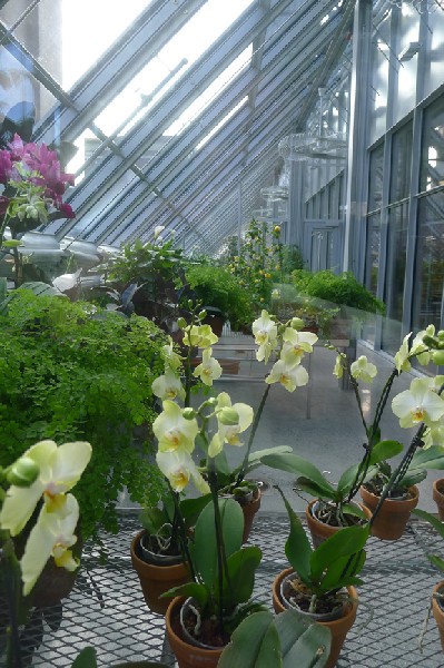
Next to the main lobby, the architect has integrated an elegant two story greenhouse with a sloped facade. There are two artist apartments on the second level. Near the entrance is the Gardner Museum Shop full of books and gifts.
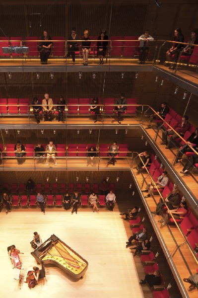
One of the major elements of the new wing is the acoustically superior cube shaped Calderwood Hall. This spectacular airy and sleek 6000 square foot performance space is 40 by 40 feet and 42 feet high. The concert hall has three balcony levels of single, front row seating organized around a central performance area. There are 296 seats in the performance space.
Spatially appealing, the Calderwood's floor is made of Alaskan Cedar. The dark walls underscore an intimate but grand musical setting, a very Gardner Museum experience.
Calderwood Hall replaces the often overpacked, cloistered Tapestry Room in the Palace. Seating capacity is about the same but with much more comfort and beautiful sound in the new hall.
Acoustical engineer Yashuisa Toyota of Nagata Acoustics collaborated with Piano to create the state of the art sound for Calderwood Hall. Toyota worked on many other prominent performance facilities throughout the world including Frank Gehry's Disney Hall in Los Angeles.
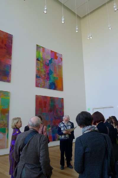
The New Contemporary and Special Exhibition Gallery is three stories high. It allows for great flexibility as the ceiling can be lowered to heights of 24 feet and 12 feet from its 36 feet maximum. Here the exhibition space can change from the intimate to the immense allowing the art to be placed to great benefit.
The stunning gallery has three times the space as the former special exhibition gallery in the Palace. It also has options for managing natural light through a north glass wall, a skylight and adjusting the ceiling.
At the end of the public corridor in the new wing is an educational workshop space. The Claire and John Bertucci Education Studio is the new home of School and Community Partnerships. Formally located in a cramped basement area, the studio provides an art-making area that complements learning in the galleries.
State of the art conservation labs and archival collection storage areas are located in the upper volumes on the south side of the new wing. Art history scholarship and research will benefit greatly from these facilities.
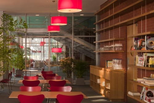
A new expanded restaurant and a museum shop are also along the public corridor. These spaces are bright and inviting. Scale works in both spaces to increase comfort and sense of place.
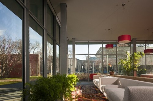
A new visitor orientation space, The Richard E. Floor "Living Room," is both inviting and innovative. It reflects the notion of the Gardner Museum as a home in a historical sense for Mrs. Gardner and in a comfortable contemporary setting for art. It allows for rest and contemplation as well as opportunities to learn about the history of the museum and the life story of its founder.
The Isabella Stewart Gardner Museum’s new wing makes as strong a horticultural and landscape as art statement. Though always conceived as an integral part of the museum's visitor experience, flowers, plants and greenery are even more a part of the new museum configuration.
The Gardner's entrance has been strategically moved from the busy traffic of the Fenway to the quiet Evans Way. New trees, more lawn and a transparent working greenhouse have replaced fencing. Therefore, the new Gardner Museum is a much more literally "green" structure and environment.
By changing the entrance with its adjacent greenhouses, Piano has created a greenspace connection with Frederick Law Olmsted’s Evans Way Park across the street. The result feels parklike and elegantly more spacious.
Executive Director Anne Hawley has demonstrated a wonderful 21st Century vision by expanding upon Mrs Gardner's great interest in flowers and plants. There have been greenhouses and potting sheds associated with the Gardner Museum since its inception in 1903. Creatively pushing the green envelope, she has appointed as the Gardner Museum's curator of landscape architecture Charles Waldheim.
In fact, Waldheim may be the only museum curator of landscape architecture in the world. He is also a distinguished professor and the chairman of the Department of Landscape Architecture at the Graduate School of Design at Harvard University. Last fall, Professor Waldheim was named one of the best design teachers in the world.
Among his first duties, he is developing a program of distinguished young landscape fellows to be in residence at the Gardner. There will be permanent plantings and temporary, more experimental gardens created by the fellows.
In addition the Gardner is a very green building. It has eight geothermal wells supporting its heating and cooling that will result in eventual energy reduction. Also a storm water management system collects and controls rainwater runoff to irrigate the greenhouse and landscape.
Other sustainable building features include lighting controls to maximize daylight and extensive use of materials with high recycled content. Based on all of this, The Gardner is pursuing a Leed Gold certification.
The Isabella Stewart Gardner Museum's new wing underscores a pride of place by enhancing an already special and quite historical institutional setting. The Gardner is a now a 21st Century great small museum. This is thanks in large part to the vision of its Executive Director Anne Hawley and the design creativity and construction oversight of architect Renzo Piano and his creative colleagues.
The Gardner's new wing should be celebrated and cherished. Just visit it to experience its quality and vitality. Bravo Maestro Piano. Bravo Anne Hawley. It is a great architectural achievement.

