London’s Design Museum — An Inspiring Experience
One of the Major Venues for Experiencing Art of Design
By: Mark Favermann - Jan 23, 2017
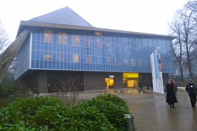
The Design Museum’s wonderful new building on Kensington High Street in West London opened on November 24, 2016. It is an exhibition space that explores functional objects, celebrating their intrinsic visual impact, their expression of the magic of human creativity and invention. These are the machine-made items and ideas that shape our lives, and the Design Museum has found a deft way for us to appreciate their creativity, along with the economic and environmental forces that mutually influence the parameters of design.
The notion of London’s new Design Museum began as a campaign begun in the 1960s by Sir Terence Conran for the best modern design of the past 60 years. A couple of decades later this effort led to the then futuristic Boilerhouse Project design gallery located in the basement of the venerable Victoria and Albert Museum. Between 1982 and 1986, the Victoria & Albert Museum hosted a series of exhibitions primarily devoted to industrial design, but these events also included shows about functional objects, individual design firms, and design personalities, as well as robots, graphic design, and even hand tools. This structure, sort of a white cube within the V&A, eventually evolved into the Design Museum’s first building — a bright white Art Deco structure, on Butler’s Wharf located near Tower Bridge in 1989 on the south side of the Thames at Shad Thames.
Through perseverance of vision and a decade of passionate determination, even during the economic downturn of the Great Recession and the diminishment of cultural support from the British government, the Design Museum’s Director Deyan Sudjic energetically moved the project along.
The museum was designed by a team including the minimalist designer John Pawson and OMA, starchitect Rem Koolhaus’ superlative firm. Pawson sensitively created the museum’s interior, while OMA both master planned the city block in which the museum is placed as well as designed the luxury apartment buildings that play a strategic part in making it all a financially viable (and unified) mixed use complex.
The museum structure itself is the reconstituted version of an iconic ’60s landmark: the former Commonwealth Institute. The building’s hyperbolic paraboloid roof has been restored and is the elegant geometric top or crown of the sparkling new museum.
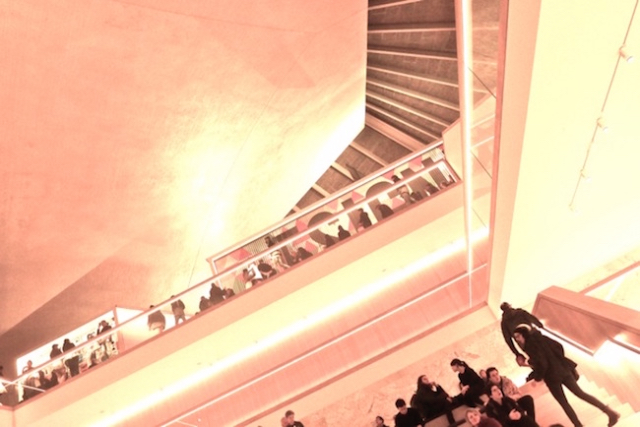
Growing up in West London, Pawson saw the building as the “tent in the park.” In designing the interior space, he recognized the challenge of repurposing an older exhibition space into a contemporary museum that had to include the museum’s permanent collection, temporary exhibits, educational environments, and other spaces necessary for a prominent institution. Pawson simplified many of the existing spaces and opened up others. The result is, as in all the best examples of design, a magnificently soaring yet pragmatically flexible environment.
Two notes for tourists: first, the directional signage on and near elevators is just terrible. Visitors spend needless time disoriented and confused; secondly, the unisex toilets are amazing. They should be highlighted as part of the institutional display experience. You put your hands under the mirror and bingo!: soap is applied, water appears, and then drying commences — all in one horizontal plane!
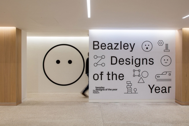
A major danger when it comes to presenting design objects is that museum displays look like a furniture showroom, a science fair, or a trade show. The Design Museum tries to steer clear of this problem, but it falls short. There are touches of the less than elegant throughout the exhibitions. And too often process outweighs aesthetics. What appears to be clever is chosen over what would be more appealing designs. This seems to be particularly true of new medical apparatus as well as architectural applications in the two inaugural exhibits, Fear and Love: Reactions to a Complex World and Beazley Designs of the Year.
Fear and Love: Reactions to a Complex World presents eleven new installations from what the curators consider some of today’s most innovative and thought-provoking designers. The display was thought-provoking but not always compelling. In its ninth iteration, the Beazley Designs of the Year exhibition celebrates design that, according to Design Museum PR, “promotes or delivers change, enables access, extends design practice or captures the spirit of the year.” Like most other “best ofs,” this was a display with highlights and lowlights, but it was a pleasurable and accessible visual and educational experience.
The most satisfactorily resolved exhibition turned out to be from the Design Museum’s permanent collection. The objects, furniture, and forms are arranged in a narrative dedicated to the history of design and mass production, from 19th century manufacturing innovations to the digital age. Here examples from the impressive wealth of the museum’s holdings — a 3000 object collection that spans all aspects of design, including architecture, fashion, furniture, product and graphic design, digital media and transportation — tell a fascinating story.
Architecture also presents difficulties in terms of display. Photos and drawings often capture only a small part of the experience. Scale is the impossibility hard issue. How can the viewer be made to feel the size of a structure by looking at just pictures or models? Still, the risk is worth taking, given the obvious mass appeal of design.
Unfortunately, Boston has nothing that comes near to matching the success of London’s Design Museum. The city’s fledgling (without a building) Design Museum has decided to focus on process rather than present a mix of design aesthetics. This narrowness of vision has undoubtedly reduced its potential audience and civic reach. Boston’s Institute of Contemporary Art’s (ICA) only nod to design is the array of products sold in its store.
Over the past several decades, the Museum of Fine Arts Boston (MFA) has had a hit or miss history with contemporary/modern design. The Boston Society of Architects (BSA) exhibition space continually wrestles with how to display architecture as well as construction materials and methods. Perhaps the best design and architectural display program and space is at the Harvard Graduate School of Design’s Gund Hall, and it is free.
The Design Museum provides an inspiring model for the efforts of others interested in displaying the history and beauty of design. The payoff is self-evident; this museum has quickly become one of the must-see destinations for visitors to London.
This article was previously published in Arts Fuse. It is posted in Berkshirefinearts by their permission.


