Two Uninspired Boston Public Art Competitions
A Dull Gillette Edge & A Fishy Swan Boat Pavilion
By: Mark Favermann - Jan 31, 2009
Public art as a cultural concept is usually a wonderful thing, and as a part of the civic landscape can be great. Public art competitions are generally an enlivening exercise for a community. But, sometimes public art can be used as an excuse for a civic obligation or a notion of cultural noblesse oblige. Two recent public art competitions were held last fall and early winter in Boston. The cash prizes were very low, almost laughable, but creative interest was high. Many of the entries had merit, though, both winning pieces were unappealing and probably unbuildable.
Public art is a hybrid of visual art as well as architectural and engineering tools and methods. The best of it results in quality civic design. This is not art that evolves easily out of an artist's studio, but it is often a serious and long-term collaboration between an array of professionals with various training and skills. Fundraising efforts and governmental agency involvement along with community review processes are also part of the public art formula.
Public art is often thematic, and when it is right and most fitting should result in an iconic visual statement. However, most public art does not reach this high bar. Regrettably, unlike several other cities, Boston does not have that many iconic pieces of public art. These two 2008 competitions did nothing to improve this situation.
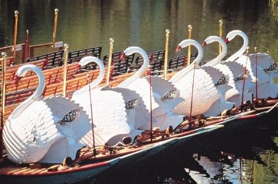
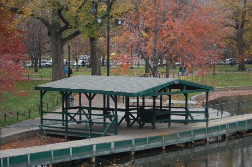
One competition was to create a new pavilion for waiting passengers for the generationally beloved Swan Boat ride in the historic Boston Public Garden. According to the sponsors, the objective of this juried architectural design "ideas" competition was to explore possibilities for two new structures in the setting of one of our country's most significant public spaces. The Public Garden was America's first botanical garden. Its beauty is reflected in the 1859 landscape design created by George Meacham.
As there was not any formal plan for a replacement for the existing Swan Boat pavilion and duck house (a covering for a stem pipe where ducks are often found seeking shelter), the competition was to be considered an ideas competition. It was the hope of the competition coordinator, CBT architect Paul McIntire, that sponsors and funding would be found to actually implement a project. He should be congratulated for his optimism and work on this if not the results of this competition. In this fading economy, there is not much hope for this. However, a great idea could encourage eventual facilitation in the future.
Although the competition invited artists, landscape architect, designers and students to participate, it clearly was not meant to be an open exchange of creative concepts and visionary ideas across professional disciplines. The resulting prize winners all focused upon rather conservative architectural solutions. The jury's choices were disgraceful. Architectural submissions seemed to be the only ones considered by the jury. This was a damn shame in regard to the amount of time and energy that individuals and firms put forth to create their submissions. Clearly, there was no truth in advertising here.
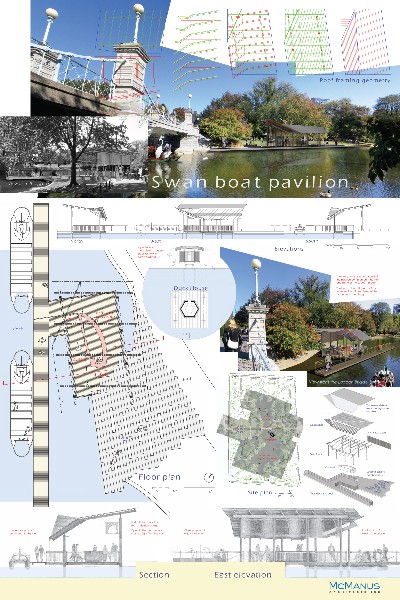
The first prize winner (receiving a paltry $1000), McManus Architects Inc. of Cambridge was an uninspired but well rendered simple pavilion idea that seem to have little feeling for the history of the existing Swan Boat Pavilion. Second and third prizes were architecturally unmemorable and could have been placed almost anywhere on another riverbank or waterside setting.
Also disappointingly, the only merit award winner (receiving no cash prize) looked like a series of drawings found in a 19th Century pattern book for gazebos. Actually, the merit award winner would look better on Mother's Vineyard, Savanah, GA or Prince Edward Island, Canada rather than in the Public Garden. This was certainly not contextural architecture, and this project's architect happens to be a good friend of the competition's coordinator McIntire. Gambling in Casablanca? Shocking!
The list of jurors included community members, architects and artists plus two members of the Paget family who have for generations owned the Swan Boat ride franchise. However, it appears that the community people deferred to the architects, and the two artist jurors were either overruled or silenced by the architect jurors as well. One prominent juror was architect Richard J. Bertman, a founder of the architecture and urban design firm (surprise) CBT. He considers himself a sculptor and creates wire and gear welded forms and figures. Bertman is responsible for the design of the second Prudential Tower with the less than iconic and unimaginative roof feature. Here, as with this competition, was a creative opportunity missed.
There were certainly more visionary pieces to choose from among the submissions. There was a project based upon lilly pads and frogs, and there was a project based upon a floating leaf among others. Both these had real "ideas" rather than the same old-same old stuff. Too bad. Maybe one day in the not so distant future someone or some group with vision and money will actually implement one of the non-award winning ideas?
The other competition was sponsored by the long-time Boston-based consumer giant Gillette, or rather by its somewhat new corporate even larger consumer giant parent, P&G (formally Proctor & Gamble) which is headquartered in Cincinnati, Ohio. It should be remembered that Gillette was founded in Boston in the early 20th Century by King Gillette who patented the first safety razor. The company became huge and developed other consumer products and appliances for world-wide distribution.
Though a world class corporation, it was always a little-known Boston civic player. It's enormous manufacturing facility was visually branded, but its hugh administrative staff taking up over twenty floors in the Prudential Tower never was acknowledged by the company. Perhaps, they were afraid of attacks by bearded hippies, students and radicals? Oddly, it was one of the few companies in the world not to acknowledge visually it's world headquarters with a brand identification on its headquarters building. For decades, it was Boston's stealth world headquarters.
Because P&G/Gillette is currently involved in the most significant renovation of its World Shaving Headquarters in its 100-year history, the firm wanted to add a landmark icon to the complex. When completed, the 33-acre site which is located in South Boston, will house P&G/Gillette's Research and Development, Engineering, Manufacturing, Marketing and business support division.
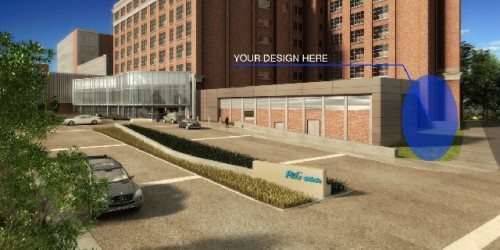
As the company wanted a signature sculpture to mark the entry to the headquarters complex, there was a site assigned for this purpose. Design professionals, artists and students were encouraged to submit designs that reflected the essence of the Gillette brand that drew inspiration from the company's shaving product innovation and manufacturing technology.
The design brief also stated that each design should reinforce the P&G/Gillette corporate identity, enhance the new campus, and contribute positively to the South Boston community neighborhood environment. The chosen art piece was to serve as a welcome to employees and visitors, as well as an acknowledgement to the South Boston neighborhood.
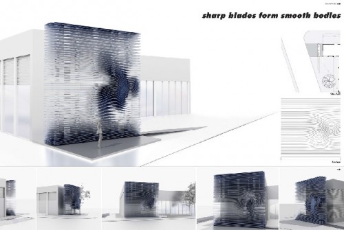
Disappointingly, the winner was Sergio Araya of Cambridge, MA for his entry Cutting Edge. The piece is made up of 53 thin sheets of stainless steel plate ("blades") that has an undulation in its metal rectilinear form. The stated desired iconographic quality of the piece is not apparent. The designer is a Phd candidate in architecture who works with new materials, new technologies and new structures.
Conceptually worse were the other prize winners including 2nd Place for Heath Cody of Chelsea, MA in collaboration with Hing Fung for their entry Sinuous Points. This was a conventionally designed three piece streamline archway. Third place was by Vicky Chan and Amy Chien of Jamaica, NY for their entry Flow. This was some kind of towering abstract tree forms that seemed to have little or nothing to do with the site or the brief. A Merit Award went to Joanna Borek-Clement of San Francisco, CA for her entry Gillette Sustainable Sculpture Park. This was not even drawn well and had little to do with anything.
The great disappointment here is that there were again some rather creatively vital and significantly iconic pieces submitted to the competition that are better than the prize winners. The first prize winning piece is contemporary-looking, even technologically advanced, but the renderings of the piece suggest little if any aesthetic appeal. It looks like it will cost several hundred thousand dollars to fabricate as well. In today's economy, is this realistic or even publicly palatable? There is a gallery of some of the other often more exciting and visually compelling competition submissions at: Link to gallery
Public art can be great. It is also can be not very good or appropriate. It is too bad that a lot of effort ultimately results in mediocrity. In very few areas of our culture do professionals actually do work for the pleasure and excitement of expressing their creative ideas. The prizes for these two competitions offered no reasonable rewards. This phenomenon seems to take place only in the arts and design.It is an odd paradigm for a fee for service world. Yet, traditionally, this is how our society develops new expressions of civic design. The problem often is not in the designs themselves, but as shown in these two recent Boston competition cases, but in the decision-makers, the jurors. It is disappointing, no sad, when opportunity is lost.
