
Vancouver's Olympic Look of the Games
Failing By Trying Too Hard On a World Scale
By: Mark Favermann - Feb 16, 2010


The much anticipated 2010 Vancouver Winter Olympics opened on Friday evening, February 12, 2010, with an inadequate Canadian flourish rather than a real visual bang. The setting, British Columbia, is not only one of the most dramatically beautiful parts of Canada but arguably one of the most beautiful places in North America. The magnificent environment has been beset with too warm weather, fear of a lack of snow and a hope that the Olympic gods will smile down upon it. It was too warm to make artificial snow, and helicopters had to fly in snow.
The Olympics are supposed to run like a precise beautiful watch. Instead, the Vancouver Olympics have caused observers to wonder what bad will happen next. In addition, there have been a number of technical and design problems at these Canadian Olympics. So many, that it has now been dubbed The Glitch Games. Before the overly long, often dull, very Canadian Opening Ceremonies took place in an inclosed stadium, a young luge athlete from the country of Georgia died doing a practice run on the course. His head crashed into an unpadded structural steel column. This and other less severe crashes led to the luge course being eventually adjusted for a lesser speed and safety. A pall immediately came over the Opening Ceremonies.
Highly visible, the Olympic cauldron malfunctioned at the end of the Opening Ceremonies. A pillar did not move in proper position and one of Canada's sports legends was left standing holding on to a hot torch. Millions, perhaps even a billion were watching. This caused a delay in the torch lighting and took away from the major ceremonial moment of the night. Fingers must have started pointing at everyone involved immediately. Besides uncontrollable weather on and around the mountains, standing room areas at various outdoor venues were done away with and tickets were refunded because designers did not anticipate dangerous weather-related environmental conditions that occurred. As usual like most other Winter Olympics, transportation to outlying venues was a mess. It takes skill and a bit of luck to be a designer.
Also, there was an ice malfunction at the speed skating long track delaying competition and causing additional embarrassment to the organizers. The organizers must have gotten a deal on something else rather than a reliable Zamboni icemaker that are used at almost every major ice or hockey rink. A faulty spigot leaked a spray of water at the Luge facility causing icing issues. Add to this the fact that there is a fence separating visitors from getting a good photo of themselves with the Olympic torch, drug addicts and homeless residing close to Olympic venues in Vancouver and scads of radical political protestors wearing masks and sometimes throwing rocks at store windows. Oh Canada!
Professional planners, architects, engineers and graphic and industrial designers are all involved in the design and development of an Olympic games. Bids are suppose to be awarded based upon a locality's ability to meet the challenges of creating a successful, safe games. The Lords of the Rings, the International Olympic Committee (IOC), awarded the Olympic bid to Vancouver and thus Canada as well over seven years ago. Certainly, this was enough time for the Vancouver Olympic Organizing Committee to get its act together? But, apparently it was not for Vancouver 2010.
Some of the problem is the very provincial (no pun intended) way that the Olympics are created or recreated each time. The local organizing committee who develops the bid and the master plan is then asked to implement the plan. They in-turn generally like to give jobs to local area individuals or citizens and firms located in their own country. There is a certain logic to this, but there is also a need for achieving the best possible results in the most efficient and cost-effective ways. Despite this good politics and good neighbors approach, it does not mean that local, regional or national firms are the best for the job.
Some technical expertise is brought from one Olympic city to another. But probably this is very limited and not strategic enough. The wheel seems to be redesigned every time. London 2012 has taken this approach as well. The British press has taken a certain glee in the Vancouver messes suggesting that London 2012 couldn't do any worse. The chances of an architectural or engineering firm that has a formidable reputation to be chosen for an Olympic venue project is quite high. It is also possible that they have little or no background in sports facility construction and its necessary technologies. One size or firm does not fit all here. Mistakes have been made. Therefore, easily and most probably problems can arise like they did in Vancouver. But, they are not suppose to happen at the Olympics.
Once the bid is granted, the IOC allows the local organizing committee to use the five Olympic Rings on all of their look. This is the international brand with its five colors individually being found in each flag in every country in the world. Unity through colors! If world peace, poverty, disease and malnutrition could be solved only so easily.
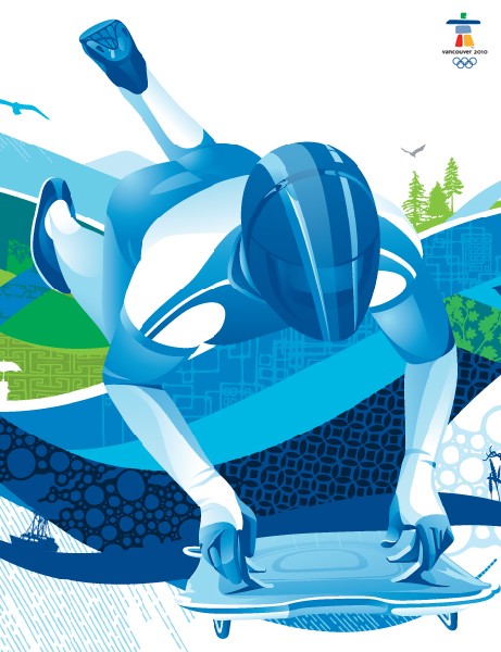
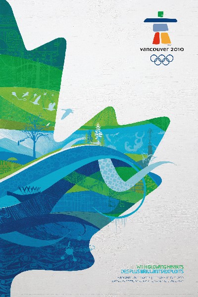
The "Look" of the Olympics separates it from other major sports events as well as from other Olympic games. It is a digital and environmental graphic exercise that too often seems to be given to primarily two dimensionally oriented firms. Vancouver's "look' is more retro-illustration than graphic symbolism. It strangely has a 50s/60s sensibility. Each organizing committee attempts to visually capture the Olympic and Paralympic spirit while telling the unique story of the host region and country. Vancouver's approach is not only heavy narrative illustration but a dense cacophony of images and forms. The sea colors of blues and yellow green don't help.
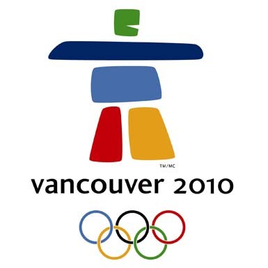
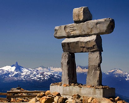
Vancouver 2010's graphic identity began with the selection of the Olympic Games emblem prior to the bid and the development of a separate but somehow related Paralympic Games symbol. The emblem is IIanaaq, an Inuit stone configuration that denotes friendship. Vancouver's motif graphics were added later. These attempt to use color and shapes to highlight the beautiful coast, forest and mountain peaks in the host region. Abstract urban representations and digitally-inspired elements representing Canada's modern cities and cutting edge technologies add to the narrative nature of the graphics. The designers literally included the kitchen sink in the design.
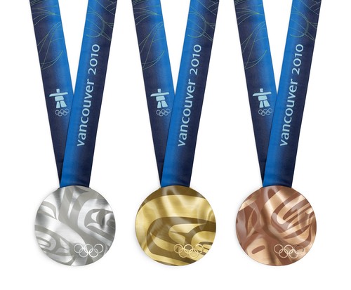
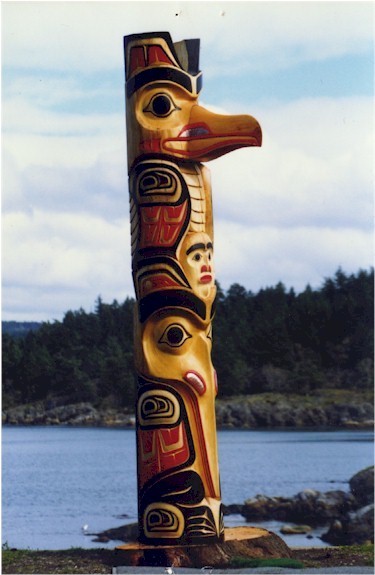
Additionally, images from First Nation tribal totem poles and masks are sprinkled in and can be most directly seen in the medal designs, and thus creating a swirling illustration of hard to decipher images. Ultimately. this Vancouver "Look" just tries too hard to do everything and it fails, not spectacularly but rather mediocrely. At least they stayed somewhat away from the nation's ubiquitous red Maple Leaf.
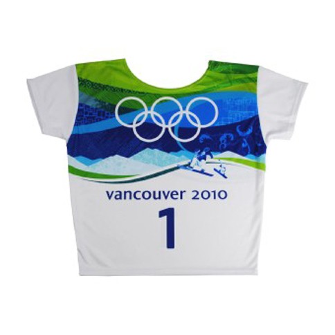
This sort of dense 50s/60s wallpaper approach to "the Look" is somehow justified by the organizing committee as underscoring " a welcoming spirit, a setting that combines a vibrant city with a stunning natural environment, and a country shaped by both ancient spirits and the exciting call of tomorrow's possibilities." In other words, all things to everyone about everything is the theme. The colors are questionable as well: blues and greens. Are these appropriate Winter Olympic colors? Aren't they more Summer or Spring colors (Summer Olympics) rather than Winter Olympic ones? They get visually muddy on television, a rather viscous mix of pigments. Weren't these tested beforehand? The bolder, more distinct primary colors of the earlier emblem would have been more resonant. Even the athlete bibs seem insipid at best, visually unappealing at worst.
In the US, NBC (who overpaid for the rights to televise the games) and its various cable channels have used the natural beauty of the region as television backdrops rather then the look elements. Perhaps the Vancouver 2010 visual image will (should) just be forgotten? Other than the Parthenon, does anyone remember what Athens in 2004 looked like? Or more recently, after the structurally brilliant Bird's Nest Stadium and Water Cube Aquatic Centre, remember exactly what the 2008 Beijing Olympics looked like? These two even more expensive looks were not particularly great either, but somehow, Vancouver promised much more than it delivered.
There are waves intertwined in the Vancouver design. Are these to suggest motion, energy, a timeline and Olympic continuity? Perhaps, just the waves would have been enough? This heavily layered narrative set of graphics that read poorly on television and at venues probably looked great when presented in power point presentations or on computer screens. They fail here as distinctive and strong visual language, too dense, too uninspired and untranslatable.
Other and better design directions could have been followed. A more clearly graphic 50s/60s design approach could have been developed into a thematically cohesive, visually elegant program. An example of a contemporary interpretation of a period design are the crisp, elegant even subtle graphics of the award-winning early 60s television program Mad Men.
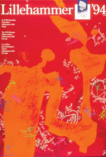
Another thematic but much more successful approach was taken by the design team at the 1994 Lillehammer Winter Olympic Games in Norway. This approach incorporated earth tones and natural material elements along with graphically appealing primitive-looking somewhat edgy pictograms based upon historic pictographs found on rocks and cave walls. Less was more here. Simple but not simple-minded was the key. Looking like clipart, the Vancouver pictograms are cartoonish and uninspired. Unfortunately, the Vancouver approach wanted to illustrate everything and not creatively embrace visual quality or thoughtful design. There seemed to be little or no visual editing. Not much design inspiration is here. Too bad as this was a major opportunity lost.
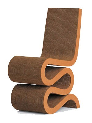
Interestingly, unlike other Olympics like Beijing and Lillehammer, there are no notable buildings to be remembered at Vancouver or any of the outlying venues like Whistler Mountain, Cypress Valley, etc. Unfortunately, green, sustainable structures were considered a substitute for inspired building forms. Aren't all new buildings all green, sustainable structures anyway? Certainly, there are a number of talented, world class Canadian-born architects that should have been enlisted. Buildings need not have been created if other elements and structures could have been added to the quality of the built environment. Imagine Toronto native, Frank Gehry could have at least created a wonderfully organic Olympic medal pedestal related to his furniture designs out of recycled corrugated cardboard like his distinctive Wiggle Chair.
There are no notable smaller structures like the telescoping medal platform pavilion in downtown Salt Lake City either. Montreal-raised architect Moshe Safdie could have created interesting start houses at ski runs. Even the sculptured ice cycle form of the Olympic cauldron is rather heavy and inelegant. 1994 Lillehammer had several distinctive buildings by international architects. There are many quality architectural firms in Vancouver who could have made a visual and functional contribution. Could of / should of, more design opportunities lost. The Canadian architectural community as well as the critics have loudly reacted to this lack.
Even the designers at Google seem to have done it better than the Vancouver Olympic designers. On February 16, 2010, they interpreted the visual essence of the Olympics by creating images of curling stones which abstractly and colorfully evoke the Winter Olympic Games with style, humanity and grace. Oddly, Olympic visual eloquence speaks to us at unexpected places and in unexpected ways.
The Look of the Games for Vancouver 2010 was a bit like the words from iconic Canadian poet/songster Leonard Cohen's Hallelujah that was sung at the Opening Ceremonies by Canadian KD Lang,
I did my best, it wasn't much
I couldn't feel, so I tried to touch
I have told the truth, I didn't come to fool you
And even though
It all went wrong
I'll stand before the Lord of Song
With nothing on my tongue but Hallelujah
Trying too hard to please, the Vancouver 2010 distinctive visual expression is sadly lacking. Unfortunately, the whole world was watching.
Mark Favermann's firm, Favermann Design, was one of the five American design firms that designed "The Look" for the 1996 Centennial Olympic Games in Atlanta.