New Museum on Skid Row
Trashy Exhibitions Launch a Permanent Home
By: Charles Giuliano - Apr 10, 2008
Marcia Tucker (1940 to 2006), the founder of the New Museum and its director from 1977 to 1999, was one of the most remarkable curators and visionaries of her generation. While in the tight world of mega museums, most curators appear to operate by consensus with a cautious tendency to work the inside while watching your back, Tucker was notable as a risk taker. She pushed the envelope just as courageously and outrageously as any of the radical artists, issues and movements she championed from process and installations, to minimalism and feminism.
During her time as Curator of Painting and Sculpture at the Whitney Museum of Art, from 1969 to 1977, her exhibitions including Bruce Nauman, Lee Krasner, Joan Mitchell, Richard Tuttle and cutting edge thematic shows, often baffled the general public and infuriated the Board of the museum. In a lecture, long after her ousting from the Whitney, I recall how she described with great wit, the last straw which occurred when she showed a series of works by Tuttle, using her spread fingers to demonstrate "Which were just this big." It was incomprehensible at the time that the large and prestigious galleries of the Whitney would be given over to works of such modest dimension that they were dismissed as insignificant.
Having lost the battle to champion new and progressive art from the inside of a then far more conservative mainstream museum she established her own New Museum. Its progressive mandate was to champion the new in whatever manner she and her staff, all of whom had an equal say in curatorial decisions, agreed was significant. For a time all of the staff were paid the same salary. That didn't last. Among her major exhibitions were "Our Lives" (1999) "A Labor of Love" (1996), and most importantly "Bad Girls" (1994).
During visits to the former New Museum in Soho one came to expect the unexpected. It was normal and even refreshing to emerge from the exhibitions confused and uncomfortable. This is the precise response that should be provoked by fresh, untested, and challenging work. Only time and hindsight will eventually sort out just what work has proved to be enduring. Looking back at the era of the Whitney shows her vision was so prescient that those projects today seem established and mainstream. The artists she worked with are now the building blocks of their generation. Considering the shows of the New Museum it is less impulsive to be that affirmative. Through its zeal for the emerging and cutting edge there is the collateral damage of advocating much that has proven to be ephemeral, strident, and gimmicky. But in taking the flack for such adventurous programming Tucker appeared to have elephant hide.
But keeping such a radical institution afloat was by far her greatest risk and challenge. Those with deep pockets, who support emerging museums and arts organizations, tend to be more conservative than the curators. It is daunting to get solid support for exhibitions and positions that do not encourage polite conversations at the dinner parties of New York's socialites. Through enormous adversity she prevailed but did not live long enough to see her dream now established with a permanent home of some 60,000 square feet.
Initially, during the era when galleries flourished in Soho, the New Museum was its focal point and matrix. For a time its neighbor was the Downtown Guggenheim. But the success of Soho was also its eventual undoing as a gallery district. While it attracted throngs on Saturday afternoons, that also brought in Victoria's Secret, and upscale boutiques which drove up rents. During a recent Saturday in Soho there was more foot traffic than ever but very little of that visiting art galleries. The art world has since decamped for Chelsea. All of which left the New Museum in an increasingly untenable position.
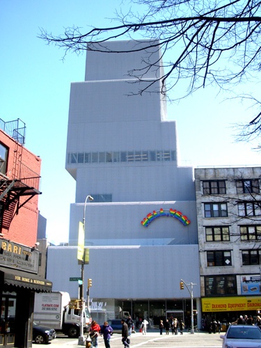
In 2002, the New Museum put out a call for proposals for a new building to be located at 235 Bowery (at Prince Street between Stanton and Rivington Streets, one and a half blocks south of Houston). There were also projects for new branches of the Guggenheim Museum and the Whitney Museum to be located on the waterfront near Chelsea and in the Meatpacking District. Of these only the New Museum has come to fruition.
On a recent Saturday morning I walked from Grammercy Park to the Bowery. It was good exercise as well as a chance to get a true sense of the changes in the area of New York which was its notorious Skid Row. In the inexorable changes forced by economic development the formerly unsavory real estate is now poised for upscale renovation. Surely the New Museum will prove to be a matrix on the Bowery just as it was formerly in Soho. By relocating before the boom surely they had the best price advantage in purchasing a suitable property which actually appears to be a relatively small plot hemmed in by undistinguished, low rise, commercial buildings. Mostly these venues are purveyors of wholesale restaurant equipment. But can Starbucks be far behind?
The degree to which I found the building brutal, ugly, disagreeable and the inaugural series of exhibitions of little interest or significance is, arguably, a measure of its success. After all, this is the New Museum, and what do I know, one is Not Supposed to like it. That would be just so bourgeois. And while finding little pleasure in the prospect I am committed to make obligatory visits in the future. I regard these as the necessary exercises in self abuse that entail keeping up with what is fresh and provocative. But that doesn't mean we have to enjoy the experience. The prevailing curatorial and aesthetic position of the New Museum, in the spirit of its remarkable founder, is "here, look at this, it's good for you." Oh well.
Perhaps I am unique in being underwhelmed by the building designed by Kazuyo Sejima & Ryue Nishizawa/ SANAA. On top of a glass fronted, street level lobby with an inviting transparency to street traffic, there are six, uneven scaled and staggered boxes, sheathed in a creamy, textured metal skin for the most part opaque and windowless. The arrangement of the cubes, with three levels for galleries, is entirely devoid of any subtlety or grace of movement. It just resembles a clunky stack of boxes. The outer skin makes one think of tarps left over from construction that may eventually be removed to reveal a more attractive outer veneer. But not. Seen in the context of its neighborhood, however, it is already a landmark, logo, and signifier of dramatic change. All of which is positive and may indeed work well for the mandate and growth of the museum.
But the brutal boxiness of the exterior is even more disastrous from the inside. From the lobby elevators one emerges, from floor to floor, through one generic white box to another. They vary only in details of scale and egress. One may avoid the snail paced elevators by finding the cramped back stairs which seem more like an afterthought and concession to fire codes than a suitable way of conducting visitors fluidly through the galleries. This disjunction further exacerbates the discontinuity of the series of exhibitions which were intended to be thematically interconnected.
While the overall massing and design of the structure offers lip service to progressive and even avant-garde design the notion of delivering generic white boxes as galleries is all too enervating and familiar. It vividly reminded me of my initial reaction to the pathetic, big box designed by Graham Gund for the new addition to the Harrison and Abramovitz Rose Art Museum of Brandeis University. It is precisely the breaking up of internal spaces that prove to be so refreshing when visiting the Guggenheim Bilbao designed by Frank Gehry.
Of course the generic white cube levels the playing field for curators. There is a kind of one size fits all potential for installing exhibitions in these modular spaces. Unlike the dramatic spiral of the Guggenheim of Frank Lloyd Wright, for example, there is nothing to struggle and cope with in creating an installation. Of course, it is precisely how an artist and curators wrestle with demanding spaces such as the Guggenheims in New York and Bilbao that makes an exhibition particularly dramatic and triumphant. The Robert Wilson design for the controversial Armani show at the New York Guggenheim is a prime example of an exhibition which used an impossible space to best advantage. Compared to which, shows in the New Museum will be predictable and ok to the extent of being humdrum.
The only element that distracted me from restful slumber during this first tour of exhibitions at the New Museum was the process of keeping cognizant of just how boring and predictable the work proved to be. It is similar to the experience of sitting through a mediocre movie compared to a really bad film. There is a certain vicarious pleasure in enduring a truly awful aesthetic experience. The Boy Scouts should award merit badges for surviving such adventures.
The obvious caveat here is that New Museum exhibitions are intended to be bad, or at least offensive. It is embedded in the mission statement and hence this was perfectly acceptable and only served to prove how conservative and narrow minded I have become in my now critical dotage.
The four part sections were organized by Richard Flood, Laura Hoptman, and Massimiliano Gioni of the museum's staff. The projects opened in segments starting with its primary focus "The Object in the 21st Century" in December. It comprises freestanding assemblages by 30 artists. It was followed by "Collage: The Unmonumental Picture" with enormous, sprawling wall works by 11 artists as backdrops to the Objects. That opened on January 16. The third and fourth elements "The Sound of Things: Unmonumental Audio" and "Montage: Unmonumental Online" opened in mid-February. I visited during the final weekend at the end of March.
In the disorderly clutter of so much recycled trash as ersatz neo dada "objects" and assemblages it was difficult to focus on specific elements. We encountered the dysfunctional progeny of Marcel Duchamp, who, by comparison was remarkably droll and understated. These installations comprised an orphanage or asylum of his seminal and far reaching influence. In a different context there was much in this mumbo jumbo mélange that deserved more careful consideration. There were a number of artists represented whose work I have absorbed under better circumstances. Was that really a Sarah Lucas? No better or wore than her usual self absorbed, junky dribbles. And the enormous wall of collages by Thomas Hirshorn, whom I found so fascinating in an earlier ICA Boston installation, just got subsumed as a part of the visual noise and clatter.
Regarding the curatorial "vision" yeah, the kids are alright, but it takes experience and maturity to edit and clarify all of those raw nerves, hormones and impulses. It is the challenge of curators and museums to digest and absorb work and not just fling it in our face. There, take that. Can you feel my pain? I dare you, no, I double dare you.
Well I got that off my chest. But, heck, this is, after all, the New Museum. So what did you expect? Chopped liver?


