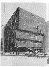
Whitney Museum: Limits of Iconic Architecture
Buildings As Unique Sculpture Stifle Institutional Expansion
By: Mark Favermann - May 16, 2011
To many architects, their buildings are functioning pieces of sculpture. Architecture as art. At their creative best, they hope to design icons. This is design alchemy creating gold from steel, glass and contemporary building materials.
A building or structure can be considered an icon when its image is larger than its physical self. In our mind's eye, we easily conjure up the White House, the Eiffel Tower and the Golden Gate Bridge. All are icons. Architectural icons are usually embraced or vilified by the public. They are never neutral.
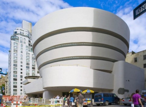
Architect Frank Gehry created an instant icon in his 1997 Bilboa Guggenheim Museum. This was a visual counterpoint to Frank Lloyd Wright's 1959 iconic original Guggenhiem Museum on New York's 5th Avenue. All iconic structures go beyond their mere use and their location to exhibit a metaphorical presence, a sense of place, as well as symbolic visual statement full of magical meaning and wonder.
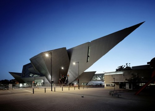
Frank Gehry's success has encouraged other prominent designers to attempt to create their own iconic structures. Somehow, with Bilbao, Gehry made it look easy. Unfortunately, other architects are not as gifted or successful. Also not all attempts at icon creation are brilliantly resolved. Often sculptural forms are only that.
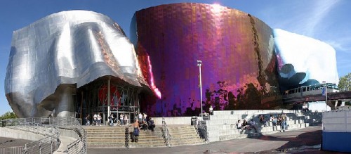
Even Gehry has not got the gold ring each time. A case in point is his Music Experience Project and the Science Fiction Hall of Fame in Seattle. It contradicts the notion that "if you build it, they will come." So far, they haven't.
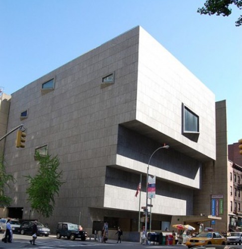
Encouraged by cities, institutions and corporate entities, in recent years, designers have attempted to create icons to enhance image and to underscore commerce, tourism and civic pride. The Whitney Museum of American Art had the former Bauhaus architect Marcel Breuer design their museum building as a distinctive structure. Though iconic, the unique, complete design in itself created problems for the future expansion of the museum. This was natural for him, as much of Breuer's furniture, especially the low-slung chrome and leather Wassily Chair, were iconic as well.
For years, the fate of the Whitney Museum on Madison Avenue has been uncertain. This got cleared up quite a bit last week when Director Thomas Campbell of the Metropolitan Museum of New York and The Whitney Museum of American Art’s Director Adam Weinberg jointly announced the outline of a deal for the Met “to lease” the Whitney for 8 years with an option to extend starting in 2015.
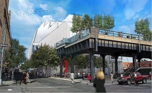
Additionally last year, the Whitney sold eight nearby buildings along Madison Avenue. All of this is in the context of the nearly $750 million new Whitney downtown building in the Meatpacking District (aka Chelsea extended) adjacent to the High Line. The project will break ground May 24.
It seems that the landlocked Met needs space to exhibit its now mostly cloistered Modern and Contemporary art holdings as well. Is the deal actually lease-to-buy? The Met arrangement will certainly be helpful to the paying for the Whitney’s new Renzo Piano designed museum that is scheduled to open in 2015.
Though the lease agreement was negotiated swiftly, the Whitney and the Met had been in talks for over a year. The agreement comes one day after the Museum of Modern Art agreed to purchase the American Folk Art Museum's building nearby on W53rd Street.
Due to the terms of a $131 million gift by chairman emeritus, Leonard Lauder, the Whitney can not sell its uptown building to help finance the downtown space. Now the income from the lease of the building at Madison Avenue and 75th Street will help the Whitney with its financial obligations.
"Throughout our planning for the Whitney's new building downtown we have committed ourselves to finding a distinguished museum partner for the Breuer building in keeping with its iconic stature," Director Adam Weinberg. "The Met is ideal in so many ways." The two museums plan to collaborate on collection-sharing as well.
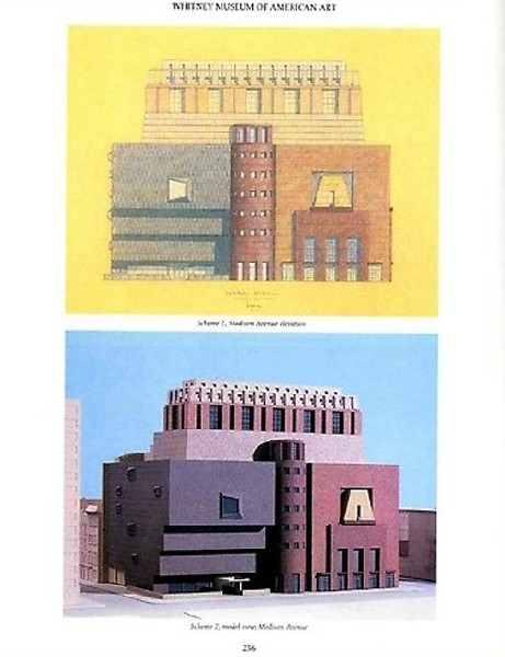
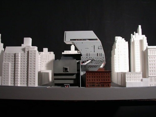
The Whitney Museum of American Art has had on-again, off-again expansion plans over the past three decades. During that period, the museum has gone through four directors and has had three star architects make proposals for its expansion. For various reasons, all were totally rejected.
Perhaps the worst proposal was the first one, a 1985 design by Michael Graves. This concept literally wrapped existing building in a collage of the architect's Post-Modern pseudoclassical references. His visual language would all but obscure Breuer's work. Almost fifteen years later, a structurally aggressive proposal by architect Rem Koolhaas was rejected due to Post-9/11 economic uncertainties and the design's overwhelming inappropriateness for the site.
Though more conservative, the third proposal, an adjacent skyscraper by Renzo Piano seemed to the neighborhood too large and non-contextural. In truth, none of the proposed designs seemed to work visually. This is mainly because the Whitney is an iconic building.
But the problem is designing to adapt and to expand an iconographic structure. Breuer's Whitney is fully whole unto itself. It is distinctively and compactly visually organized. His visual language is non-expansive or non-adaptable. And thus, three prominent architects' proposals could not get it right.
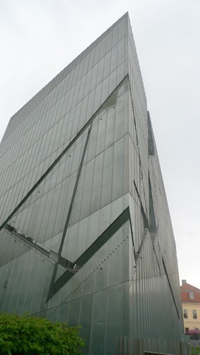
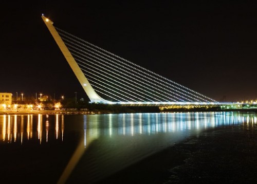
Other prominent architect's wrestle with icon creation. This easiest are done on a university campus or for a museum. Daniel Libeskind's first major commission may be his best, Berlin's Jewish Museum. This deconstructivist edifice is iconic. Most of his successive projects (primarily museums) are just sculptural. Similarly the Spanish architect/engineer/sculptor Santiago Calatrava's works are often more sculpture than functioning. His bridges and transportation hubs are all elegant forms. His Ground Zero Transportation Center should open sometime in 2012.
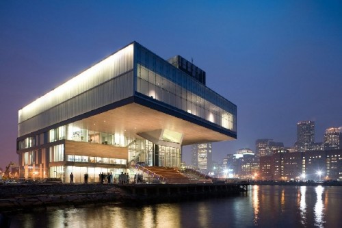
Diller Scofidio+Renfro's Institute of Contemporary Art in Boston is similar to the Whitney in that it is whole into itself. The cantilevered museum is a sculptured form on the edge of the harbor. Unfortunately, the structure turns its back on the City of Boston. There is no room or potential connected form that can enlarge the museum. Expansion to the ICA can only occur with an additional nearby or underground building.
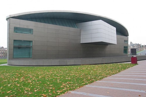
Amsterdam's Van Gogh Museum Expansion by Kisho Kurokawa in 1999 is an example of parallelism with iconic results. The Expansion Building is certainly visually notable. It is an elegant icon attached by an underground passage to Gerrit Rietveld's last architectural work, the Van Gogh Museum's Entrance Building. It was built in 1973, nine years after the now acclaimed Zig-zag Chair (a furniture icon) architect died. This earlier museum had the appropriate site and access to allow for an iconic companion to be built. The Whitney's failed past attempts had neither of these factors going for them.
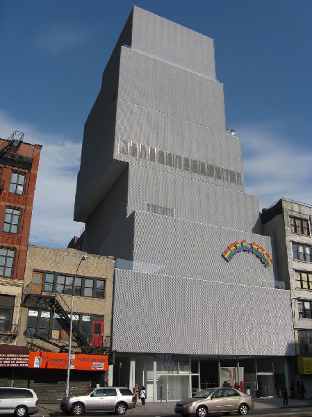
The New Museum for Contemporary Art was designed by the Japanese architectural team of Kazuyo Sejima and Ryue Nishizawa. Probably relegated to its own footprint and vertical silhouette, the New Museum in NYC's Bowery has its expansion limitations as well. Many feel that its rainbow sign on its front greatly detracts from the edifice. Perhaps, it is only half an icon?
The new Whitney Museum will be a larger space with plenty of room to grow. We will have to wait to see until 2015 if Renzo Piano has created a beautiful and functional museum or only a 21st Century icon. And it looks like The Met will eventually own Marcel Breuer's 75th Street iconic structure as a satellite museum for its Contemporary and Modern collections. Will wonders never cease?

