ICA to Expand
Lucky Break After Poor Initial Design Issues
By: Charles Giuliano - May 19, 2015
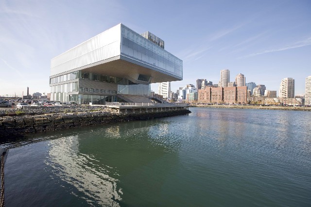
After decades of musical chairs with inadequate structures and locations there was short lived celebration nine years ago when the Institute of Contemporary Art relocated to the Boston waterfront in a dramatic building designed by Diller, Scofidio + Renfro.
Jill Medvedow accomplished what directors David Ross and Mielna Kalinovska had failed to do. At long last the ICA had a permanent home.
Initially, the new ICA was surrounded by vast empty parking lots. It wasn’t immediately obvious that for its prime location the museum had gambled on a small plot with no possibility of room to expand.
Not only did the award winning building occupy ever square foot of its property but, for the sake of design and visual impact, the architects squandered potentially functional space with impunity.
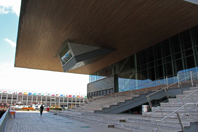
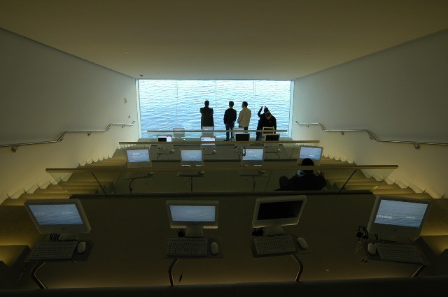
From the side view there is a gaping, empty, jaw like space. On the outside, during warm weather months, it provides stadium seating and a broad terrace. Above it is a downward sloping media room with theatre-like rows of desks with computers. One looks down toward a bottom revealing a glass wall/ window with a view of water.
In all of our visits the space has lacked visitors. What may have been a cool idea at the time has proven to be an utter failure.
Entering the ground floor of the structure there is an overly generous, empty lobby. It may well be full during an opening celebration. At the side is the reception desk. Behind it at a lower level is an unenticing book store. It takes a conscious effort to enter a retail space which should be more inviting.
Behind the large glass elevator, oddly one of then most engaging details of the building, is a too small and far too expensive café. It’s above most folks' pay grade to grab a snack or enjoy comfort food. Even when you sit down it takes forever to get your meal.
The point of a museum is its exhibitions. In the 65,000-square-foot building only 17,000 square feet represents galleries. The old ICA had about 6,000 square feet of exhibition space so the waterfront incarnation has about three times that.
Nine years ago that seemed like a significant improvement but almost a decade later it is proving to be inadequate. Part of the issue is that the ICA redefined itself and evolved from a kunsthalle to a museum with a commitment to develop a permanent collection.
Since the ICA didn’t collect, and for the most part the Museum of Fine Arts didn’t give a damn until 1971, Boston missed the boat on modern and contemporary art. Of the major American cities it has the worst reputation in this area. To be sure the ICA mounted great exhibitions over the years but didn’t retain an increment of that rich legacy.
Now that it has a collection, which is painfully obvious in its infancy, there is the question to where to put and store it. What is currently on display, for the most part, is marginal.
In this landlocked jewel box design the larger question moving forward is where to store what is acquired. Contemporary work is generally large in scale and with precious real estate this is a daunting issue.
In addition to building and paying for the new ICA it would have made sense, while still available, to purchase nearby, affordable loft/factory space for expanded exhibitions and storage. In LA the Temporary Contemporary eventually was upgraded as the Geffen Museum.
Given the current building boom that kind of cheap warehouse space is fast approaching the romantic notion of another bygone era.
Revisiting the waterfront the modestly/ inadequately scaled ICA is being dwarfed by an ever more dense cluster of high rise buildings with many providing luxury housing. The same is true for the SOWA gallery district in the South End.
On the upside this dramatic growth of luxury inner city housing and office development is providing an increased critical mass of audience for contemporary galleries and museum programming.
Even though Medvedow accomplished the seemingly impossible it was a critical mistake that the design she checked off on allowed for no expansion slots. She should have insisted on a design that allowed for vertical growth. The proportion and scale of the current structure does not provide that possibility.
It should have been obvious that there would be a need to double the overall scale from the initial 65,000 square feet within a decade or two.
Perhaps years from now the ICA will face selling its building and relocating. This is precisely what has now happened for the Whitney Museum which has relocated from its Marcel Breuer building on Madison Avenue to a vast new space near the High Line.
This is precisely the forward thinking that Medvedow and the ICA trustees never addressed.
Frankly, not even a decade later, the thrill is gone when visiting the ICA. That dramatic design, a logo for progress and change, has now gotten pretty old. The flaws are ever more glaring. Too often what’s on view is just not worth the effort to get there by public transportation from South Station or to pay through the nose for parking,
The old ICA on Boylston Street, while inadequate, was easy to get to and inviting for frequent visiting. Now there is the feeling that one may skip the ICA with impunity. Bothering to visit too often feels like you are doing them a favor with its enervating mix of a tepid permanent collection and academic, theory driven, special exhibitions.
Of course that’s true for most contemporary art. The ICA just doesn’t have sufficient critical mass on view to find something to like.
Now, thanks to its lucky stars, the ICA plans to take up a couple of floors in the high rise being constructed next to it. A 17-story adjacent tower is being developed by the Fallon Co. It will likely be linked to the ICA by a sky bridge. The expansion would increase the museum’s usable footprint by 19,000 square feet. It will be relatively cheap at $10 to $12 million.
The spoiler is that it will only increase the museum from 65,000 to some 84,000 square feet. Long term that’s just not adequate.
In hindsight the no brainer is why the ICA didn’t plan to build with options to develop vertically. The building which opened nine years ago might have been phase one for later expansion.
It is a miracle that they will now have those two additional floors right next door. It is just a temporary fix for flawed design decisions that will haunt the ICA for generations to come. If, that is, they opt to stay put.


