The Elegant Sculptured Door Knocker
Minimalist Functional Design
By: Mark Favermann - Jun 07, 2011
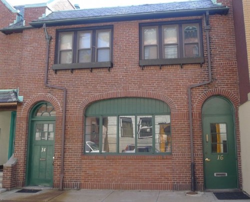
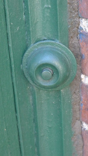
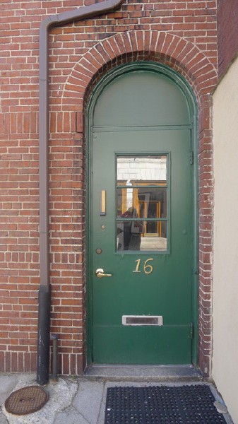
This past winter was quite cold and stormy. Ice and snow punctuated a grey sky almost every week. First time deliveries and visitors were often delayed by the nonfunctioning bell on the right of my carriage house. It has not worked in at least three decades. The wiring was disconnected. So individuals trying to get the attention of the building's inhabitants often waited in the bitter freeze or rain soaking in front of the facade. I needed to make the entrance more acoustically accessible. The door needed a clapper, a door knocker.
Like Fenway Park, I thought that my carriage house was built in 1912. But when I looked up my tax bill, I discovered that it was actually built in 1897. Set on a short deadend street off of Beacon Street, the two story brick structure is near the old ballpark and close to the City of Boston and Town of Brookline border. On the second floor is an apartment that is rented out to students.
I live and work on the first floor where my living area is integrated with my design/art studio space. It is somewhat like an elongated loft. Friends claim that I have a zero (0) carbon footprint. The finished, dry basement spaces are divided into storage and workshop areas.
The architectural historian Douglass Shand Tucci (Built in Boston, 1800-2000) once visited the building and said that the turntable visible in the ceiling of the basement was only the second turntable that he thinks still exists in a carriage house in the City of Boston. This rather unique structure has served well over the years as a creative environment.
Though the carriage house is a utilitarian building with little or no architectural flourish or prominent details, it does have a bit of character. There is a large window in the front that is book-ended by the two doors leading on the left upstairs to the apartment and to the right into the design/art studio and my living space. A row of windows underscores the second floor. a bit of copper sheathing outlines the shingled roof.
The appropriate piece of exterior hardware had "to fit." Finding the right hardware element would be a task of reviewing the hardware market and balancing what was actually available with my aesthetics. This would not be simple. Therefore, the object quest for the ultimate door knocker would not necessarily be an easy or short task.
The object quest started out informally. Visits to suburban neighborhood hardware stores over several weeks came up with nothing usable. Available door knockers were either too traditional, too ugly or too ornamental. Home Depot and Lowe's were of no use either, either online or at the stores. Each store only offered clunky inappropriate elements.
The object quest's excitement for me was not only the treasure hunt and goal to obtain it, but the literal formulation of what the object could actually be and would look like. Unless the exact object is known beforehand, then finding the piece also helps "design" the element with combining what one desires with what one can obtain.
In other words, with my personal minimalist and very sculptural aesthetic, I would know it when I see it. The element would have to be elegant in form while enhancing its functionality. Thus, the hunt was for a door knocker that echoed the old chestnut form follows function. Somehow it had to integrate with the existing door and its rather basic hardware details as well.
To expand the search, I went on my computer and Googled contemporary "door knocker." After literally hours of searching over several evenings, one was found. It was discovered at an online design and furniture boutique with a mailing address in Brooklyn, NY. named DESU DESIGN. It seemed like just the right vendor. I placed the order online and received the object about a week later.
Besides its many beautifully designed objects and pieces of furniture, DESU DESIGN even has a mission statement. "At DESU DESIGN, we strive to make innovative products that blur the boundary between art and design. Our goal is to create pieces of lasting quality, retaining their beauty and functionality for generations. We utilize the precision of modern manufacturing methods with the unmatched skills of the human hand. Inspiration comes from forms found in nature, the history of modern design, and the combined beauty of geometry and the machine."
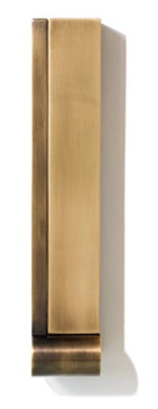
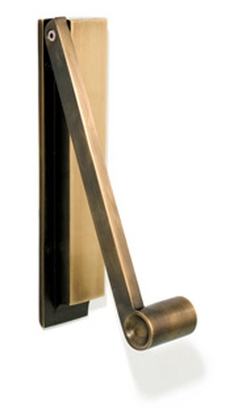
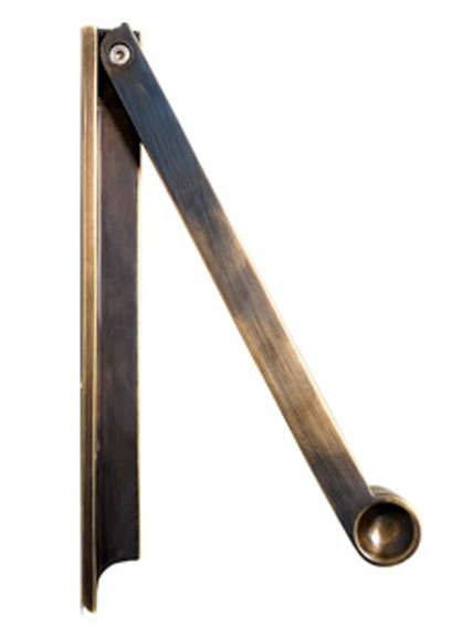
DESU DESIGN is a 21st Century paradigm: online, high quality, high aesthetic with no retail store as place only a virtual location. However, their mission and philosophy is steeped in the history and even textures of modern design. Their door knocker, The Pendulum, is a small sculptural design masterpiece.
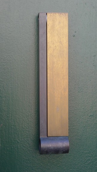
The Pendulum is a bronze door knocker that combines old world craftsmanship and unadorned utility to create a minimalist sculpture. The weight of the handle feels right in your hand. It has slightly recessed sides to intuitively grasp. The bronze is a living finish patina that will naturally wear and color according to use and the environment. Its dimensions are 1.50" x 2.00" x 10.00".
This door knocker is a wonderful minimalist design object. Minimalism is much more than Mies van der Rohe's Less is More. The element is reduced to its necessary basics that in turn create an extreme simplicity that results in multiple visual and functional purposes. The best minimalism designs visually and materially suggest less to do more elegantly and efficiently.
Minimalist design has been highly influenced by the elegance of traditional Japanese design and architecture. In addition, the work of De Stijl (Dutch for The Style) artists is a major source of reference. De Stijl expanded the ideas both in two dimensions and three dimensions that could be expressed by using basic elements such as lines and planes all organized in very particular ways.
Buckminster Fuller adopted the engineer's goal of "Doing more with less", but his typical concerns were oriented towards technology and engineering rather than aesthetics. Industrial designer Dieter Rams said, "Less but better." This was adapted from Mies van der Rohe's "Less is More" dictum. Wags like know-it-all writer Tom Wolfe have added "Less is a Bore," but I don't agree.
The minimalist design credo includes that the structure uses relatively simple elegant designs. Any ornamentation is quite simple (think Shaker) and of high quality rather than quantity. Basic geometry creates the outlines, and design unity is developed by using only a single shape or a small number of like shapes.
Objects and structures can be enhanced by tasteful bright color combinations usually with natural textures and colors or by clean and refined industrial finishes and patinas. Surely, the Pendulum Door Knocker exhibits these aesthetic and functional traits. Most strangers and friends admire it, and I love it.
Knock, knock...

