Jim Hodges at the ICA
Summer in the City
By: Charles Giuliano - Jul 23, 2014
Arriving at the ICA mid afternoon on a summer Thursday there were more guards than visitors as we toured the special exhibition Jim Hodges: Give More Than You Take. It remains on view through September 1.
Co-organized by the Walker Art Center, Minneapolis and the Dallas Museum of Art, it is coordinated for the ICA by Anna Stothart, Assistant Curator.
As former Boston Phoenix critic, Greg Cook reported for WBUR “The exhibition is part of what’s emerged as the ICA’s central focus on queer artists—Nick Cave, Amy Sillman, Steve Locke, Mickalene Thomas, Isaac Julien, Roni Horn, Mark Bradford, Felix Gonzalez-Torres, and the major survey of 1980s art 'This Will Have Been,' organized by head curator Helen Molesworth, who is scheduled to leave to become head curator at Los Angeles’ Museum of Contemporary Art this September.”
Hodges was born in Spokane, Wash., in 1957. He came to New York in the 1980s and studied painting at the Pratt Institute. Like other gay artists of his generation Hodges was impacted by the loss of many friends through AIDS. There was a particular visual arts aesthetic which grew out of this devastating sense of loss.
The ephemeral, conceptual work of Felix Gonzalez-Torres (November 26, 1957 – January 9, 1996) a friend and colleague of Hodges has defined that development. We viewed his posthumous installation in the American Pavilion of the 2007 Venice Biennale. Like many artists in this genre the work of Hodges is influenced by but less insightful than that of Gonzalez-Torres.
In an overview of these artists Sebastian Smee in the Boston Globe stated that they were “…cultivating an aesthetic, influenced by minimalism and conceptualism, that was poetically restrained, valedictory, and preoccupied with the idea of “the overlooked.”
Several reviews by Boston critics, including Smee’s were dismissive. But he appears to be onto something however unsympathetic.
“Some of these artists — they were and still are legion — are very good. They endow banal subject matter with a kind of spiritual adhesiveness, roping it into wondrous new forms, occasionally injecting it with a cool shot of ruthless intelligence.
“But the aesthetic — call it the Mournful Mundane, the Indeterminate Elegiac, or Catharsis in the Corner — is by now a kind of official taste. It is sought out by sighing, self-satisfied collectors, and nurtured by institutional support so entrenched it is beginning to resemble, well, a lack of imagination.”
My responses were more benign. Compared to most ICA shows we have seen I found this engaging in its eclectic invention and lightness of being. On a bright summer’s day it was appropriate that there was no heavy lifting although daunting sentiments and issues were embedded in the approach to using “feminine” skills such as sewing or assemblages of cut out flowers and even Shalimar perfume to evoke memories of the artist’s mother.
My primary objection to the exhibition was that, yet again, there was considerable effort to reach the isolated ICA on the slowly populating waterfront. We came by Silverline bus from South Station as it is so expensive to park a car. Then there was not much to see once we arrived.
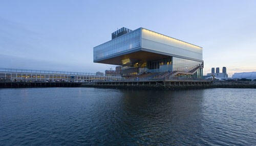
With just the top floor for exhibitions, now roughly divided by half with a yet to be interesting permanent collection, the ICA’s “Award winning” design and restricted footprint leaves it no possible expansion slots. There is no where to go either up or out.
After decades of dealing with inadequate space it was widely celebrated as a triumph when ICA director Jill Medvedow secured a permanent home on the waterfront.
As the official PR of the ICA puts it “Award-winning architects Diller Scofidio + Renfro designed the ICA, conceiving the building both ‘from the sky down,’ as a contemplative space for experiencing contemporary art, and ‘from the ground up,’ providing dynamic areas for public enjoyment. The design weaves together interior and exterior space, producing shifting perspectives of the waterfront throughout the museum's galleries and public spaces.”
From the beginning conceived as a kunsthalle or exhibition space with this move the ICA started a collection. Considering that the MFA did little or nothing about contemporary art until after 1971, and then with mixed results, getting a pony in the chase so late is just tragic.
If you tour NY galleries or make the rounds of art fairs and biennials the conventional wisdom is that this is not an advantageous era to start a collection. Compare the ICA to the Rose Art Museum of Brandeis University. With about $50,000 in seed money the founding director, Sam Hunter, purchased about 25 works in 1963. Some of those initial works are now worth in the millions.
From what’s on view currently at the ICA it is doubtful that lightning will strike twice.
Then, considering how boxed in the ICA is, as the collection expands in coming decades, where will they put the stuff? Off site storage seems inevitable and when will they jump ship for affordable warehouse space like Mass MoCA’s.
Given the current boom in Boston real estate that may already be too late. Even the long moribund waterfront is starting to fill in. Those vast parking lots are morphing into luxury high-rise condos. How long will it be before the ICA, now strikingly visible, is boxed in by a canyon of surrounding skyscrapers?
The severely limited exhibition space also means that it is becoming difficult for the ICA to attract and retain top curatorial talent like the widely renowned Molesworth. The only option appears to be recruiting young and ambitious curators as an interval before better opportunities. That may result in edgy programming but the responses of established critics, as quoted above, are increasingly annoyed and skeptical.
That, however, may have less to do with the ICA than the general state of contemporary art. The current generation of curators, emerging from theory driven graduate programs, have a narrow focus on social and political issues primarily based on gender/ sexuality, race, identity and globalization.
Many ask what happened to art? As in ars gratia artis!
Well, for that we have Jamie Wyeth currently at the MFA. It is after all contemporary art since the artist is more or less alive although his family derived approach is rooted in another century.
There is a lot of great art being created as we speak. But the cabal of ambitious critics is not interested in showing it. Even though the shows they mount may bomb with the public they get cred with their peers by having the guts to show it.
Or something like that.
As I said, however, for the most part the Hodges exhibition was pleasant.
After school, like so many, he stopped painting. Some schools, the hipper ones, have been phasing manual skill, painting, drawing, print making, sculpting in clay and plaster, out of their curriculum.
Institutions that stick to basics are viewed as reactionary.
But for artists like Hodges this is a huge challenge and dilemma. In the tradition of Duchamp it is all about coming up with simple and clever ideas.
There is a lot of that in this exhibition. The individual works, with everything looking very different, don’t always work. Even if they have a marginal impact the watchful and clever critics, often a step ahead of or several behind the artists, tend to point out the unflattering provenance of ideas.
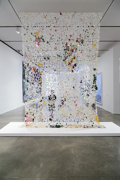
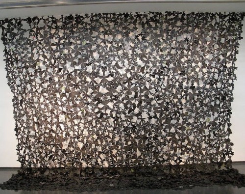
The cutout flower curtains of Hodges, for example, while pretty and attractive too readily recall the signature beaded curtains of Gonzalez-Torres.
Entering a small specially created room “the dark gate” I wondered about the rustic wood materials of the door. One enters a dimly lit room. This has become a cliché of contemporary art. It is the equivalent of gothic stories that begin with “It was a dark and windy night.” That’s an idea that dates to “Wuthering Heights” and the Lake Poets.
Facing me was a circle of sharp, knife like flat surfaces surrounding an empty space. Because of the darkness there were tricks of depth perception. Was there a wall or void behind the circle? Previously I had poked my hand into a similar James Turrell installation. So I expected to find a deep void.
Out of nowhere I found a voice telling me not to do that. Only then did I discover the guard who explained that the triangular metal forms were sharp and there was the risk of injury.
Sorry, my bad.
Only later did I learn that each day the tips of these shards are enhanced with drops of Shalimar perfume. It was the favorite scent of the artist's mother. My sense of smell is not that acute. Then I walked around to the back of the circle and found another guard in a room with dim shadows forming a knife edged shape.
If that threating room, with its quite literal vagina dentata, references his mother then one would have to see a shrink to figure that out. Being a critic is tough enough without springing for psychotherapy.
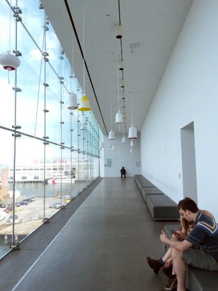
In a room of video monitors slanting down to a window with a view of water (a wasted design conceit) we learned more about the artist and his work.
Some faintly drawn concentric circles on the walls related to the artist and his lover. It is how they overlap. It takes several days for volunteers to install this work at each venue. They are instructed to think of love while performing the task. Oh my. This was inspired by lines on walls by which the growth of children is measured by their parents.
Neat. But from a visual point of view just how is this different from the wall drawings of Sol LeWitt?
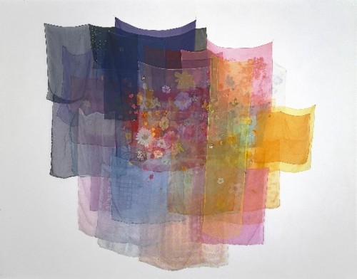
The idea of sewing and delicate fabrics, inspired by his mother and exploring the feminine side, was engaging. The assemblages of scarves were ephemeral but simple and engaging.
The most ambitious piece, a mural scaled treatment of a turbulent cloudy sky “Untitled (one day it all comes true)” (2013) was really terrific. Of course cloud studies in art date back to romanticism and the British landscape painter John Constable.
But here’s the fun part. The Hodges work has been created by cutting and stitching denim from thrift store blue jeans. It comes in a range from blues to white that equate to this tapestry like piece. Working with stitchers this appears to be a labor of love.
As with Duchamp the success of a piece, particularly his found objects, readymades and assisted readymades is dependent upon simplicity, economy of means, and intuitive cleverness.
In this sense “Deformed” (1989) a splayed out, tattered Bonwit Teller shopping bag pinned to the wall worked for me. The best works always come with the tag line “Why didn’t I think of that?”
The piece was of particular interest as I was working on curating a Bag Art show for Suffolk University. I just ran out of time but had already identified three terrific artists working with that idea: Matuschka, who later published a book about her recycled shopping bags, Peter Jemison, a Seneca artist, and Mitsu a young Japanese artist. This piece by Hodges would have been a perfect fit for the unrealized project. Surely further research would unearth more artists for what could be a terrific show.
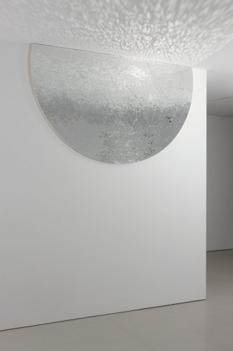
We considered other ideas in the Hodges show like grids of different light bulbs in programmed sequences. There were works entailing aspects of mirrors as tesserae or smashed. Again there are a lot of artists working with these ideas.
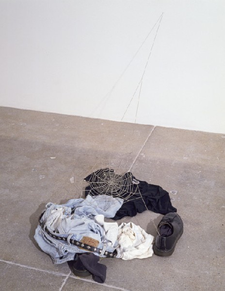
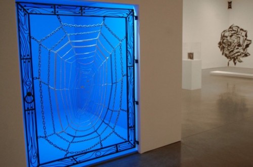
The nested shirts within shirts was interesting. Or the clothing dropped on the floor with a spider’s web. You glance at them then have to put on a thinking cap to figure out what its about. That’s what they do for hours in grad school crits. It's how they teach kids to do this stuff.
Hopefully they eventually get to pay off their student loans. Consider that art school costs as much as med school, law school, or earning an MBA. With slim hope of earning a living making art.
That’s another story.
It was about 5 PM when he left the ICA surprised to find a packed lobby. It was free night.
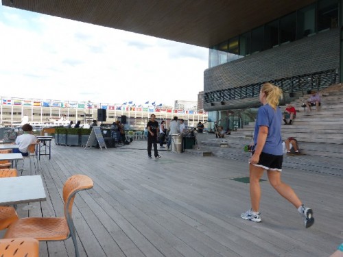
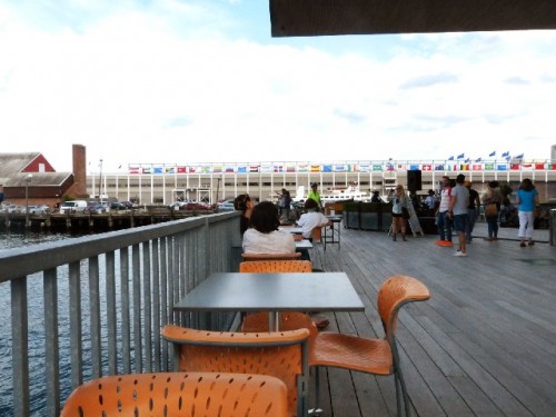
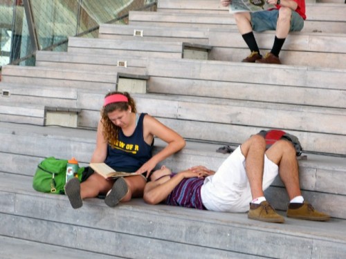
Out on the deck facing the waterfront under that waste of space overhang there was a jazz band playing for free. We grabbed drinks and enjoyed the waterfront view. Gradually the steps of the outdoor stadium filled up.
At the next table we chatted with a couple from Paris.
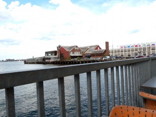
We looked across at an angle toward the long abandoned Anthony’s Pier Four. The structure seems to be crumbling. Back in the day it was a tourist attraction. There is talk that it will be razed and that precious waterfront property converted to a sculpture park.
Walking back to the T we encountered several upscale bistros and bars doing booming business.
The current ICA is a part of this developing mix and ambiance. It works as a precious jewel box.
Not long from now, however, the landlocked and constricted ICA will have no place to run and no place to hide if it hopes to grow and be taken seriously. Until then as the Hodges show underscored it's a one trick pony.


