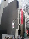
American Folk Art Museum May Close
Architecture, High Debt and Bad Choices Cause Crisis
By: Mark Favermann - Aug 20, 2011
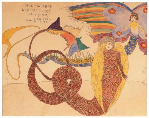
This is a very sad story. New York's American Museum of Folk Art, the premiere museum in the United States for the appreciation of traditional folk art and "outsider" self-taught artists looks like it will close. This is from bad architecture, unwise financial choices, delusions of gradeur and just plain bad luck.
Due to its reach exceeding its grasp and limited popular appeal, the highly focused museum is now after nearly fifty years in negotiations with the Smithsonian Institute in Washington, D.C. to take over its extensive holdings. The American Folk Art Museum just can't afford to keep going.
In an effort to keep part of its wonderful collection (over 5000 paintings, drawings and objects) in New York City, discussions are being held with the Brooklyn Museum, another institution that had fallen on hard times as well and needed severe cutbacks.
The American Folk Art Museum has been involved in financial brinksmanship throughout its half century of existance. Each time previously, it was able to right its ship. However, this time looks like the situation is too dire to continue.
During the heady, can't lose late 1990s, the museum's first major strategic blunder was to join the museum building boom hiring star architects to create an iconic structure. The American Museum of Folk Art chose the sometimes quirky internationally recognized architectural firm of Tod Williams and Billie Tsien Associates to create their edifice. This turned out to be a big mistake.
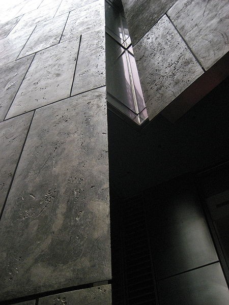
Critics have attributed much of the museum’s troubles to its architecture. Instead of if you build it, they will come. This seems to be a situation of if you build it wrong, they won't come, or at least come back. Starting with a rather funereal and imposing facade, the architects created a structure that felt unwelcoming. To many, the building looked much like a tombstone. The overly subtle building identity signage was not good either. More architect hubris: the building is a sign.
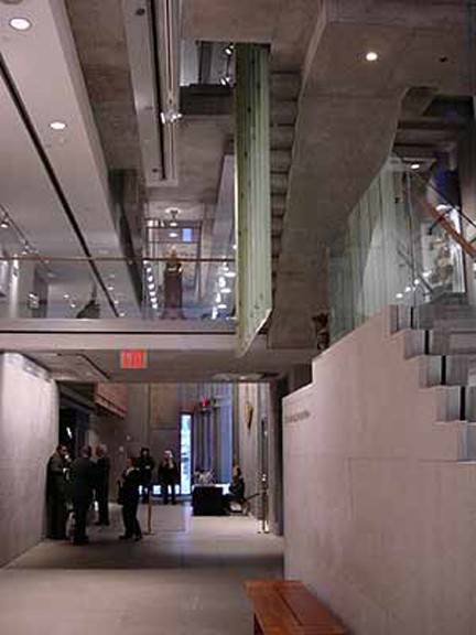
Awkwardly, the problem was even worse on the interior. It did not allow for the display of the art and objects in an appealing or visually compelling manner. Spatially disjointed, this effected the viewing of the exhibits in a unpleasant way. Due to the architects' decisions about the space, the exhibitions often appeared haphazard and disconnected.
Design issues were caused by the quirky use of geometry by design. Confining, odd and unappealing are three of the nicer descriptions. Gallery spaces were often dark, clumsy and claustrophobic. Trying to reflect something they referred to as "domestic scale" of the museum's collection, the designers wanted "to allow" for a personalized art experience. One of the problems was the definition of "personalized." Personalized for whom?
The interior of the space was dominated by ostentatious stairs. The architect's signature interior feature, in varying scales, the stairs resulted in odd small landings and awkward leftover spaces and nooks. The galleries themselves were long and narrow, corridors rather than open viewing spaces. The interior configuration made it almost impossible to view the art comfortably.
The largest stairway, a major cantilevered concrete rather heavy structure, connected all levels of the building. It overwhelmed the museum's interior. Additional staircases provided varied paths of circulation between floors. Stairs and more stairs leading to odd and too small platforms and landings gave visitors difficult and rather odd visual perspectives on the art.
Older and disabled visitors' museum experiences were effected quite negatively by this. Many could not comfortably use the various stairs. Though celebrated in the architectural press and prize-winning when the museum opened in 2001, over a short period of time, this space was shown to not have been a sensitive, clever, or ADA spiritually compliant design. The design flaws became quickly apparent. The museum interior totally failed as a positive and functional space to appropriately show the museum's collection, a major failure of fitness to purpose.
Curatorial attitudes caused problems, too. Perhaps this was a function of the architectural setting? The shows often featured less liked or understood "outsider art" over more well-received functional craft pieces of Americana. Outsider art is somewhat like the olives of the art world. It is an acquired taste. Everyone does not quite like the flavor. Curatorial balance was needed and not always achieved.
All this led to once only visits and nonpositive word of mouth concerning the American Folk Art Museum experience. Museum membership has been limited.
Administratively, the last director of the museum, Maria Anne Conelli, had never run a museum before. She knew nothing about American Folk Art either. It was on the job training at a minefield. It was not a hiring of quality or even thoughtful personnel application, just foolhardy.
It is not surprising that added to this formula for failure, the American Folk Art Museum has never drawn the unrealistic optimistically high estimated crowds it had earlier planned for in the 1990s. There is a narrower appreciation of this art than other broader collections. Therefore, financial support, individual patronage, and corporate sponsorship just never developed at the level required. Underscoring this, the crash of 2008 and the recent stock market roller coaster ride have not helped.
In a more generous and enlightened era, the City of New York set up the Trust for Cultural Resources, a public corporation that helps major cultural institutions borrow money for capital projects. In order to pay for its new bulding, the American Folk Art Museum borrowed $32 million by issuing bonds through the Trust for Cultural Resources.
Over the last several years, ithe Folk Art Museum did not even receive enough support to pay for its bills, specifically its construction loan interest payments to its bond holders. The vagaries of the investment market have not helped. Sorrowfully, the American Folk Art Museum is the first institution that borrowed through the Trust to default on its debt.
The Folk Art Museum building on West 53rd Street was bought last May by the nearby Museum of Modern Art. MoMA paid $31.2 million to get the museum out of debt with its bond holders. It was not enough for the American Folk Art Museum to thrive or even survive. MoMA is now considering an option of tearing down the white elephant building.
In July, the American Folk Art Museum moved to its new space at 2 Lincoln Square, Columbus Avenue at 66th Street several blocks uptown in Manhattan. The 5000 sq ft space is 1/6th the size of its former building. It remains to be seen how temporary this location will be.
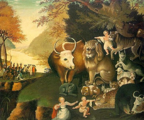
Like a dark cloud, bad luck has followed the American Folk Museum. Potential important individual donors have also let the institution down. A former chairman of the museum, Ralph O. Esmerian, promised to donate his major collection of folk art. Included was a version of Edward Hicks’s “Peaceable Kingdom,,” an iconic piece of American Folk Art.
Esmerian had put the painting up as collateral against money that he owed. After the crash of 2008, he was forced to auction the painting. In July, no longer on the board, Esmerian was sentenced to six years in prison for fraud. Other not so dramatic letdowns have also occurrred for the museum.
Sadly the American Folk Art Museum is a poster child for what can go wrong when a cultural institution's reach exceeds its grasp. Here a building has cost dearly. This situation eerily reflects the tomb-like building structure. It seems to have been an architecture of institutional death.
