
MFA Goes Contemporary
New Linde Wing Abounds in Surprises, Satisfactions
By: David Bonetti - Sep 19, 2011


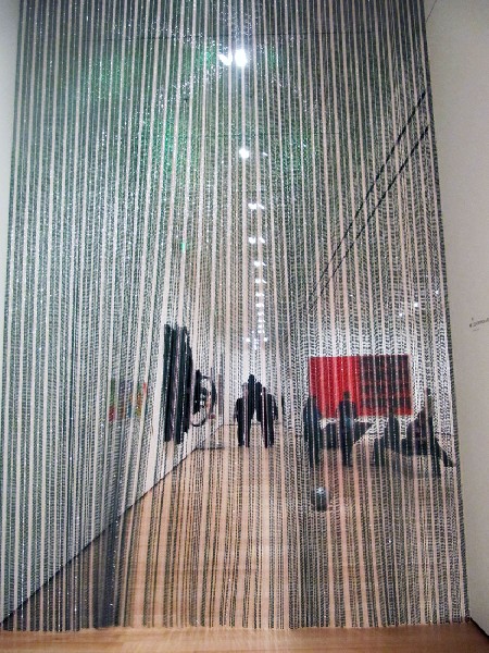

They said it couldn’t be done. They said it wouldn’t be done. But “they,” the naysayers who dominate the Boston art world, were proved wrong. With the opening of the Linde Wing, the repurposed 1980 I.M. Pei addition used primarily for special exhibitions and ancillary functions (bookstore, auditorium, etc.) with a relatively small gallery space for contemporary art, the Museum of Fine Arts demonstrates that it does have a collection of contemporary art worth showing.
And in the inaugural display, filling the 80,000 square foot space with more than 250 works of art in all media made from the early 1900s until today, it also shows that it doesn’t have anything to be ashamed of.
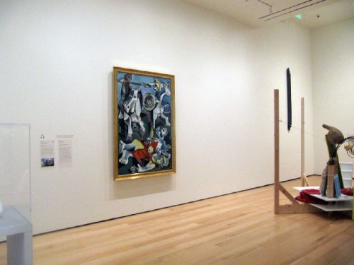
To be sure, there are major gaps in what would be a comprehensive collection of art made internationally during the past 50 years. (And, of course, there are inexplicable inclusions.) Even though the great “Rape of the Sabines,” Pablo Picasso’s angry response to the Cuban Missile Crisis, was purchased in 1964, a year after it was painted, this is still in many ways a new collection, one that has to grow aggressively to fulfill its considerable promise.
But the museum cannot rest now that the Linde Wing has opened. If anything it has to refocus its attention on filling some of those yawning gaps while keeping up with what’s new and arguably hot.
What is surprising, though, is how many good, sometimes great works were acquired during the years the museum seemed indifferent if not hostile toward the art of its own time. Major works by Morris Louis, Andy Warhol, George Segal, Ed Ruscha, Sigmar Polke, Gerhard Richter, Cindy Sherman, Barbara Kruger, Mark Tansey, Kiki Smith and Doug and Mike Starn have been among the works acquired, many when they were still new, that are now on view.
What the curatorial team – topped by Edward Saywell and Jen Mergel and overseen by museum director Malcolm Rogers – did wisely to divert attention from what’s missing was to arrange the seven galleries according to themes that cut across decades and movements to find affinities in work that might not ordinarily be shown together.
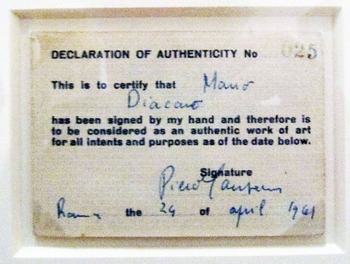
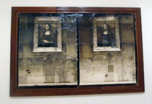
Thus, in the opening Ives Family Gallery, that stentorian anti-war statement by a geriatric Picasso finds company not only with “Lager” (1982), Polke’s searing evocation of a German concentration camp, but with Louis’s Apollonian formalism, Richard Tuttle’s quirky constructivism and the provocative “Certificate of Authenticity” Italian neo-dada artist Piero Manzoni gave local art dealer Mario Diacono after he “signed” him as a work of art.
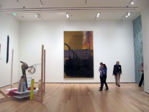
The theme is “Art can be…,” which is so general anything and everything could be shown under its rubric, but because of curatorial fine-tuning, it all works together. And what a witty juxtaposition it is to show Louis’s “unfurled” painting – rivulets of pure pigment poured onto unprimed canvas - next to Lynda Benglis’s frozen flood of molten aluminum apparently pouring out of the wall.
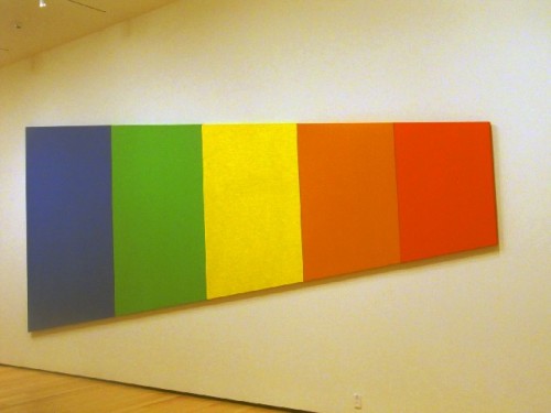
This method works better in some galleries than in others. The most successful is probably the Catherine and Paul Buttenwieser Gallery, the second in the sequence, which is devoted to the proposition “What is it about?” Dominated by the recently acquired Ellsworth Kelly “Blue Green Yellow Orange Red” (1968), it is a serene display of minimalist-oriented work.
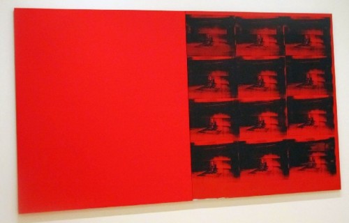
The surprise is that Warhol’s 1963/85 “Red Disaster,” a diptych of two large red canvases, one with a grid of silk-screened electric chairs, fits so comfortably with minimalist artists like Kelly, Tony Smith, Anne Truitt and Roni Horn. Warhol’s subject might be hot but his manner is cool. In the gallery with the Picasso and the Polke, the political content would come to the foreground. Here his formal reserve dominates.
By the way, Kelly’s five-panel spectrum painting, a wonderful play on perspective, each panel diminishing in size from left to right, seems to have lost a panel – where’s the purple? Look to the right. Truitt’s beautiful column work – is it painting or sculpture? - stationed there, shades of purple and lavender, nicely completes it.
By the way II, Kelly is the Linde Wing’s favored artist. Not only has a large recent acquisition been unveiled for the public, but the museum’s first special exhibition in the Henry and Lois Foster Gallery is devoted to his works in wood. To say it is a knock-out is not enough. Elegantly installed, it shows that Kelly, a great colorist, can find color in slabs of wood. A bravura performance.
Other galleries fare less well. The Jeanne and Stokely Towles Gallery, dubbed “Quote? Copy? Update?” should be a high point in the entire installation. It addresses the issue of appropriation, one of the major practices of the past 30 years, and it includes some of the best work in the collection. But it is broken up by a badly positioned wall so that one half of it feels too narrow and tight and the other half opens onto a larger gallery that addresses another theme.
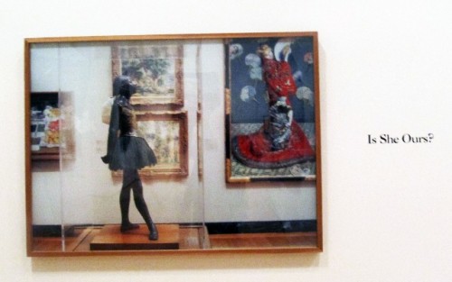
In this gallery Louise Lawler’s “Is She Ours,” a rather obtuse question appended to a photograph of Monet’s “La Japonaise,” is juxtaposed with the original Monet painting, answering, “Yes, she is ours!” (Who else’s is she, Zahi Hawass’s?).
The inclusion of the Monet emphasizes the fact that “All Art Has Been Contemporary,” the installation’s major theme, made explicit in a blue neon work by Italian artist Maurizio Nannucci of the same title and content. But quite frankly, I’d prefer that the space be used for a real work of contemporary art. The Lawler is too jejune to carry the weight of the didactic point.
Although many good works are included, the installation loses its punch in the last two sections. Part of the problem is that the work in these galleries, almost all relatively new, is not of the same high quality as that in the previous galleries. Of course, this is a matter of taste. Contemporary art, despite the curatorial team’s attempts to tame it, remains a contentious area. And that’s why we love it!
But Kara Walker? Please. Is there a more meretricious artist working today? (Well, yes, there are many, but they are not represented at the MFA with the largest work in the installation.) Walker, to put it mildly, has issues – of race and scatology– that should best be discussed with her therapist. For the last 20 years she has been the poster girl for political correctness, but her shrill work fails to address the issues beyond the minstrelsy she aims to critique. Works by Providence-born Ellen Gallagher and Fred Wilson, who deal with the intractable issue of race more subtly and powerfully than Walker, are installed nearby.
Another work that I would never have included in the installation is the painting of bucolic cunnilingus by society girl Cecily Brown. Why the museum ever bought it is a mystery to me. Was the curator at the time unable to read the central subject matter?
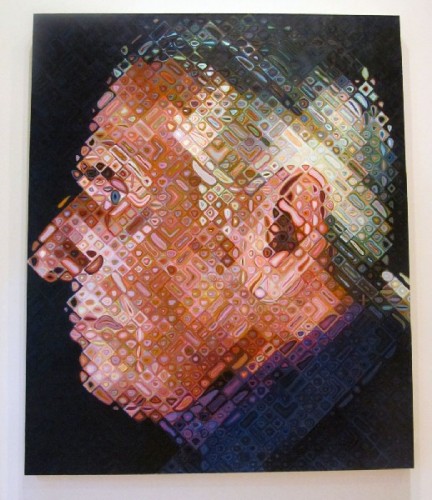
There is also a depressingly mediocre painting by Chuck Close - a portrait of fellow painter Paul Cadmus - whose work can be so vivid. And then there is the wall devoted to the work by Jeffrey Gibson. In a show of student work, it might stand out, but it is outclassed here by nearly everything else.
Happily, the Lizbeth and George Krupp Gallery, the museum’s first gallery dedicated to media art, should prove a hit. The first three videos featured are sufficiently different enough from each other to offer a sampling to an audience that might not be well-versed in the medium.
A second gallery dedicated to a single genre, the Daphne and Peter Farago Gallery, features craft. Occupying the former book/tchotchke shop appended to special exhibitions, the gallery is generously proportioned and includes a wall of windows overlooking the museum’s Japanese garden, which should prove beneficial to craft works that are not damaged by natural light.
The opening exhibition, which highlights the Farago’s private collection, is a mixed bag, as most contemporary craft collections are. And it is claustrophobically installed. There are terrific ceramic pieces by Rudy Autio, Robert Arneson, Betty Woodman and Jun Kaneko, but there are other works, primarily in glass, that strike me as scaling the heights of kitsch. Chacun a son gout.
The major galleries are really only part of the show. The previously long artless walls facing the Eunice and Julian Cohen Galleria now host works based on text, underscoring the enduring power of conceptualism in contemporary art. Inspired by the Jenny Holzer LED work that has long offered a provocative welcome to the Remis Auditorium, the upper galleria is filled with neon and other light works, some engaging, others less so, including works by conceptualism’s daddys Joseph Kosuth and Lawrence Weiner.
One of the best is Wade Aaron’s “Untitled (INTENT),” a work made of incandescent light bulbs arranged in a grid that spell out the title word. As the lights burn out over the next two years, the nature and the appearance of the piece will radically change. Call it an essay in entropy. As of Sunday afternoon, one bulb was already dead.
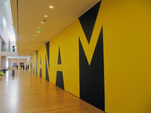
At the ground level, word artist Kay Rosen created an l20-foot long wall mural titled “Manana Man.” I don’t know what relevance that text has for the museum, but Rosen has made a punchy yellow and black graphic that should serve well those sipping wine at the stylish new Taste café (they serve a terrific scone).
One of the wittiest pieces in the entire installation is William Anastasi’s “One Site,” an inkjet print of a photograph of the beautifully textured concrete wall that hangs, full-scale, exactly on the site of the photograph. Brilliant.
The Anastasi, which clearly belongs in the museum’s permanent collection, is owned by a private collector, but what is perhaps most exciting about the new Linde Wing is to see the abundance of works newly acquired or commissioned by the museum from the great vintage Kelly painting and the recently cast 1970 Benglis wall sculpture to the Fred Wilson black Venetian glass mirror, made for his 2009 Venice Biennale show, and the 2011 Tuttle, given by the Pace Gallery’s Arne and Mildred Glimcher.
Not to mention the brilliant 24-hour long video “Clock,” by Christian Marclay, an acquisition that signals the museum’s serious intentions better than any other. I watched two hours of it, and I hope to return to see as much more of it as I can.
Other significant recent acquisitions that give one hope that the museum will fill in and out its collection include work by the Italian arte povera artist Jannis Kounnellis, California photo-conceptualist Sharon Lockhart, California collagist Mark Bradford and African assemblagist El Anatsui.
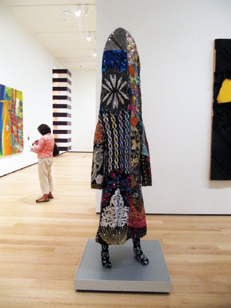
A number of “promised” gifts keep hopes high, although promises of gifts to museums are about as reliable as the promise a new husband makes to his bride that he will be forever faithful. These include the wonderful Truitt column and a fabulous multi-media construction of a shaman in his sequined glory by Nick Cave.
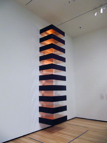
And there is at least one loan, a Donald Judd stack piece, which makes one cream – it is the best Judd of that series I’ve ever seen. Owned by the museum’s friends, the Glimchers, one can only hope. Maybe when the museum raises enough money to buy Dale Chihuly’s “Green Icicle Tower,” it can start another campaign to acquire the Judd. It would make a major difference.
To get the full extent of the installation and the depth and breadth of the collection as it exists today, it pays to poke around in secondary exhibition areas. In the short corridor leading to the education area, there is a terrific painting by color field artist Jack Bush that hasn’t been shown I’m sure in decades.
In Bravo, the museum’s upscale eatery, there are first-rate paintings by Philip Taaffe, Yayoi Kusama, Claudio Bravo and two locals – Jeff Perrott and Jim Thompson. And in the cafeteria there is a nice collection of hardedge geometric abstraction, including radiant paintings by Ludwig Sander and Olle Baertling and an op-art exercise by optical painter Julian Stanczak.
What’s cheering about the Linde Wing installation is to realize that it is really only the tip of the iceberg. When it is time to reinstall – rotate in current museum lingo – there are plenty of first-rate works in storage. By my own reckoning there are works by Agnes Martin, Bridget Riley, Susan Rothenberg, Robert Rauschenberg, Roy Lichtenstein, David Hockney, Jim Dine, Alex Katz, Sylvia Mangold, Robert Mangold, Sean Scully, Lawrence Carroll, David Park, Wayne Thiebaud, Joan Brown, Anthony Caro, Helen Frankenthaler, Jules Olitski, Kenneth Noland, Sol Lewitt, Dan Flavin, Joseph Beuys, Anselm Kiefer, Georg Baselitz, Ross Bleckner, Donald Baechler, Julian Schnabel, David Salle, Nayland Blake, Elizabeth Murray, Francesco Clemente, Thomas Ruff, Thomas Struth, Candida Hofer and Takahashi Murakami the curators can choose from.
A brief note on inclusion. The percentage of artists of color seems to be fair, as does the number of female artists, although I suspect the Maud Morgan crowd will take exception to that assertion. The only failure of inclusion is that of the so-called local artist. Although if Maud Morgan Prize winner Wendy Jacob is representative of what local artists are doing today, maybe that is just as well.
Nicholas Nixon, Robert Freeman, Michael Mazur and Scott Prior are the few who seem to have snuck in. Better represented are Museum School grads, Kelly foremost among them. But the Starns, Ellen Gallagher and Wade Aaron (Mr. “INTENT”) also attended the museum’s own school.
In short, the museum got it almost all right. The installation is spacious, avoiding the clutter that often afflicts the new Art of the Americas Wing. The works chosen are for the most part apt. Eventually the Kara Walker and Cecily Brown will be retired. The designers that remade the Pei wing have been respectful of his refined and enduring vision.
But there are a couple of major problems, one of which can be easily corrected, the other not.
The latter first. Whatever was the museum thinking in replacing the escalators with a staircase? They say it was noisy. It never bothered me. The escalators were an integral part of the aesthetic of the 1981 West Wing – as it was then called. Escalators speak of modernity; staircases of the 19th century.
The grand staircase in the museum’s original Lowell building is absolutely appropriate, but the West Wing escalators were absolutely appropriate for a late 20th century building. According to The Boston Globe, museum in-house designer Keith Crippen couldn’t wait to get rid of the escalators, and he sees the staircase as his “crowning achievement.” Well, I say make that crown a dunce cap. Sorry.
The second problem is the general distrust of museum visitors’ ability to think and see for themselves. The didactic panels prominently displayed in each gallery trumpeting the theme at hand - “Art can be…,” “What’s it about?” etc. – are simplistic and condescending. Bostonians are among the best-educated and most sophisticated people in America and they don’t need to be treated as if they are grade school children when it comes to contemporary art.
The text-labels for individual works are more than sufficient to help those in need of further information to understand the artist’s intentions. I hope in future rotations, the organizing rubrics are rethought - the texts should be rewritten at least, if not jettisoned.
Okay, rounding up: let me offer a short list of artists I hope are on the museum’s wish list for future acquisition. Cy Twombly, Brice Marden, Bruce Conner, Robert Gober, Jeff Koons and Julie Mehretu immediately pop into mind. (And the backup list starts there.) One just hopes that the museum doesn’t buy another Cecily Brown.
Mark Favermann on the Linde Wing
Charles Giuliano interview with Malcolm Rogers
Contemporary Art in Boston, an Overview