
John Currin at the Whitney Museum
A Bra Busting Exhibition
By: Charles Giuliano - Sep 20, 2013
John Currin
The Whitney Museum of American Art
November 20, 2003 to February 22, 2004
Organized by the Museum of Contemporary Art, Chicago, and the Serpentine Gallery, London
Curated by Staci Boris and Rochelle Steiner
Catalogue: Harry N. Abrams, Inc. with essays/interview by Boris, Steiner and Robert Rosenblum, 124 pages, illustrated
Reposted from Maverick Arts Magazine December 18, 2003
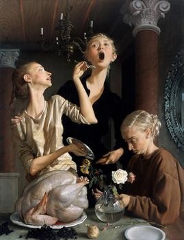
In the final gallery of the much debated retrospective of the 41-year-old, New York based, figurative/narrative painter, John Currin, at the Whitney Museum of American art is a magnificent painting, “Thanksgiving,” 2003. It was evidently too recent to be included in the catalogue. But this new piece, a benchmark for the artist, seems to solidify the shaky pretext for a wildly uneven, premature retrospective for an artist who is only just beginning to get his bearings as an artist of potential, who, arguably, has his best work well in front of him.
This painting assembles three, attenuated female figures, a reference to the distortions of figure and space that we associate with the style of Mannerism, and a large, unbaked, raw turkey sitting on a platter in a puddle of its blood. The woman on the left who, to quote the late Duchess of Windsor, looks strikingly rich and thin, is smiling and offering a spoon of juice/blood to an open mouthed grimacing companion. This second woman forms the apex of a pyramid, the bottom right of which is a blonde woman bending over to arrange a rose in a trompe l’oeil, clear, glass vase. To the right of this triangle of female faces is a soaring vertical column with a composite capital. The top of the capital is truncated by the edge of the canvas. Perhaps this column is a reference to the Mannerist masterpiece, “The Madonna with the Long Neck,” by Parmigianino, from 1535, which employs a similar spatial device. The sense of color and surface in this painting is sublime, particularly in the translucent skin of the raw bird.
Why the uncooked turkey? And the enigmatic plot of this narrative painting, as puzzling as the Mannerist works, which serve as its prototype? Is there an ars gratia artis delight in the obfuscating gamesmanship of the era of Mannerism? Is this a reflection of a new decadence in art and culture? Can we look forward to some Baroque, Counter Reformation correction when art will get back on track after such wisecracking self-indulgence? Will there be a new faith in art and an age of martyrs? Or, will we glance back and turn to salt?
Had the turkey been cooked, as one would expect, would that have cut too close to the kitsch of such illustrators as Norman Rockwell, to whom, Currin has been stridently compared? Is the rawness just a post modernist ploy to distract us from the unpardonable sin of reveling in representational art? Do critics compromise their avant-garde status to praise such traditional forms of painting? It is precisely here that the battle lines are drawn and the debate over this artist has become a spectator sport and art brawl. It is how critics are being measured and counted as for or against this work. Where do you stand on the issue? Lives, careers, and reputations appear to be at stake.
The heavies have been wading in on this. Start the rumble on the Whitney show with a puff piece in the New York Times, crit-light, by Deborah Solomon. Counter that with some mud slinging by Blake Gopnick in the Washington Post. Methinks he doth protest too much. Then a Bud Light, Taste’s Great, Less Filling, exchange between a pair of Art Net pundits, Richard Polsky, “Hold” (not buy or sell) and the ever over-the-top, Charlie Finch, who more or less says, “Buy, Buy, Buy.” There was a kind of fudgy, fence sitting report by David Cohen, “Curryin Favor,” in Artcritical.Com. A mixed report in the New Yorker. In Newsweek, Peter Plagens got himself off the hook by offering an interview with the artist. I would have preferred to have him go on record about the work. Although he did ask some tough questions. The catalogue essay by Robert Rosenblum gave the project its increment of heavy-duty, art historical endorsement. His essay was itself an example of mannerist, obfuscating writing. Once again he proves to be a facile gun for hire willing to take up the cause of reactionary, narrative realism for the right price. An essay by the curator Boris proved to be more refreshing and true to the mark.
One of the evident attractions of writing about the work of this artist is the temptation to display your art historical chops. With a passing mention of Northern European Renaissance and Mannerist art, a clear resource for the artist, I will attempt to steer clear of that self-indulgence. Or, to evoke it only when necessary to present the evidence of the work at hand. Plagens, for example, stated his preference for Reginald Marsh. An interesting artist to be sure but in this case, arguably, apples and oranges.
The challenge is to discuss the work in its own terms. And to avoid an arm in arm tour of the Met with the artist that Rosenblum describes so tenderly. It reads less like a discussion of Old Masters than a lunch date between the scribe/fan and an art star.
So, where to begin. Well at the beginning. Which is to say the early work. It is, dare I say it, just bad. Too many rooms of really mediocre juvenalia. But it is what one expects from a figurative painter. At 41, typically, he is just coming into his own at an age when poets, rock stars, and matinee idols start to fade to black. It just takes a long time to master the craft of representational painting. Currin is no exception and this show makes no attempt to hide the blundering beginnings. Indeed, there is so much bad work that it is not until one is half way through the exhibition that the pace picks up. This is really embarrassing and could have been avoided. Most obviously, the Whitney might have waited a decade to launch a retrospective. Why this rush to judgment? Was there a calculation that, in the future, the work and its issues would no longer be relevant? That is not showing a lot of faith in the artist or allowing for proper incubation. Don’t we deserve the right to see some twenty or so more works on the level of, “Thanksgiving?” Instead of rooms of plodding mediocrity?
Another solution might have been to do a show with an overview of the artists who are Currin’s peers and equals: Cecily Brown, Delia Brown, Inka Essenhigh, Damien Loeb, Tim Gardner, Will Cotton, Hillary Harkness, Jenny Saville and Lisa Yuskavage. It would have been far more useful to see Currin in context than stretched out here to the breaking point.
It is the boobs and bimbos of Yuskavage, a classmate at Yale, to whom his work is most often compared. Surely it would have been provocative to see them side by side. Or the decadent LA lifestyle of Delia Brown’s watercolors. In terms of technical painting how does Currin match up to the deadpan Loeb, or the lush confections of Cotton? The tortured flesh of Saville who is arguably a better painter? The kitsch, erotic genre of Harkness? The masterly, surreal distortions of Essenhigh? The snap shot realism and genre of Gardner? In this case, Currin compared to what? Tiepolo? Cranach? Bronzino? Let’s try for a more level playing field.
A careful tour of this exhibition, viewed in the context of his shows at Andrea Rosen Gallery in the past few seasons, reveals Currin as one artist with several tendencies. He is at his best as a classical figurative painter. His nudes, with their Northern European angularity and kinky erotic distortions, for me, represent his most compelling works. Then there are the gothic, grotesque, triple D cup fantasies, more horrific than sensual. Another excursion is along the garden path of contemporary genre with its emphasis on the decadent and cosmopolitan. There is a kind of,“Sex in the City,” flavor to this body of work. Now and then he flops a dead fish onto the head of a bent and compliant women. Here and there we have come to recognize the persona of his wife, an art star on her own terms, Rachel Feinstein. Finch describes them as, “the first truly equal art couple since O’Keeffe and Stieglitz.” Oi vey.
But Currin appears to have evolved out of his early neo fascist phase. There are genre pieces from 1993 in which bearded Nordic males apathetically embrace similarly ambivalent Aryan women. These kitschy works all too grimly recall the pictures that curator Deborah Rothschild included in a survey of the young Hitler in Vienna. It was the kind of volkish work he so much admired as a struggling artist and future dictator.
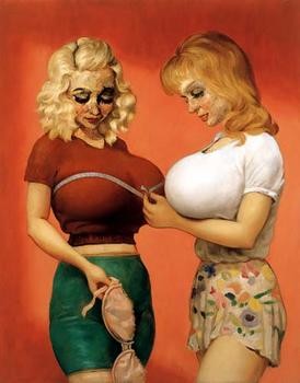
One of the shocking encounters in this exhibition was a face to face confrontation with such often reproduced works as, “The Bra Shop,” “Jaunty and Mame,” “The Magnificent Bosom,” “Dogwood,” and ‘The Dream of the Doctor,” all from 1997. While provocative in reproduction they were positively gross in real life. There was the odd contrast in technique between the smooth, deadpan brush of the bosoms and costume and the rough textured, ugly surface of the faces. In her essay Boris states that this awful painting was deliberate. “Over the past decade Currin’s manner of painting has evolved from an intentionally, ‘bad,’ technique with a limited palette to a more complex, if more traditional system of underpainting, modeling and color application,” Boris wrote. And, on the “Bosom” series, she states that, “The women’s bodies are painted with brushes in monochrome passages with a smooth finish, while the faces are thickly built up of numerous colors with a palette knife, resulting in a horrifically craggy surface. Currin maintains that these two types of paint applications symbolize different kinds of intimacy, the idealized and the real. While painting the breasts with brushes, he insists that they get better with each successive layer. The palette knife portions are conversely impossible to improve, each extra scratch or dab increasingly damaging them- a metaphor for romantic relationships, perhaps.” Perhaps.
A parting comment. Make every effort to see this work as we will contend with and argue about it for a long time. Perhaps. Also, the reproductions in the catalogue suck. They are utterly flat and completely off color. Just who was in charge of this printing? By contrast, the reproduction of,“Thanksgiving,” in the Newsweek article is very accurate in catching the nuances of the work. This is work that deserves to be seen with your own eyes
-----