Shipping Container Architecture
Puma City Store Near Fenway Park
By: Mark Favermann - Oct 08, 2010
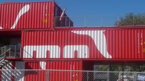
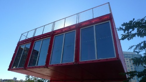
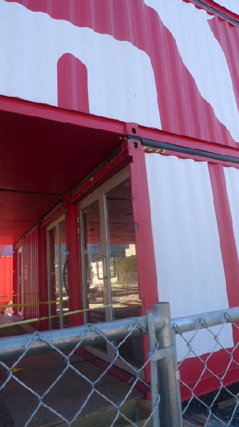
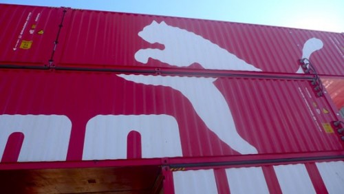
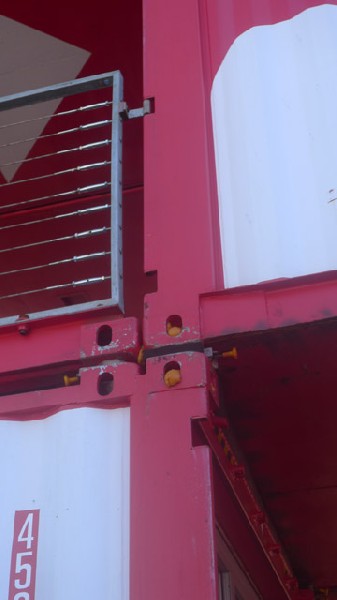
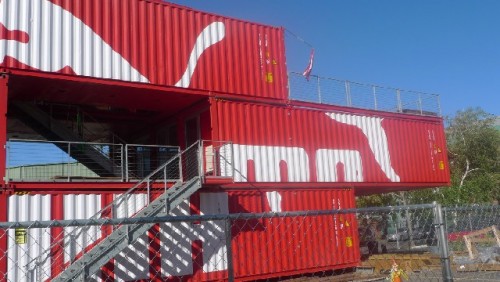
It is October and as Fenway Park is packing away its tarps, pads and bases until Opening Day 2011, literally down the block Puma City, the bright, red, temporary branded, stacked structure store, is unpacking. Puma City is expected to open hopefully sometime this month. The store sections and shipping containers are the same. Puma City is composed of 24 metal shipping crates that are architecturally arranged and engineering enhanced into a recyclable 11,000 square foot environment.
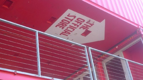
Puma City is not a city or even a town, but a multilevel retail and event space. Architecture and design of the 21st Century is about new forms, materials (or new uses of older materials) and technologies in sustainable and accessible ways. This is exemplified by Puma City. Like a marketing giant's blocks, it is a heavy metal, simple geometry vending configuration.
The Puma City store has been traveling to various locations around the world in the last few years. The structure walks the line between prefabrication and custom architecture. The design combines colorful and strong aesthetics with clean, modern lines and the stylish Green reuse of industrial materials. It was designated by Travel+Leisure Magazine as the best retail store in 2008.
The portable Puma store was designed by LOT-EK, architects whose firm focus has been on re-using urban detritus. They make clever architectural re-use of discarded and abandoned materials like shipping containers, train cars, and scaffolding.
In fact, in 2006, the Lot-ek architects created a concept for a library made from obsolete airplane fuselages. This developed a lot of press and professional buzz. The firm led by Italian architects Ada Tolla and Guiseppe Ligano walks the line between architecture, art and information/entertainment. All the while, they rethink, reconsider and reconstruct the ways human beings interact with today’s industrial/technological/cultural environment.
The Puma City structure is designed to include double and triple height spaces with skylights. The architectural notion is to environmentally dissuade the visitor/shopper from feeling like they are in a grouping of 24 shipping containers. In early 2008, Puma City was set up in Alicante, Spain. It arrived in Boston in late Fall, 2008, and remained in South Boston all winter.
Last year, it was set up on Fan Pier near the Institute of Contemporary Art for three weeks to celebrate the Volvo Ocean Race, a nine month global yacht race. At each stop of the race sponsors would set up a temporary buildings village for the racers and crews.
Boston-based Puma officials wanted to open up their pavilion to the public. Therefore, the Boston venue was the first US location and only the second time the structure was a public place. The result was Puma City which included Puma footware and apparel as well as official Volvo Ocean Race merchandise. After its initial Massachusetts visit, it traveled to Galway, Ireland and then to South Africa.
Last June, it appeared at New York City's South Street Seaport to help celebrate soccer's World Cup. Apparently, as in any new or refitted technology, Puma City was not inexpensive to fabricate. However, it is a 220 ton spokesbuilding (a rather new term) for the Puma brand and that has a perhaps unmeasurable added value.
Why in the Fenway and why now? Initially, the project was to happen when there was a soccer match between two European football clubs, Celtic FC of the Scottish Premier League, and Sporting Clube de Portugal, during an extended away series for the Red Sox. It did not or could not happen sooner due to City of Boston building permitting and licensing procedures. Boston bureacracy and red tape has caused delays over the desire to have a bar in the space.
In an urban design sense, the Fenway has slowly developed into a new hip area of Boston. Not only are there a plethora of college students living and going to school nearby (including Boston University, Northeastern, Wheelock, Emanuel, Simmons, Wentworth, Mass College of Pharmacy, Mass College of Art and Design, Harvard Medical School, Harvard Public Health School, etc.), but there has been a gentrification taking place over the last couple of decades with higher-end apartments and condominiums. So a variety of interesting, smart stores, shops and restaurants now are on Brookline and Boylston Streets. The location seems right for a trendy Puma athletic gear store.
Symbolically, Puma City represents a globalization of both retail and design trends. The metal crates represent a compartmentalization of urban debris, utilitarianism, retail marketing and branded products that, when coordinated and organized, constitute a true sense of place. Puma City harkens back to the funky but precient Archigram group's notions in the 1960s.
The architectural group agitated to prevent modernism from becoming a sterile and safe orthodoxy. group Relying on a future of unlimited resources, more was better to these paper rather than structure architects. Some of Archigram's unbuilt concepts were Walking City, Plug-in City and Instant City. Back then the Archigram designers saw architecture as functions of techno-robots, environmental mobility and pro-consumerism that could move and shape structure, function, and visitors/residents from one location to another.
Archigram inspired the work of then emerging architects Richard Rodgers, Renzo Piano and Norman Foster. A descendent of this futuristic, anti-heroic and new technology-driven aesthetic, Puma City is architecture as event, architecture as brand. This rectilinear retail space signifies architecture as quick rather than ponderous development, and architecture as utilitarian chic.
