Design Life Now: The National Design Triennial at ICA
A Snapshot of what is the best in current American Design, but sometimes taken with the lens out of focus or the lens cap left on.
By: Mark Favermann - Nov 09, 2007
At The Institute of Contemporary Art Boston100 Northern Avenue on Boston's Waterfront
On view from September 28 through January 6, 2008
Located in arguably one of the most creatively designed structures built in Boston in decades, the Institute of Contemporary Art is currently and appropriately showing the national design triennial exhibition developed by the Smithsonian's design museum, New York City's Cooper-Hewitt Museum. Every three years, a large-scale multi-discipline design exhibit is put together by the Cooper-Hewitt. It is part of their series, inaugurated in 2000, that attempts to present the best and supposedly most innovative or cutting edge work from the prior three years in the areas of product design, architecture, furniture, film, graphics, new technologies, animation, science, and fashion.
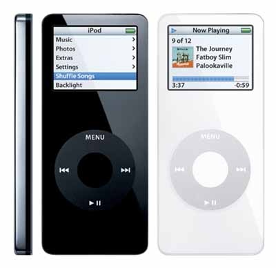
This particular exhibit, the 2006 Triennial drawn from works from 2003 to 2006, includes works from 87 designers and firms. The projects and pieces range from the usual suspects (established design leaders) such as Apple, superstar architect Santiago Calatrava, and Nike to emerging often trendy designers like Joshua Davis, Jessica Smith, and David Wiseman. Always structured along the lines of some connecting concepts or even vague affinity organization, the triennials are quasi-academic approaches to design systems, trends or directions. "Design Life Now" focuses on four principal ideas that supposedly characterize elements of the design world during the last three years: emulating life, community, handcrafted and do-it-yourself design, and transformation.
Presented in the exhibition are designs that tend to imitate the natural world. These are done either through form or movement. The examples include digital game design, robotics as well as products ranging from kayaks to sneakers. "Design Life Now" also tries to demonstrate how design has responded or reacted to the growth and dissemination of the Internet. This is somehow suggested the evolution of vast communities of affinities or not that interact across enormous distances via blogs, film, animation, graphic design, limited-edition toys, and music.
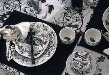
Another area of "Design Life Now" showcases designers whose work reflects an appreciation for craft and personalization through the use of updated traditional techniques such as embroidery and beading. The exhibition also examines the transformation of form and materials through design. Examples of this focus on bringing the outside into architectural interiors or using light sources to dissolve and transform surfaces in provocative ways.
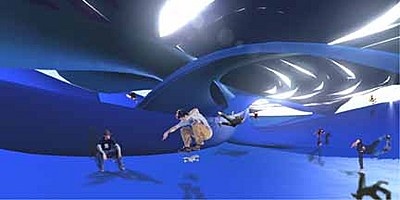
Objects and projects of particular interest: a polyurethane organic skate park designed by Acconci Studio, Brookline (yeah, that's same Vito Acconci of masturbatory conceptual art fame), Joseph Ayer's Robolobster that behaves like a crustacean, Nike's Free—a running shoe that simulates range of feet running barefoot, a modular house by Charlie Lazor called Flatpak, a very cool kayak by Clear Blue Hawaii, Seattle's Central Library by Rem Koolhaus/OMA, and a chair, (what else?) by the Godfather of Chair Design, Niels Diffrient, who always does it right.
Design is a process, interactive, built on refinements with the desired outcome of being functional as well as beautiful. With some of the objects in the exhibit, this was immediately apparent, with others, the sensibility was way too precious. In almost all the cases of the architectural projects, and I include landscape design as well, the model scale diminishes the environmental quality and size sensibility to the point that the architectural models and the toys exhibited seem to be roughly equivalent. Calatrava's work suffers from this the most.
I found the more traditional print graphic design extremely retro and frankly disappointing. The Nozone Magazine Empire by Nicholas Blechman appears to be like some sort of insiders' joke. The pieces by Planet Propaganda of Madison Wisconsin are extremely simple, even simple minded. Is that the point? Target's color-coded prescription bottling labels looks like a nice 1980's graphic system. But are male pharmacists disqualified from dispensing pills, like pilots, if they are colorblind? About 30% of all men have some color blindness. By the way, Target was a major sponsor of this show. There seems to be undisputed conflict of interest here.
There is a certain inaccessibility to much of the exhibition. Often, objects are set too high to view either comfortably or in any depth. I would especially liked to look at Knock Down /Drag Out Table by Christopher Douglas that was created in modular pieces, but it was too damn high for me to comfortably look at it. By the way, I am 6 ft tall, so this wasn't a function of my own vertical impairment! The ICA commissioned one of the featured architects, Michael Meredith, Associate Professor of Architecture at the Harvard University Graduate School of Design, to design and adapt the exhibition to the museum's galleries. Clearly, Mr. Meredith came with a strong resume, but designing museum exhibitions apparently wasn't on it.
It appears that he has spent too much time in Ikea's warehouse in Stoughton, MA. The warehouse at least has the space to allow viewing of objects on higher shelves easier than his ICA space. Following this Ikea approach, the exhibit has a very retail environment feeling to it. Well designed consumer products should not be presented in a museum as if in a store unless they are on sale at the museum's shop. The labeling doesn't help much either. It is often confusing and not easy to read. Note: Good museum design enhances exhibitions whether they are about design or art or anything.
With all my complaining, I encourage the ICA to continue to bring important design exhibits like this one. The Institute of Contemporary Art is absolutely the right place for this as the line between great contemporary design and great contemporary art is quite thin. It is too bad that one of their first shows is so flawed. This is not the ICA's fault entirely.
The Cooper-Hewitt needs to bring in others to choose the pieces of the show for 2009. Curator Ellen Lupton has selected each of the previous Triennials, and her sensibility may simply overwhelm other curators at this point. No more jellen, time for Ellen to leave the Triennials to others. Whether true or not, all of the triennials to date seem like just too much friends of friends. The focus needs to be clearer and certainly more democratic.
By the way, only women chose the 2006 show. If only men had chosen it, there would be howling from Lower Broadway (NYC) to Melrose Avenue (LA) and everywhere inbetween. Reverse sexism? What a surprise! I can't believe that there is gambling in Casablanca.
Models may be Documenta, the Venice Biennale or the Whitney Biannual in the art world. Curators rotate and show different points of view and choose different individuals to participate. Also, parallel to the Whitney Biennial, just as artists, I am not sure that any designer or architect would want to say that he or she aspires to be in the exhibition. But, anyone who makes it is probably very pleased.
Flawed or not, there is much to see and to think about at this design exhibit. Perhaps, good or bad, there is even something to learn?


