
Albrecht Durer at the Clark
Looking at Durer's Geometry Addiction
By: Gregory Scheckler - Nov 17, 2010
How much of our lives grow out of sensible patterning that we can explain with reason, and how much of our lives result from inexplicable chaos?
If time travel were possible, then I’d go back to the Renaissance and ask artist Albrecht Durer (1471-1528). Of course we can’t literally time-travel. But we can get clues from Durer’s artworks in “The Strange World of Albrecht Durer” currently on display, through mid-March 2011, at the Sterling and Francine Clark Art Institute. Few artists' work is as rigorous, as imaginative, and as dexterous as Durer’s. There are few institutions that have the range of collection to articulate Durer’s work so thoroughly. Seeing 70 of his prints in one place is a rare treat, a must-see exhibit.
Multi-headed dragons, paunchy troglodytes, levitating nudes and soulful angels cradling their heads – just how ought we explain and describe Durer’s imagination? Durer’s printmaking is even claustrophobic. Its intense geometries seem foreign to contemporary visual culture, our daily dose of hyper-designed ads, and casual snapshots.
His is an art that is always reasoned and measured. For all the kooky critters depicted in his works, it is because of Durer’s geometry that his images seem to hold together. They seem to say that, behind the strange truths of our lives, there is an underlying, unchanging, orderly world.
Why did Durer design his images this way and not some other way? Responses to such questions include Durer’s culture, training, technical requirements of printmaking, and travels. The Clark exhibit provides a clean and beautifully installed overview of these topics. Nice touches include handy magnifying glasses to view details, dark-toned walls the better to see the art, and a video to explain how prints are made. The show is comprehensive, and the art astonishing. In making his work, Durer didn’t do what today’s artists usually do.
Durer loved geometry and lamented an unmeasured, unplanned approach to composing when he wrote how too many artists “have run riot like an unpruned tree, so that unhesitatingly and without compunction they turn out their works, purely according to their own judgment.” He advised that “the sole reason why painters of this [unpruned] sort are not aware of their own error is that they have not learnt Geometry.”
Geometry is Durer’s why, the foundation used to articulate all imaginings. In contrast, like contemporary poets creating in free-verse, most visual artists today compose in a free-image process. Artists do this because it’s instinctive, productive and seems to suit our modern world. But it’s so open-ended, and so unmeasured a process that our answer as to why we make pictures one way and not another is usually something like ‘because I wanted to’ or ‘because it just ended up that way’. In contrast to free-image composing, Durer’s pictures are woven together by rigorous geometry.
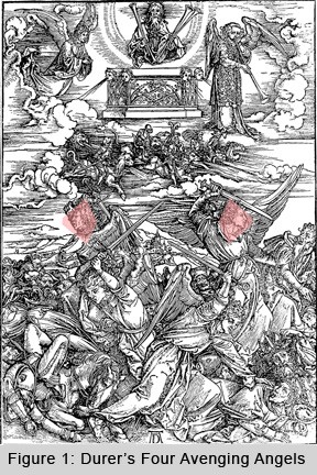
So how did he do it, really? In the exhibit, you can see the entire fifteen prints of the Apocalypse series, including The Four Avenging Angels. A quick look reveals it is symmetrically composed. You might notice that around a central vertical axis to the right and to the left there are many shapes that reflect each other, for example, the two middle angels’ faces (figure 1, in red).
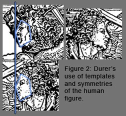
Printmakers often transfer an initial drawing to a printing plate. This can be accomplished by making tracings, and flipping them over to transfer the images. If you trace and flip the angel’s faces you can see that they are almost the same outline, same basic location of features, same basic pentagonal outline around the face, etc. They differ in ornamentation (such as hair, eyebrows, dimples, clothing), but they are the same in underlying structure (figure 2). So now the question is why did Durer place these two angels in these two positions? Why aren’t they somewhat higher or lower on the page? Why these symmetries and not some other pattern?
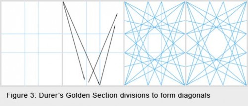
To understand how they’re located it helps to know how Durer relied on the Golden Section. The Golden Section is when a line composed of two segments (a) and (b) is constructed so that a+b is to a, as a is to b, which always results in the ratio of a:b equaling 1.618… This number is referred to as the 'Golden Number' also called Phi. Any length of line can be subdivided to create two segments whose ratio is close to Phi. Durer’s writings and diagrams show that he used Phi, often creating scaffolding for his compositions.
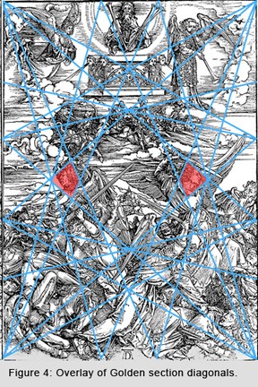
For example he often built a cross through the center of the image, with phi plotted twice for each outside edge of the rectangle. Then, he sometimes used a simple system of connecting each outer point of the cross to each other, to arrive at a faceted, diamond-like structure built up from many diagonals (figure 3). The pattern created dynamic symmetries top to bottom and side to side and corner to corner. Here then is this system overlaid with Durer’s Four Avenging Angels, and the middle angel’s faces still plotted in red – a nearly exact match (figure 4).
He didn’t use this Golden Diamond format for all of his compositions, but when he chose to use this kind of geometry, he did so with unusual precision and flexibility.
Durer’s addiction to rational geometry also appears in his massive books, the Underweysung der Messung (Four Books on Measurement) (1525) and, Vier Bücher von Menschlicher Proportion (Four Books on Human Proportion) (1528). You can see an original of the proportion book on display in the exhibit, opened to templates of human figures.
Durer insisted that “In order that this teaching of mine might be better understood I have already published a book about Measurements, that is to say of lines, planes, bodies, and the like, without which my theory [on human proportions] cannot be properly understood. It is therefore necessary for all who would try this art that they be well instructed in Measurements and know how to draw a plan and elevation of anything.” People get no special exceptions, and drawing them geometrically is the same as drawing anything else.
Also at around the time Durer was working, the mathematician Luca Pacioli named the Golden Section the ‘Divine Proportion.’ This reveals a connection with spirituality, that Durer (and Pacioli) wanted an art that was mathematic and harmonious which mirrored a theology of a divine, perfect, unchanging order in the universe. Within a hundred years of Durer’s treatises on measurement and Pacioli’s claims of Phi’s divinity, the overarching idea of the unchanging eternal was official doctrine.
Indeed by 1633 the Catholic Church condemned Galileo not just for suggesting that the Earth was not the center of the universe, but for claiming that planets and stars were in motion, mutable not eternal. God, they believed, would never create anything imperfect. They conflated ‘perfect’ with ‘unchanging.’ When finally condemned, Galileo uttered ‘Eppur si mouve’ (but it still moves) pointing us toward nature’s motility and away from the metaphors of an unchanging design.
It’s notable that Durer did not use the same methods of composing when he created his Life of the Virgin Mary series (also in the exhibit) – here he used linear perspective and a more lens-like way of making a picture, which proved that artists can make profound illustrations without being doctrinaire, whatever the official dogma. Durer’s art marks a massive transition away from the crystalline geometries into the perspective geometries – his was a huge a leap of the imagination and intellect from one tradition into developing a completely new range of imagery.
Today we are at a similar cusp, only ours is a debate between perspectival thinking and the new theses of the quantum, described well in Leonard Mlodinow and Stephen Hawking’s new book The Grand Design (Bantam 2010) which places the rules of nature firmly away from a designed absolute and into the ranges of unpremeditated chancy probability.
As such sometimes Durer’s symmetrical forms look too regular compared to the geometries that we use. But however more precise our understandings of math and physics and geometry, we too are limited by what we know of the universe. Does that not imply that future peoples may look back at our work and think our quantum probabilities quaintly imprecise or a bit too idealized? I hope so.
And if they do, I hope they see that for all our geometric oddities that there’s still a lot of room for intrigue, just as there’s something fascinating and playful about the details in Durer’s artworks, from the mice and rabbits in the “Adam and Eve” to the 7-headed dragons throughout the Apocalypse series, tiny flocks of birds, miniature goats, goofy eroticism, and rampaging regiments of itty-bitty soldiers. These are the stuff of ancient stories well-worth remembering, tales whispered around the hearth to wide-eyed children reveling in flights of fancy. They appeal today as much as they did yesterday.
[Note: If you’re intrigued by printmaking and would like to see a Durer woodcut block in fine detail and resolution, you can see one online at the Met, at this link. Everything that’s white on the page was cut out of the block, meaning every line you see in the print was a little mountain ridge in the printing block – astonishing! ]
[Note: quotes are from The Painter’s Manual by Walter L. Strauss (New York: Abaris Books, 1977), which is an English translation of Durer's treatise on measurement; and, Albrecht Dürer, The Writings of Albrecht Dürer, ed. and trans. William Martin Conway (New York: The Philosophical Library, 1958), p. 231. Diagrams were constructed by the author on the basis of diagrams and writing from Bouleau, The Painter’s Secret Geometry: A Study of Composition in Art (Harcourt, Brace and World 1963), plus Panofsky's The History of the Theory of Human Proportion as a Reflection of the History of Styles (Doubleday, 1955) and The Life and Art of Albrecht Durer (Princeton, 1955), as well as from graphics evidenced in Duerer's Four Books on Measurements. A delightful discussion of the Golden Section can also be found in Mario Livio’s text The Golden Ratio: The Story of PHI the World’s Most Astonishing Number (Broadway, 2003). ]
About the author: Gregory Scheckler is Associate Professor of Art at the Massachusetts College of Liberal Arts. He can be found online at http://www.gregscheckler.com