Rare Art Nouveau Shopfront Survives in Harvard Square, Cambridge, Massachusetts
Unique Facade Underscores Aesthetic Reform Style
By: Mark Favermann - Nov 23, 2008
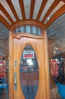
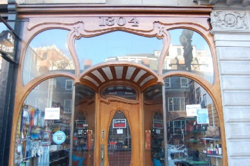
Located across the street from Harvard Yard at 1304 Massachusetts Avenue at Harvard Square in Cambridge, Massachusetts is one the most distinctively Art Nouveau storefronts to be found anywhere in the United States.
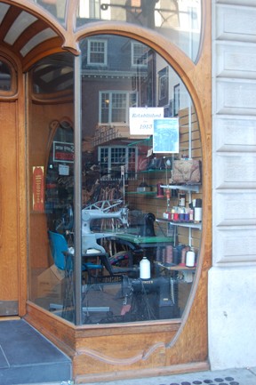
Though there is a photograph in the window that exclaims that the storefront was built ("established") in 1913, this rare shopfront was actually designed in 1907. The wonderful Art Nouveau storefront was designed by the architectural firm of Coolidge & Carlson for Coes & Young, a Boston shoe store firm. Wonderfully, the landlord, presumably Harvard University Properties, has restored it to its original glory. It is an aesthetic gift that keeps on giving.
Art Nouveau peaked as a design motif and art, architecture and decorative style between around 1890 to 1910. It ended about the beginning of World War I or 1914. Though interpreted in many divergent ways from country to country, the flowery more French style of this facade was the most universally prevalent and actually much later influenced what became Psychedelic Art in the 1960's and early 1970's.
I have admired this charming façade for decades. When I first saw it, it was being used as the front of a copy center. The Philistine of an owner had hung an ungainly and quite large internally illuminated sign on the façade interrupting the beautiful flowing lines of the design.
I actually knew the owner, he lived in my apartment building with a very nice wife, and I tried to speak to him about it a few times, but he would take no heed. "Why shouldn't I have a strong sign on my business?" he asked in response rather rhetorically. No one was going to tell him what to do. Aesthetics and history be damned!
With sometimes dangling heavy wires, a large metal case and bad lettering, for a couple of decades, the sign never was changed as long as the lease of Gnomon Copy was in effect. Seeing the mismatched heavy metal sign stuck on the delicate wooden façade aesthetically pained me for years when I would walk by it.
Then after the copy shop, various stores were in and out of there for several years. Not much changed: ugly sign visually brutalizing sensitively wrought stylized organic detailed façade. But then, miraculously, in the last couple of years, a shoe repair store has been occupying the store, and the façade was sensitively brought back to pretty much its original glory.
Art Nouveau was primarily a flowing form design style that corresponded visually to musical movement. It had various national forms and translations. Art Nouveau was literally the doorway to contemporary design. It was a refinement of the reaction to the excesses of the industrial revolution's mirror twins of technological triumphs and deplorable social conditions.
During the last decades of the 19th Century, thoughtful individuals noticed that mass produced items often resulted in poor quality products. There was also a heavy-handed quasi-historical pastiche or nationalistic kitsch applied to these pieces of furniture, tableware or even utensils.
Aesthetic reform movements sprang out all over Europe. There was artistic and design sentiment to develop better living conditions for the working classes. Besides better and cleaner housing, this was to be manifested through simpler, more honest consumer goods through more handcrafted products.
In England, influential social critic and artist/designer William Morris was most vocal. He and his followers developed a philosophy that viewed aesthetic and social problems as inseparable. He claimed that the answer to social issues was a return to the spirit of art and decoration of the Middle Ages when artists fashioned articles that were both beautiful and practical.
Morris' friend, critic and philosopher John Ruskin and others began what is now referred to as the Arts and Crafts movement. This style rejected historicism, encouraged a return to elegantly wrought handcrafts, emphasized the relationship of art to design and showed preference for simpler forms from nature.
The Arts and Crafts movement was the direct precursor and ran parallel to Art Nouveau. It influenced Frank Lloyd Wright's work throughout his long career.
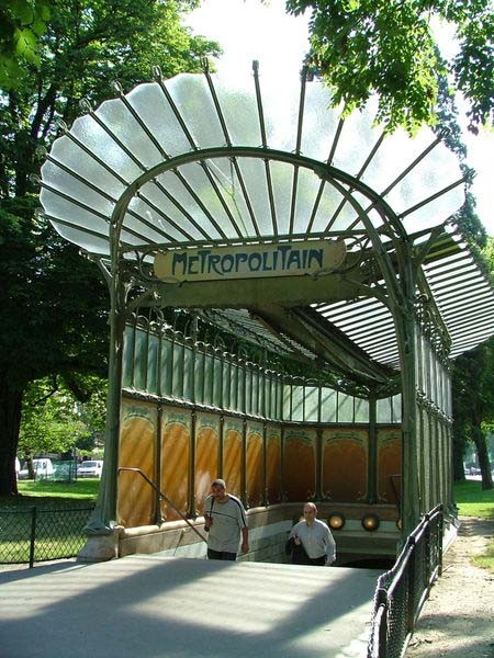
The shoe repair shop at 1804 Massachusetts Avenue is a living piece of design history. It has a certain French Art Nouveau quality to it reflecting work by architect/designer Hector Giumard (1867-1942), the designer of the fabulous iconic Paris Metro subway entrances that are still in use today. He used organic, plantlike shapes, flower, vine, root and leaf forms to convey elegance and style.
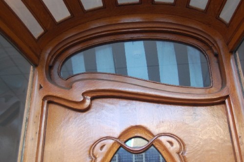
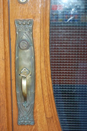
Though most often created in metal, Art Nouveau when applied to housing, shops or interior furniture was often carved out of fine wood. This is the case with 1304 Massachusetts Avenue. The façade is fabricated out of carved and hand formed wood. Metal details such as the kickplate at the bottom of the front door and door handle and ornamental lock plate add an almost Medieval quality to the beauty of the façade.
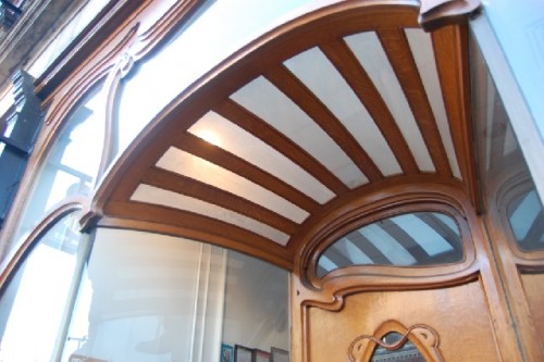
It is hard not to notice the top of the storefront. Exquisite woodwork flows. The large wooden numbers fit perfectly. Its large spacious open window treatments feel like they seem to grow like large plants with their vine-like forms. The entranceway is exquisite with its skylight canopy structure. The door is a sculptural work of art balanced asymmetrically with wood and glass.
The setback entrance acts as a distinct welcome to the visiting customer by its visual and physical depth. There is a wonderful, consistent visual harmony to the façade rarely seen or felt by encountering the vast majority of today's contemporary shops or stores.
It is sad that since 9/11, there has been little creative retail design done. Security issues have overwhelmed aesthetic concerns. In the US, only the glass cube Apple Stores, a few eccentric Japanese product stores in LA and New York and architect Rem Koolhaas' Prada Store designs have made strong and visually dstinct statements. Most stores and shops are now very similar and are often derivative or just boring.
Regretfully, with the current financial crisis affecting the consumer market, it is doubtful that much creativity will be introduced to retail shops in the foreseeable future. So, it is great to celebrate a special store like 1304 Massachusetts Avenue.
Like a rare flower in a field of dense weeds, this orchid of a shopfront has somehow survived a century of indifference, abuse and neglect. Thanks to the sensitivity and taste of the landlord, we are lucky it is now in its wonderful, charming current state. The built environment and all of us are better off for it.


