The Unaesthetic American Cell Tower
Ma Bell's Children Are Philistines
By: Mark Favermann - Nov 25, 2012
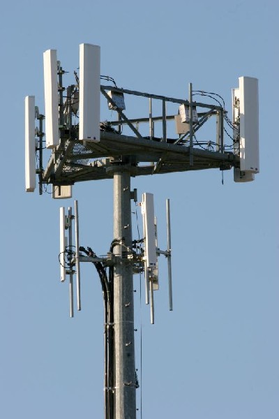
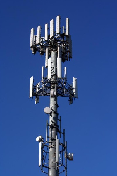
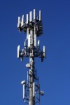
Driving west on Interstate US 90 along the Mass Pike and New York, I have always noticed awkward metal towers at various intervals interspersed between tall trees. These clumsily designed tall structures are the cell towers of various telephone companies.
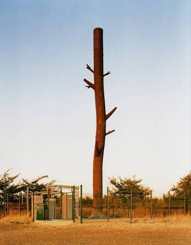
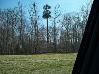
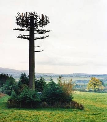
Some were actually created to look like metal trees. But instead they are usually an unaesthetic, ungainly hard structural engineer-driven response to a practical and now near universal need—cell phone coverage.
The simplest way to explain the technology involved is to start with your cell phone. When you make a call, the signal is grabbed by the nearest tower. The tower then assigns your call a frequency, translates it, and sends it to a switching point. It is then sent via wires or wirelessly to the designated destination. And the same process happens in reverse to get the call going both ways.
In more urban areas, clever commercial landlords rented space on their buildings’ roofs for aerials and other hardware. They may look like hell (at the very least an old tv antennea on steroids), but they are a means of steady cashflow.
Some landlords even had the temerity to set an awkwardly proportioned too thick “flag pole” looking structure on their buildings often with too small American flags affixed to them. These are ungainly cell towers as well.
For some reason, the attitude of the various US cell phone service providers has been to put up nearly anything that they deem utilitarian to give their not so cherished customers better and more expansive cell phone service. Functionality superceeds form. The hell with taste, elegance or gracefulness in regard to the visual environment.
Why did this situation proliferate over the last decade or so?
Except for a few bridge designers, and maybe a few car designers, few engineers are interested in aesthetic elegance or even consideration. To them function is form and only that. This was not always true. Think the Golden Gate Bridge, the George Washington Bridge, even the the Leonard P. Zakim Bunker Hill Bridge in Boston as well as designs of high-end sports cars.
Unfortunately, cell phone engineers involved in relay transmitter design went to school where either aesthetics were not taught or they took another elective course instead.
In fact, in the late 1990s, I taught a history of modern design course at Boston University. When engineering students tried to take it since nothing like it was offered among their own programs' courses, their school would not allow them to take courses outside of the BU Engineering School. Aesthetics were what some other engineer was to be concerned with. And supposedly Boston University has a very fine engineering program.
I once attended a couple of Town Hall meetings in Brookline, Massachusetts to discuss locations for a cell tower for a rather greedy landlord at a local shopping center near where I used to live. The meetings were disasters on many levels.
The landlord wanted to put two very awkward "poles" as cell towers on top of his seven store strip that would be lit up brightly all night. The neighborhood residents were aghast and the phone company representatives, both community liasons and engineers, were unresponsive and rather secretive.
In fact, the phone company staff members were so unpleasantly technical, while being hungry to do the project, that they asked the residents to give them other ideas, creative options that would make the residents more satisfied. But they would not give out their names or addresses so they could be contacted directly or realistically collaborated with. These were not very civil engineers. With greater sensitivity, the town council voted down the whole idea.
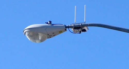
Over a year later, a much better solution was implemented. This was a series of small but not particularly visually pleasing appliances attached to existing light poles. This was a function of technology miniturized over time and the town administrators sticking to their guns.
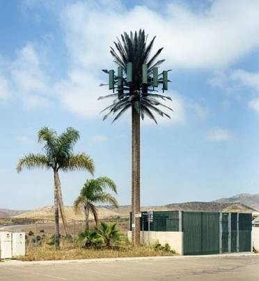
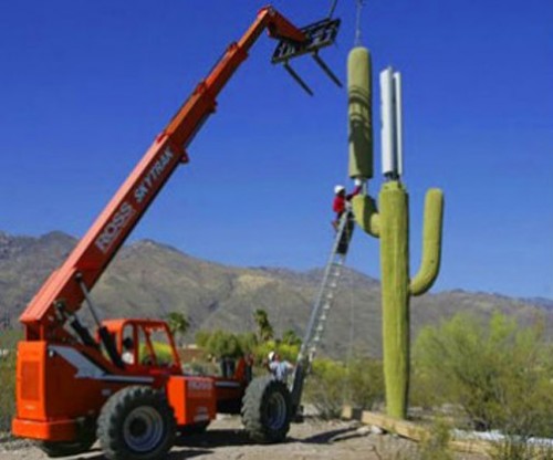
To be fair, in the West and Southwestern United States, efforts have been bad to actually try to create more approppriate-looking cell towers. Huge artificial palm trees and cactus actually seem less fake than they are. In the Pacific Northwest, large more realistic artificial trees are integrated into wooded areas.
At even some churches, the bell tower or the tall cross has been "rented" to house the cell phone technology. Religion understands cashflow well.
Rather than camouflaged elements, the more interesting large scale solution approach would have been to hire or commission sculptors to create the cell phone structures as interesting pieces of public art. Functional sculpture would have improved the visual environment and given the phone companies positive public relations.
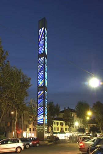
In Italy, this approach was used. They had cell towers designed as beautiful structures themselves. The exteriors of the towers were created by architects, industrial designers and sculptors. The various widgets and pieces of telecommunications engineering hardware went on the inside.
If American cell phone servers would have had any vision, cell towers would now be part of our contemporary visual heritage rather than a technological afterthought. Here a wonderful potential was lost due to a lack of thought and an absence of aesthetic perception.
In 2012, greater miniturization allows for more subtle applications of cell phone technologies. Implementation can now be set literally anywhere. Perhaps even integrated into new pieces of public art? We shouldn't hold our breath.
