In Pursuit of Beauty at Montserrat College of Art
Artists Search for Elusive Qualities
By: Shawn Hill - Nov 26, 2008
In Pursuit of Beauty
Montserrat College of Art Gallery
Beverly, MA 01915
www.montserrat.edu
November 7, 2008 — January 24, 2009
Beauty is a suspect word in art discourse, having long been feared as a symbol of seduction. An appeal to the senses must by nature be anti-intellectual, right? Without the sobering simplicity of minimalism, all that the ornate, the lush and the pleasurable can signify is corruption and decadence?
The artists in this show "In Pursuit of Beauty" at Montserrat College of Art, In Beverly, Mass., through January 24, come from a place that is "post" beauty. That's why they're pursuing it; as a quality, an aesthetic factor, especially as an artistic goal. It's a concept that's gotten lost. That each of these artists appeal to a similar decorative aesthetic in their works is a telling connection. Beauty isn't something that characterizes, for example, twentieth century art. In searching for a defensible symbol of beauty, they turn to architecture and furniture, specifically fabric and wall-paper patterns that might have pleased Marie Antoinette, furniture and gardens befitting castle grounds. Surely in the 19th century, if not the two previous, there were artists who understood what real beauty was?
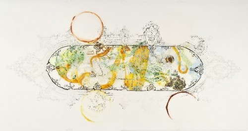
We can't really conjure them now, if so. These artists are dealing in echoes, in archaic styles that still provide a whiff of gorgeousness, however faded. Elizabeth Wallace, in her delicate watery washes on vellum, seems to be planning Baroque moldings, the beguilingly "natural" garden paths and floral mazes of a lost world. Or maybe she's remembering them, struggling to conjure fleeting visions of order and harmony in a world before planetary war and atomic bombs.
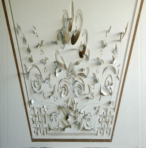
Tomás Rivas also recalls the floral adornment of Rococo fantasies, carving ornate and nearly abstract patterns into the most grimly fragile of contemporary surfaces, wallboard. His patterns would all preserve the valued symmetry of a bygone age, save for how he slants the lines in exaggerated perspective, as if glimpsed on the edge of a camera's field of view. This manipulated and fragmentary glimpse of an antique architectural order becomes a remnant, an instance of a modern eye finding a quaint attraction in some old wreck.
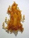
Pixnit, Julie Chang, and Timothy Horn emphasize the impact of the present on the past, transforming traditional sources in surprising ways. Horn casts a carved wooden mirror from the 18th century in rubber in "Mutton Dressed as Lamb," and the switch of material makes a busy, already quite mad object into an alien and weirdly attractive one. The rubber has the hue and translucent quality of amber, but the softness of the rubber causes the branches and the flowers to sag and wilt. The ornate details become even more organic now that they're soft and almost fleshy
.
Pixnit, a graffiti artist, decorates one wall of the gallery with a wallpaper pattern. Other flat elements include life-size schematic chairs, each of the same make but with a different clashing pattern. There's no attempt at three-dimensional modeling, though there are other swipes at verisimilitude. The complications of the pattern are belied by the appearance (at its rough edges) that it was rolled on like any quotidian paint job. The ceremonial chairs might be the flags of different nations, all subsumed under some old-school colonial banner. Beauty here isn't really found, just approximated and exposed as a tool of authority.
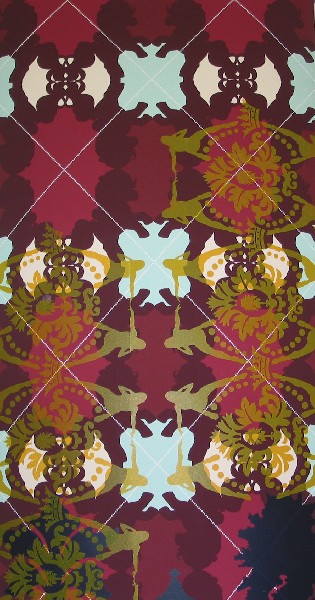
This is also what Julie Chang does in her multi-layered patterned scrolls, though with more of a dry wit than a caustic political message. Chang's complicated stencils simulate wallpaper, but the component elements are quite modern: "My Pretty Pony," photos of herself and her father, fragments of phrases and diagrams from commercial signage and brochures. Even more than her masterful application of acrylic paint through seamless stencils, it is her color sense that elevates the work beyond mere pastiche. Deep purple, royal red, oranges, aquas and teal greens all harmonize in shades that recall velvet fabrics and precious jewels. The bling may change, Chang seems to say, but the messages of status and social stratification do not.


