New Harvard Art Museums
Three in One by Renzo Piano
By: Mark Favermann - Nov 26, 2014
The new Harvard Art Museums welcome the visitor with a marvelous sense of place and space: the building exudes institutional strength, art historical gravitas, and a powerful atmosphere of beauty and light. That said (and fully appreciated), the newly renovated and expanded Harvard Art Museums tries to put too much great art (and considerable educational resources) into what is essentially a good, rather than a great, structure.
Arguably housing the finest university art collection in the world (over 250,000 objects in all mediums), Harvard University’s Harvard Art Museums comprise three museums. The Fogg Museum was established in 1895, the Busch-Reisinger Museum in 1903, and the Arthur M. Sackler Museum in 1985. Through innovation in research, teaching, professional training, and public education, Harvard’s museums have played a leading role in the development of art history, the science of conservation, and the evolution of the art museum as an institution.
The Fogg Museum was originally housed in an Italian Renaissance style building designed by architect Richard Morris Hunt. In 1927, that building was replaced by a Georgian Revival style structure on Quincy Street designed by the firm of Coolidge, Shepley, Bullfinch and Abbott. In 2008, the Harvard Art Museums’ historic building at 32 Quincy Street in Cambridge, MA closed for major renovations and expansion. The renovated and enlarged structure integrates (with purposely little visual distinction) all three museums in a single state-of-the-art facility.
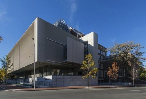
Starchitect Renzo Piano and his staff (Renzo Piano Building Workshop) designed the structure to increase gallery space by 40%, adding a stunning glass pyramidal roof as a skylighted canopy. The Boston architectural firm Payette collaborated on the project.
The new museum’s over 200,000 square feet is organized into nine very distinct areas. These include the new Prescott Street Entrance, the Calderwood Courtyard, the Art Study Center, the Straus Center for Conservation and Technical Studies, Exhibition Galleries, Lecture Halls and Seminar Rooms, the Lightbox Gallery, the Materials Lab and the Museum Shop and Café.
This is also a 21st Century very “green” project. Sustainability was a key aspect of the project. Wherever practical, the architects reused existing spaces. Nearly a 17% energy reduction was obtained by introducing new design and operations strategies as well as sustainable building materials and energy-efficient HVAC equipment. A water reduction strategy uses the building’s roof and landscaped areas to collect recyclable water in underground storage tanks. The project also made use of selected regionally and responsibly harvested materials.
The encyclopedic art collection has been showcased in somewhat cramped quarters because of demands for site and architectural stylization, but it is a welcoming place.
To be fair, the brief for the architecture project was complicated. Not only did the expanded space need to display more of the museums’ great (and they are great) treasures, but it also had to incorporate extensive teaching, conservation, and storage functions.
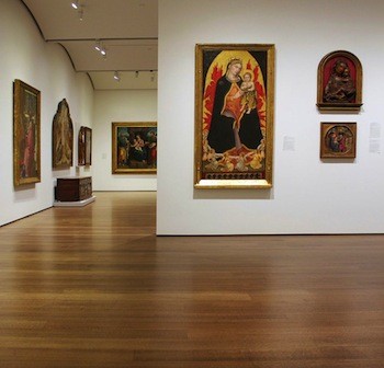
The interior space is certainly better than the exterior. The interior gallery areas bring the art collection up to an elegant, 21st-century standard. A number of the galleries proffer curved and expandable ceilings as well as moveable walls and strategically placed windows. There is a strikingly refined difference between the old structure and the reopened galleries and passageways.
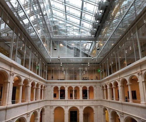
Architect Piano explained that at the core of the newly renovated Harvard Art Museums is a piazza, which acts as the communal heart of the museum, its commitment to serving as a public space. The various art gallery arcades, shop and café on the courtyard’s edges underscore this notion of a community square.
The high glass atrium brings wonderful light and a breathy airiness into the museum. This strong architectural gesture serves as a splendid unifying gesture for the museum, but it must be said that it takes up a lot of space that could have been perhaps used in other ways, such as additional exhibition areas.
Ever since Renzo Piano created the Pompidou Center (1977) in Paris with Sir Richard Rogers, his projects have used glass and steel to reveal mechanical building technology. His Harvard project has that signature guts-and-all look as well — major glass canopies, expansive courtyards and light modulating roofs, exposed vents and building mechanics.
The Genoa born Piano is the world’s master museum architect of our time. He has built a couple of dozen museums, including 14 in the U.S. Though a few are spectacular, overall his buildings are a mixed bag.
Boston’s Gardner Museum boasts a very sensitive Piano expansion of its New England Venetian palazzo; the Nasher Sculpture Center in Dallas is a gleaming contemporary homage to the three dimensional form; and the Art Institute of Chicago addition houses the museum’s huge contemporary sculpture and canvases in a big- shouldered manner that befits the personality of the city.
On the more questionable side: Oslo’s Astrup’s Feanley Museet is awkwardly arranged so visitors have to walk outside to go from one gallery to another even in Norway’s very white winter. NYC’s Morgan Library is oddly organized so that the oversized courtyard overwhelms the old and new galleries, which makes visitor circulation rather clumsy.
Placed in this list, the Harvard Art Museums sits as a very good if not top tier Piano project. This is partly due to the planning constraints that the Pritzker prize-winning architect (1998) faced. For example, the Quincy Street entrance to the old Fogg Museum is historically landmarked and had to be maintained – these and other restrictions (size of the site, need for educational spaces, etc) presented a puzzle with no one clear answer. Add to this Harvard’s longtime reputation as a client who does not necessarily get the best out of starchitects like Piano. Perhaps this is a case of just too many chiefs having to answer to too many demands.
Finally, a few exterior criticisms of the Harvard Art Museums: the Prescott Street entrance is not inviting -it is corporate rather than cultural; the extended ramp of the neighboring Le Corbusier Carpenter Center adds little to the project; and the attempt to make exterior wood slats look like metal comes off as gratuitous.
But enough carping: Piano and his team did very well given their constraints. It is damn hard to build the right frame for so much abundant beauty.
Reposted courtesy of Mark Favermann and Arts Fuse.


