Cambridge Public Art
Is It Fair in the Square or Anywhere?
By: Mark Favermann - Dec 17, 2006
Public art can be considered civic design. Civic design reflects the quality, identity and even urban brand of the municipal environment. When we think of Paris, we envision the wonderfully exquisite Art Nouveau entrances to the Metro created by Hector Guimard. Sometimes like the Paris Metro entrances, art can function wonderfully in ways other than just aesthetically. Sadly, this type of project is the great exception. While some public art projects can be quite magnificent, more often a creative vision can go badly unresolved.
Urban design is the creative manipulation of visually appealing physical elements to allow for the best function. Likewise transportation planning is the satisfactory manipulation of elements to allow for proper flow of vehicles and pedestrians. Public art is usually a civic enhancement, but it is occasionally something more functional-a gateway, a center point of a project, a memorial, a fence or other streetscape furniture. Public art should soften the built environment.
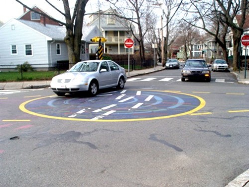
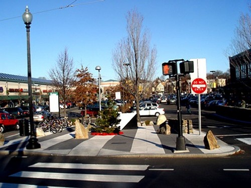
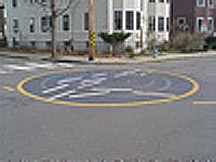
Recently and rather unexpectedly in the City of Cambridge, two public art projects have attempted to improve transportation and pedestrian safety and function. One is a painted roundabout or traffic circle in the densely residential Walden Street neighborhood by artist Wen-ti Tsen. The other is a plaza and crosswalk centerpiece by Toshihiro Katayama for the often hectic Porter Square. While the former is excitingly experimental, the latter is visually and practically rather unnecessary.
However, in both cases, good, bad or indifferent, the Cambridge Arts Council must be greatly admired and continually congratulated for its regionally superior commissioning of public art in a systematic and highly significant way. The City of Cambridge's Public Art Ordinance mandates one percent of all construction projects for public art. If only other cities and towns or even our often not too glorious Commonwealth of Massachusetts would do this.
Locally, the Town of Brookline has an abundance of lost opportunities in its long planned Beacon Street improvement project. The original Beacon Street designer, father of landscape architecture, and former Brookline resident Frederick Law Olmstead is probably spinning in his grave. It is also a damn shame that Brookline's 2005 Tricentennial left no visual legacy either in the form of public art or other significant civic design. The City of Somerville's Arts Council is trying mightily to encourage art in its own dense urban setting but with too small budgets to create anything really significant.
The City of Boston's Edward Ingersoll Browne Fund quietly funds public art and streetscape projects throughout all Boston neighborhoods and is assisted in oversight by Mayor Menino's Office of the Arts and the Boston Art Commission. Unfortunately, with no percentage of art funding for Boston, these grants carry the burden for the whole city based upon a finite amount of funding each year. Certainly, a major city the size of Boston could use more help from development funds with a percentage for public art. Other towns and cities are rather hit or miss in regard to public art. Total miss is the general rule.
So almost by default, the City of Cambridge is the model for all other Massachusetts municipalities, and thus almost by default it sets itself up for criticism as well as praise. The intellectually praiseworthy Walden Street Project is a visionary attempt at using public art experimentally, functionally and economically. Generated from an idea by Cambridge Community Development Director Juan Alvendano from the notion that public art had a traffic slowing effect in West Coast cities, it was suggested that a painted circle or crosswalk be developed and tested for the busy intersection. The city's Environmental and Traffic Division collaborated with the Cambridge Arts Council.
The location for the project was chosen because there were no capital budget repairs scheduled for the street, because there was strong neighborhood interest and because of the actual geometry of the intersection according to Alvendano. Though response to the project has been mixed, the fact that this visionary project ever happened is truly meaningful. Here, thinking out of the bureaucratic box actually occurred.
The cost savings were from approximately $100,000 for a permanent raised traffic island to just $10,000 for the painted circle and three years maintenance. Wen-ti Tsen was chosen by residents from a group of artists to create an abstract circle. The City of Cambridge is launching a study of the circle mural experiment's traffic calming success or failure shortly. The idea is that a 5 mile an hour reduction from 30 to 25 miles an hour will reduce accidents.
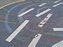
Tsen's design is entitled "FLOW- medium: traffic" and was based upon his concept of a hole in the road to slow vehicles down. This led to an illuminated pond concept and eventually resulted in the final stream concept reflecting streams of traffic which were translated into colorful dashes in a blue circle.
After a few weeks, cars seemed to be driving over the circle rather regularly and messing up the painted design. The mural circle seems to generate traffic back-ups which are more than just slow-downs. Over time, the project will demonstrate whether or not this was a worthwhile traffic calming and public art experiment.
Sometimes an artist tries to do projects for which he appears to be clearly unequipped. Sometimes (more times than not) there are artists who are championed by curators, in this case architects and others who are well-liked but not really up to the task. The Porter Square plaza was to be a bold centerpiece for vital Porter Square. However, the completed work looks more like an afterthought than visual urban icon. Unfortunately, the artist, Toshihiro Katayama, a professor emeritus at Harvard's Carpenter Center for Visual Studies, had bitten off more than he could chew or design and create.
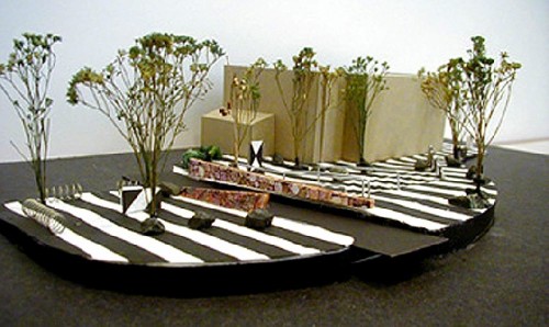
The project presentation model is elegant and visually resolved. However, the completed project includes a heavy handedness exemplified by clunky functionally necessary utility boxes. Strangely, the whole project seems much truncated. Pedestrian use of it seems unclear and even clumsy. Here, the tidy model apparently was created in a vacuum leaving out reality issues. Instead of simplifying the plaza, the project adds confusion by adding visual clutter. Did the artist ever do any real site studies or work with the Department of Public Works to test anything real before installation?
Katayama is known for his strict Swiss Design graphic approach to projects. He has a history of creating murals and public art for museums and corporate buildings, but he seems to be at a loss for what to do for this busy city plaza and intersection. Everything seems a bit wrong-materials, color, scale and placement. Maybe the overly long gestation period (1997 to 2006) caused part of the problem? As a piece of public art, it is disappointing, disorganized and awkward. Adding to the mess, there are also no seating areas. And Toshi will not get a tryout with the Red Sox, either. No ticket to Spring training for him.
Even looking at the two recent pieces of public art in Cambridge, the city's success rate is far greater than other municipalities. The fact that there are pieces of public art that can be criticized or celebrated is an ambitious and wonderful thing. At least, Cambridge is fighting the good fight and putting public art out in the civic environment. All of it is not great, but that is how our culture evolves--by trying to discover what is right and what is wrong, what is functional and what is not. Hopefully, other cities and towns can follow their inspired and at times visionary lead.
