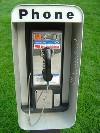
NYC Phone Booth Competition Missed Call
Free Design Work Is Just Crowdsourcing for Startups
By: Mark Favermann - Mar 17, 2013
Free design work just makes me (expletive) mad. Damn mad!
Design is undervalued enough. Design makes the environment better, our lives functionally easier and aesthetically enhances human experience. For the most part designers and architects are terribly undervalued and underpaid. Somehow society rewards lawyers, accountants and bankers for adding very little positive to our culture.
Design competitions that not only undervalue creative design efforts but offer nothing more than vague recognition for the "winners" is somehow even worse.
Perhaps I am just a design competition curmudgeon? Perhaps not. I get upset with design competitions that seem to be about themselves (governments, corporations, institutions or even interest groups) rather than about celebrating the creativity of the designers, artists or architects who idealistically participate.
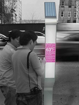
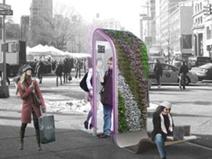
New York City once had 35,000 payphones; now it has around 11,000. How many of these are broken or out of order is unknown. Seems like a lot. Now cell phones are nearly ubiquitous. In recent years, the largest part of payphone revenue is from advertising not calls. Recently, a competition was held in New York City to design the future sidewalk payphone.
The City of New York's Department of Information Technology and Telecommunications signed a contract for the maintenance of New York public payphones in 1999. But since the contract expires on October 15, 2014, Mayor Bloomberg's staff came up with the Reinvent the Payphones Design Challenge. It had no prize money and no commissions tied to it. The competition is a bit like Rick in Casablanca: a design for love and glory.
The great City bureaucracy wanted to tap the creative community for ideas and concepts. So they invited architects, urban planners, industrial and graphic designers, design students and technologists to come up with a new design that will reflect NYC's changing aesthetics and technologies. They were looking for an answer to the mounting digital needs of the present and future for New York City.
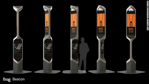
Over 500 individuals registered in 2012. Then 125 submissions were entered in February 2013. An interesting if not edgy/funky jury picked 11 finalists. More about them later. These were whittled down to 6 "winners" and were announced at one of the competition sponsor's space the "social-product-development company" (their title) Quirky.
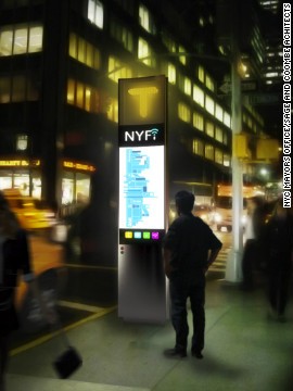
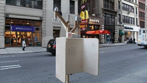
Winners were named for each of five categories: Creativity, Connectivity, Visual Design, Community Impact, and Functionality. A Popular Choice award was announced on March 15. That was the one that was "the big winner." Perhaps not surprisingly the Popular Choice, NYFi, was by a firm that had worked with several other NYC agencies in the past. The elongated (10ft high) doublesided IPad monolith was created by the 17 member firm of Sage & Combes Architects.
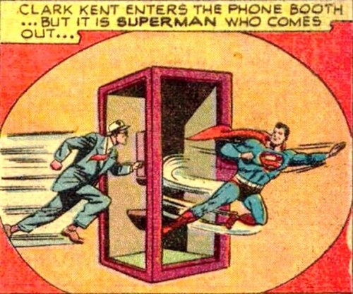
With no protection from the weather or even cacophonous city sounds, this design is more of an exposed interactive sign than a private phone booth. No Superman quickchange here. Minimalist in form, except for the potential advertising, its shape is reminiscent of the monoliths in 2001, A Space Odessey. With little or no visual personality, it can be in any city or town anywhere. Unlike Billy Joel, it has no New York state of mind. And it does not seem to be capable of morphing as new technology develops, only be replaced.
The judges of the competition were Andrew McLaughlin, entrepeneur-in-residence at betaworks; Majora Carter, founder of Startup Box; Jason Goodman, CEO and co-founder of 3rd Ward; Nancy Lublin, CEO of DoSomething.org; Ben Kaufman, founder and CEO of Quirkyand former United States Deputy Chief Technology Officer Beth Noveck. It is not clear how many of them have any major design backgrounds.
Part of the exercise was to have "conversations" with any of several social media startups during the design process. They were referred to as Resources. These included startup firms CollabFinder, Digg, Quirky and Splashthat.com. They were supposed to be there to bounce technological ideas off of. But they seemed like very willing sponges available to suck up any really creative ideas. And why wouldn't they?
It seems that this well-hyped competition was a form of focused creative crowdsourcing. This was to get as many ideas at the lowest cost to the City of New York at the highest possible return.
I remember a number of years ago, I tried to inquire about writing for the then redhot cutting-edge magazine Fast Company. I was informed that I should try out my idea in their editorial chatroom. According to my contact, if the editors saw value in it, it would become an article. Something did not feel right about this. So, I never followed up.
With no ownership of the idea for me or any vague promise of authoring the article, it sounded like a very bad thing to do with my to me great idea. A few years later, I met one of their editors at a conference at Harvard's Graduate School of Design. He informed me that Fast Company never ever hired freelance writers.
So perhaps this NYC Reinvent the Payphone Competition was just a similar design charrette chatroom exercise? Thus, it allowed creative ideas, concepts and even aesthetics to be expressed, gleaned and accessed by others with little or no reward to those who put the creative effort into actually thinking about and designing an entry.
This notion came to me and my staff about 10 days before the entries were due. So we did not submit our ideas. But the more I thought about it, the more that I felt that due to the amount of creative work already completed on it, the unsubmitted entry should be shared after the fact.
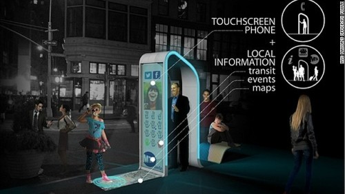
It even has a name and logo: CallAngel. The wings on top of the structure are a covering device and have solar panels to power the technology. The wings also help modulate street noise by acoustically muffling impeding outside sounds. Made from sustainable materials, there is a smart screen, imbedded speakers and camera. The camera may help with local and Homeland security--a little bit like Person of Interest (CBS) and London's ubiquitous camera surveillance security system.
LED lights edge the structure at night. It has WiFi as well as a charger for cell phones. Of course various forms of interactive information both local, national, geographic (maps) and emergency can be programmed into the menu. There is also the possibility of advertising on the structure both virtual and literal as well as future projections of hologram images as technology progresses. Retrofitting it would be relatively easy.
Of course it is ADA accessible with the screen and camera able to swivle and move. Voice activation is built into the technology. Unlike the signlike NYFi, CallAngel is a functional piece of sculpture. It has a look, a personality and a special character. It adds to the interest of the streetscape. It could become an icon of New York.
The outcome of this competition is unsatisfying. A bit like kissing your sister or your brother, There is no real passion in this project's outcome. It is technology placement. The designers, even the so-called winners, don't seem to win very much. New York City wins. It will be issuing an RFP to communications technology companies in the next several months for a long-term contract starting in 2014 based upon the competition's best ideas, concepts and designs. The results of the competition are very useful to not only NYC but also to the startups, aka Resources, who could actually bid on the contract.
Perhaps all that is gained by designers are portfolio pieces or just lessons in what designers would like to do if we could get paid for it. This is what makes me so damn mad.
