Public Art at Boston Fenway's Pierce Boston Tower
A Lost Opportunity for Developers, Arquitectonica, and artist Alexandre da Cunha.
By: Mark Favermann - Apr 04, 2018
The 1980s and ’90s inspired a type of mediocre large-scale sculpture that was referred to as Mistress Art. It is so called because it was cynically commissioned as a parting gift/payment to the more or less artistic mistress (either an artist or an art dealer) of a rich real estate developer. Usually abstract, these large pieces were often awkwardly placed inside or outside malls as well as residential and office complexes. Sometimes similar sculptures were set on desolate plazas or on university and college campuses. They shared a similar aesthetic: these bold but ugly decorative forms seem to be visually shouting something — but not really saying anything.
On occasion, an artwork of this type would rise above the average, perhaps even be the creation of a prominent artist. A number of these “better” artworks had been previously completed and concept inventoried. Because they were not site-specific, these artworks would often be discounted in price. Buying at substantial discount means that developers have scored a bargain, while, at the same time, they can assuage their social and cultural consciences by commissioning public art for their projects.
Both public art ‘options’ (conscience or bargain purchase) enable the developer to commit a kind of multi-layered environmental crime: the art piece is not welcomed by the public; it is not embraced as a valuable add-on by the architect; it is not critically appreciated by the art world.
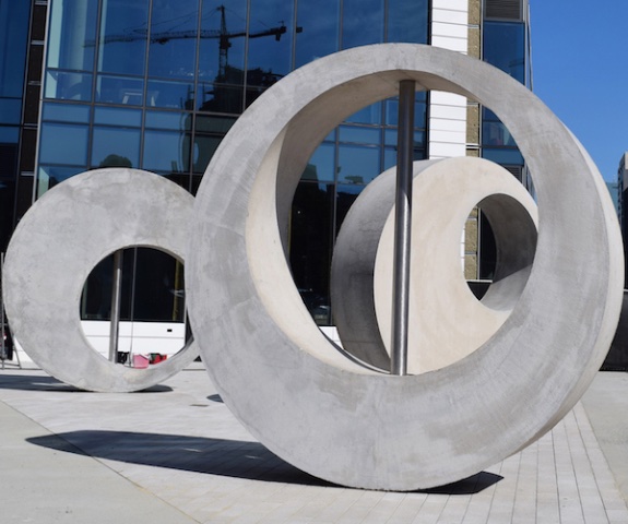
An example of the above offense was unveiled last Fall in front of the soaring Pierce Boston Tower, a luxury condo complex. The developers are Samuels & Associates, in partnership with Landsea and in association with Weiner Ventures. Pierce Boston Tower was designed by the prominent firm of Arquitectonica. Materially and visually ungainly, apparently not site-specific, the artwork comes from London-based Brazilian artist Alexandre da Cunha. The sculpture would appear to fall into the inventoried category. The work is titled Plaza (Arcade). According to the PR from the developers, da Cunha is an internationally acclaimed artist “recognized for his transformative use of industrial materials and found objects.” Reminiscent of several of da Cunha’s previous minimalist studio/gallery artworks — round rather than reflecting the building’s geometric shape — this piece is far from transformative, and it is fashioned from materials that are inelegant and unappealing.
To be fair, Samuels & Associates and their colleagues should be recognized for including public art in their project. Because there is no 1% funding for public art mandated by the city of Boston, this action was taken by the developers voluntarily. Public art attached to private development is a rare thing in Boston. But, and a big but, this public art commission could have been a lot better.
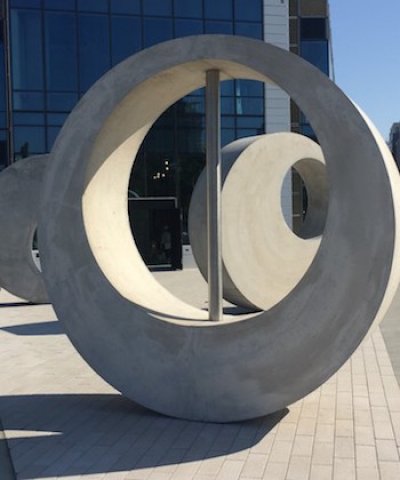
da Cunha’s artwork is comprised of three grey, large, and inelegantly thick concrete discs. Each is of a different size and contains an O. The artist explains that these architectural forms are intended to serve as frames and/or arches that encourage observation of, and reflection on, the nearby environment — the newly restored Muddy River, the vibrant Longwood Medical area, and the city beyond.
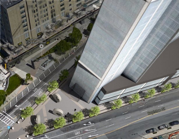
Unfortunately, the artist has conceived of his sculpture as looking out from the building. But the artwork’s location works against its being an effective aperture on the nearby area. In truth, its location would be more appropriate for the piece to be some kind of a conceptual or literal gateway. Set at a strategic roadway fork between Brookline Avenue and Boylston Street, the site would make a fine geographic location for a strong visual welcome to The Fenway Neighborhood. The opportunity to come up with a unique Fenway Neighborhood icon appears to have not been considered.
In addition, Boylston Street (on the right side of the building) contains a number of Samuels & Associates’s earlier development projects. The result has been the establishment of a somewhat characterless, almost West Coast suburban edge city. . The steely line-up looks like almost anywhere else in citified North America. Visually overwhelming, the Pierce Boston Tower building takes its place as part of an urban high wall. Nearby Brookline Avenue (at the left of the structure) also starts out as an urban canyon, but eventually transforms into a more appropriately human scale.
And scale, including urban, architectural, pedestrian, and human, is another problem with da Cunha’s Plaza (Arcade). The great designer and urban theorist Kevin Lynch posited that there was a need for areas within a metropolis that proffer a distinct character — such as neighborhoods — and that they should have individual civic presences. What could have been a natural “gateway” to Boston’s Fenway Neighborhood exhibits none of these reassuring characteristics.
Lynch went on to address notions of different levels of scale — urban, architectural, pedestrian, etc. Like too many other City of Boston buildings, Pierce Boston Tower fails in terms of its handling of scale, especially in regard to connecting pedestrians to a large edifice. This building looks fine from a distance, but it provides no visually satisfing connection to the street. This huge edifice dwarfs, even effectively obscures, any pedestrian access. A more sensitive public art piece might have helped to alleviate this difficulty.
What’s more, the artwork’s rather bleak concrete and pipe materials do not relate in any way to the facades, texture, and materiality of the venerable Fenway Neighborhood. This work of public art asserts no cultural or historical context. The circles or, as the artist refers to them, the discs, have only a minimal relationship to the somewhat hidden main entrance to the huge building.
Public art is not easy to do well. Public art should not be seen as studio art writ large. At its best, public art is about site specificity, community, and collaboration. In the case of the Pierce Boston Tower, the huge structure and the added artwork are clumsily out of scale with each other. The arrangement is not close to being thoughtfully integrated — public art and building enter into no visually cohesive physical conversation. Instead of a meaningful dialogue, we are given a stand-alone, uninspired rhetorical statement, a flop that is the result of a team failure shared by developers, architects, and artist.
This article was previously published in Arts Fuse and is re-published by their permission.


