New Directions: The Cover Story
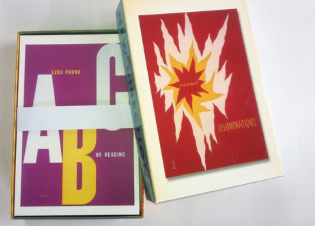
Pioneer Designer Alvin Lustig’s Fifty Best Book Covers In One Box
By: Jessica Robinson - Apr 16, 2021
The great graphic designer Milton Glaser once said, “there are three responses to a piece of design—yes, no, and WOW!”
WOW! is what you’ll say to New Directions’ newly assembled set of fifty postcards celebrating its greatest salesman, Alvin Lustig—a creative genius who revolutionized the craft of book-cover design. Each of the postcards in this glorious collection is a work of art in its own right.
The evolution of book-jacket art is a fascinating story. It dates back to the 1800s, when jackets were designed as simple, paper wrappers whose sole function was to protect a book as it traveled from the printing press to reader or bookseller. The only defining design element was a small window cut out of the wrapper used to display the author’s name, book title and publisher’s name. Once it reached its destination, the jacket was tossed.
By the 1850s revolutionary changes were happening in publishing. With the rise of technology, and bold graphic styles - think the Arts and Crafts and Art Nouveau movements - publishers began designing elaborate covers. The biggest development in book cover design came in 1935 when Penguin invented the paperback, making books affordable for the working class. Thus the rise of a book-buying society.
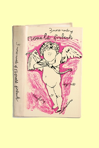
A year later James Laughlin - poet, ladies’ man, and heir to a Pittsburgh steel fortune – founded New Directions Publishing. Within five years of founding the company, Laughlin had the insight, and vision, to begin hiring independent artists who would soon become mega-stars: Alvin Lustig, Milton Avery, Rockwell Kent, Ray Johnson, and, (yes!) Andy Warhol. These early designers were, in a very real sense, salesmen. They visually introduced a book by adopting a totally new approach to typography and color, thus creating eye-catching covers that became the book’s marketing billboard.
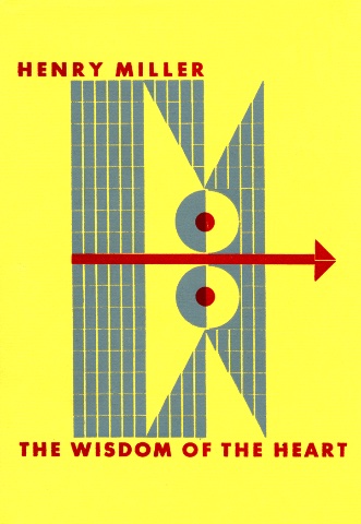
Of the many luminary artists Laughlin worked within the early years, his most enduring relationship was with Alvin Lustig, whose first jacket was designed for New Directions’ 1941 edition of Henry Miller’s The Wisdom of the Heart : “Quite unlike anything then in vogue,” wrote Laughlin, “but it scarcely hinted at the extraordinary flowering which was to follow.”
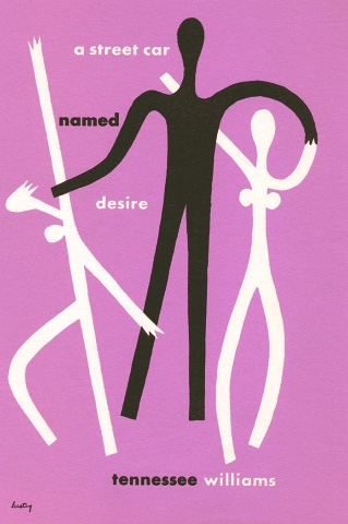
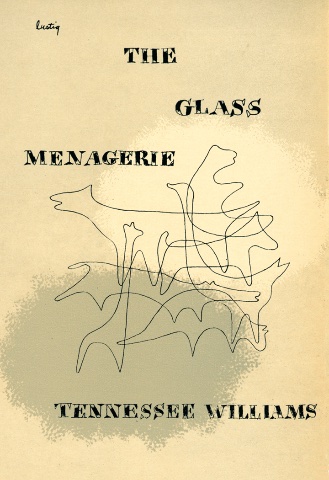
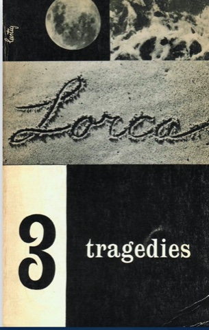
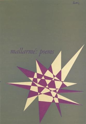
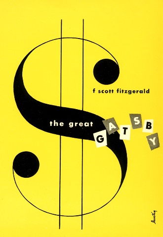
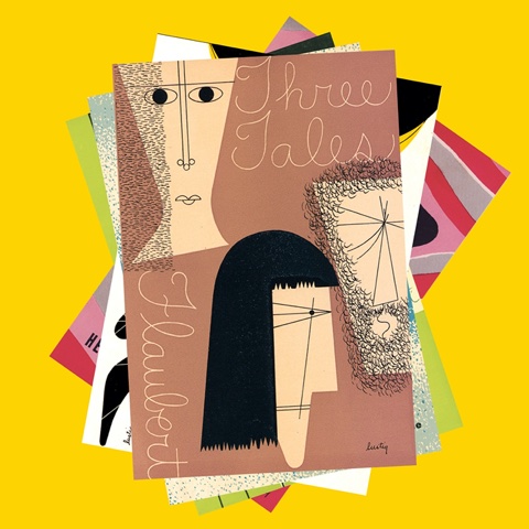
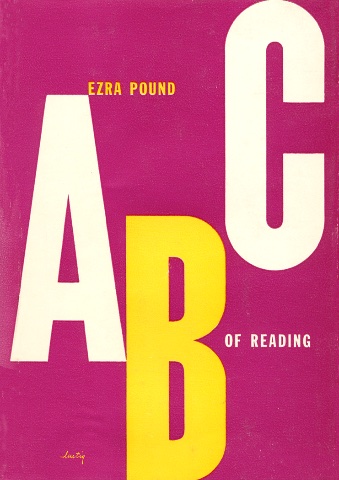
Lustig’s graphic vocabulary was entirely his own. Excited by avant-garde movements such as Futurism, Constructivism, and Surrealism, he exploited color and abstract form, symbolically demonstrating, rather than slavishly illustrating, a book’s content. Lustig’s inventive use of space and typography quickly grabbed the public eye. “Before Lustig came into the picture,” wrote Laughlin in his autobiography, “our sales were pretty dreary. With the newly brightened Lustig covers, stores began devoting window displays to the books, where before they had hidden them away on the shelves.”
“For each book,” wrote Lustig, “I tried to establish a quickly grasped, abstract symbol that would, by sheer force of form and color, attract and inform the eye,” (Alvin Lustig papers, Smithsonian Institution.)
“His jackets took shape in his mind,” wrote Laughlin, “drawn from a reservoir seemingly as inexhaustible as that of a Klee or Picasso. Quite as important, these jackets enormously increased the sale of the New Classics Series.” Indeed, the groundbreaking covers Lustig created, beginning in the 1940s, increased the company’s sales by 300 percent!
Lustig continued producing one masterpiece after another, creating a rich, visual language with shape, form, color, and line. And, his sheer amount of creative output is astonishing, not limited to book covers, but reaching into almost every field: record jackets, magazines (both Look and Fortune,) textiles and furniture, most notably the “Lustig chair,” an upholstered, mid-century design that is still reproduced today.
At the age of thirty-five Lustig developed diabetes and began losing his sight. With the help of his wife, Elaine Lustig Cohen, herself a noted graphic artist, he continued designing, choosing colors by indicating household objects: a chair, a sofa, a table - which allowed him to execute his concepts until his untimely death in 1955. He was only forty. The covers he designed for New Directions in the last year of his life were covers he never saw. He was virtually blind. But by then he had elevated the status of book jackets into the realm of fine art.
“It is sad to think,” wrote Laughlin, “that so many of his designs must live in hiding on the sides of books on shelves. I would like to have his beautiful Mallarmé crystal or his Nightwood, (Djuna Barnes) abstraction on my living-room wall."
Fast forward.
Times change, and so do tastes, especially in today’s digitally-dominant world where books are promoted primarily online. While good books do not need to contend with the indignities of aging, covers often do. Modern covers need to appeal to new readers in ways that a dated jacket can’t—even if the text reads just as it did a century (or centuries) ago.
It’s astonishing, then, how many of Lustig’s original covers are still selling books. Who would imagine that modernist, minimalist, covers designed in the 1940s would be as fresh and relevant today as they were when first created?
More than sixty years ago Alvin Lustig revolutionized the art of book cover design by proving that a simple abstract line could transform an industry and lift the life of a book’s sales. Lustig had a short life, but his legacy is long. His distinctive, rule-breaking style keeps his work timeless. Never finding it necessary to “design down” to achieve better sales, through his iconic use of symbolic forms, expressive typography, and feel for an author’s intent, better sales he did, and does, continue to achieve!
https://www.ndbooks.com/book/alvin-lustig-for-new-directions/
Click here for New Directions new and forthcoming books.

