
Patricia Hills, Letter #5 from Southern California
Pacific Standard Time: Art in L.A. 1945-1980
By: Patricia Hills - May 05, 2012
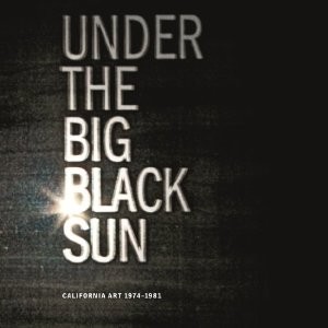


Letter #4 took us from Newport Beach and Pomona back to LA. So on Monday morning, January 9, 2012, my son Brad and I tackled the Geffen Contemporary on North Central Avenue to see what turned out to be the very biggest of the “Pacific Standard Time” exhibitions. Including all of California in its embrace, the show was titled Under the Big Black Sun: California Art 1974-1981. In the Geffen, as the Museum of Contemporary Art (MOCA) is called, California artists filled the airplane-hanger like space with art made during those eight years. Although the Vietnam War had wound down, the US government was still involved in supporting right-wing dictatorships and suppressing socialist governments in Central and South America. Politically the time spanned the presidencies of Richard Nixon, Gerald Ford, Jimmy Carter, and Ronald Reagan.
The exhibition, curated by long-time MOCA Chief Curator Paul Schimmel, was intended to be a prequel to Schimmel’s 1992 exhibition Helter Skelter: L.A. Art in the 1990s. But Schimmel knew many of the artists included in Under the Big Black Sun from an exhibition he did back in 1977 for the Contemporary Arts Museum in Houston, called American Narrative/Story Art: 1967-1977. Catalogue essayists include Frances Colpitt, Thomas Crow, Charles Desmarais, Peter Frank, Leta Ming, Paul Schimmel, Rebecca Solnit, and Kristine Stiles. Only Peter Selz seems missing. By the way, Selz (now 94) looked great when I chatted with him in February in LA at the College Art Association book fair. He was there to admire Paul Karlstrom’s new biography of him (University of California Press).
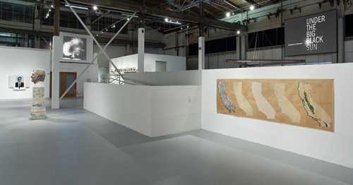
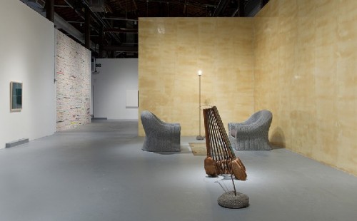
The artists at the Geffen numbered about 136 plus four collectives. Impossible, of course, to write about everyone, even with repeat visits. How to narrate my visit? The way I walked through the spaces? But that’s too disorganized. Or, by following the catalogue reproductions arranged alphabetically by artist? But that’s also disorganized, as well as boring, and doesn’t allow any flexibility. Therefore I’m going to organize my thoughts according to what I see as thematic categories, whether or not Paul Schimmel saw them the same is another issue.
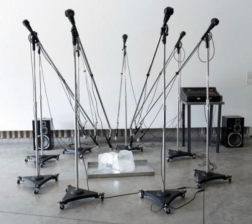
Here goes: I saw works, often photographs, in which the text, or at least the subtext, dealt with the theme of destruction and dystopia—of cities, of neighborhoods, and of alienated people—in the works of Bruce Connor, Chris Burden, Anthony Hernandez, Terry Schoonhoven, John Divola, Suzanne Lacy, and Paul McCarthy. I find such a category not surprising for California—home to a film industry that embraces dystopian movies.
Another category: the rich vs. the poor; or corporate America vs. working-class America. Here we have art, again many photographs, that visualized the economic poles of the USA, such as the work by Allan Sekula, Jim Goldberg, Chauncey Hare, Bill Owens, and Howard Fried. Alongside such images was the art for the working class, such as mural studies by Judy Baca and posters by Rupert Garcia and others appealing to social activists.
A third category embraced the image/word/archive artists that I have come to associate with California, such as John Baldessari and Ed Ruscha. A fourth category included the documentation of performance events and installations—again, usually in photographs—by Bas Jan Ader, the Asco collective, and Karen Finley. Space constraints don’t allow me to describe the works of many other fascinating artists, including Vija Celmins with her obsessively realistic painted bronze rocks.
Dystopian nightmares are the flip side of sunny visions of sitting by the pool and sipping mojitos. And California had its share of artists who probed the darker side of contemporary life. Obsessed with the atomic bomb Bruce Connor used discarded government films that included the mushrooming of an atomic cloud in his film Crossroads of 1976. Atom bombs are scary, but neutron bombs are even scarier.
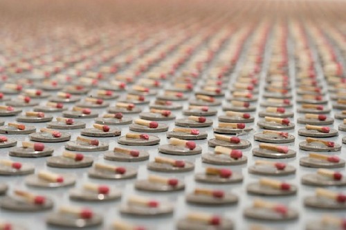
Three years later Chris Burden showed his installation The Reason for the Neutron Bomb at the Ronald Feldman Gallery in New York. The piece recreated at the Geffen consisted of some 50,000 American nickels topped by matchsticks, placed in even rows on the floor, each representing a Soviet tank. It is up to the viewer to imagine those nickels transmogrifying into tanks rolling over Europe and facing the deterrent of the USA’s neutron bomb. Let me (with the help of Wikipedia) remind you of the sinister neutron bomb, developed in the late 1960s and 1970s, which could kill people targeted in a specific area because of the “intense pulse of high-energy neutrons, but not destroy the infrastructure of cities. It was considered an ideal anti-tank warhead. Folks back in the 1970s protested so much that President Jimmy Carter nixed its production.
Dystopia, however, can affect neighborhoods and homes; urban decay begins with broken glass, boarded-up windows, rusted machinery, smashed cars, sagging chain-link fences. Anthony Hernandez’s photographs of wrecked trucks and empty car lots reflect economic downturns and portend urban decay that chews at the margins of neighborhoods.
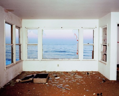
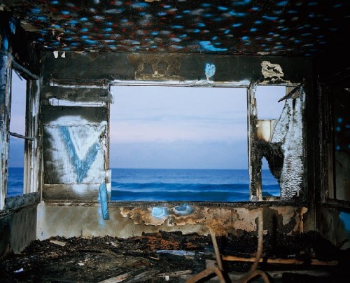
John Divola’s Zuma Series, 1977-78, consist of photographs of a house interior looking out through cuts in the walls, where windows had been, onto the ocean. In Zuma #8 shards of glass lie on the carpet, strewn around a battered empty suitcase; wedges of glass still cling to the window frames. Other photographs show the same room, charred by fire and further neglect.
Divola’s Zuma #8 contrasts with our beautiful serene experience of seeing 1° 2° 3° 4° executed by Robert Irwin—his actual cuts into the large, picture windows at the San Diego Museum of Art in La Jolla [See Letter #3 ].
Whereas Irwin’s were actual openings in windows that one experienced directly, Divola’s image is its dystopian antithesis. Zuma #8 is a simulacrum, an archival photograph of what once existed (at least we can be pretty sure of that since it was done before photoshop). Its power as a photograph comes from the symbols we read into it.
As to Los Angeles as the subject for dystopia, Terry Schoonhoven’s Downtown Los Angeles Underwater, 1979, a huge painting six by twenty feet is like a movie still of a depeopled Atlantis where an entire city with very tall buildings is submerged in murky water. The image predicts a future where the hubris of human beings has left the globe with no life, not even fish.
“Dystopia” is defined by my Concise Oxford Dictionary as “an imaginary place or society in which everything is bad.” Not a very subtle definition, but it’s workable. What’s the name for a real place in which everything is bad? To Suzanne Lacy in 1977 it’s a place where bad actions taking place were being ignored by civic leaders. It was LA. Her maps from Three Weeks in May, represents the archival remains of a performance done in 1977, when she set up two huge maps of LA on panels near the LA City Hall. On these maps she rubberstamped the words RAPE over the neighborhoods where 90 rapes had occurred between May 7 and May 24. The maps are a chilling reminder that things have not much changed in terms of acts committed and indifference from the politicians.
Then there is Paul McCarthy a talented painter and weird performance artist who pushed, and still pushes, against the envelope of decorum and good taste. Shown at the Geffen were stills from McCarthy’s performance caught by the video Sailor’s Meat of 1975, which suggested an onanistic alienation bordering on personal dystopia. Hmmm! More about him in a later letter.
Another category made evident to me at the Geffen—and a stretch away from images of dystopia—is working-class America in contrast to corporate America. Here the photographers were much in evidence, as well as the poster artists. Poster artists, bless them, are very direct in their celebration of workers and their condemnation of oppressors. The art comes in the initial impact of the image, backed up by composition, colors, the interplay of text and image, the appropriateness of figurative elements, and the novel use of well-known symbols. Rupert Garcia’s Human Rights Day poster, 1975-76, for Amnesty International has a strong graphic message, as do Judith Baca’s drawings for the The Great Wall murals in LA. There was, in fact, a whole section of posters from the collection of the Center for the Study of Political Graphics, many done by individuals such as Rachel Romero and Yolande Lopez, with others done by various LA collectives.
At this point in my Letter, I can only mention briefly the photographers who “heighten the contradictions” between the rich (the 1 %) and the rest of the country (especially the working poor). Allan Sekula’s photographs from the series School is a Factory, 1978-80, show students enrolled in a dreary trade school where they learn skills that make for alienated repetitive work. Accompanying the photographs in the catalogue are quotes Sekula drew from a public school administrator, writing in 1916: “Our schools are, in a sense, factories in which the raw materials are to be shaped and fashioned into products to meet the various demands of life. The specifications for manufacturing come from the demands of the twentieth century civilization, and it is the business of the school to build its pupils to the specifications laid down” (p. 248).
Perhaps I should include this quotation in the “dystopia” category discussed above. The rigors and ordeals of corporate indoctrination become a dystopia for the working class. I think Sekula would agree. By the way, Sekula won the “2012 Distinguished Lifetime Achievement Award for Writing on Art” at the CAA conference last February. Well deserved!
Other photographers that deserve extended description and analysis, but a mention will have to suffice, are: Jim Goldberg with his Rich and Poor series of the late 1970s and early 1980s, Chauncey Hare with his This Was Corporate America series of 1976-77, and Bill Owens with his Working series of 1977.
A hilarious video is Howard Fried’s The Burghers of Fort Worth, in which the shaggily bearded Fried hired four golf pros to give him lessons in playing golf. A friend shot the video. Fried called the exercise, “A metaphor for art education, where students attempt to follow the advice of several masters, who tend to speak in abstract, often contradictory terms” (p. 34 in the catalogue). The catalogue also noted that Fried had founded the performance and video program at the San Francisco Art Institute in 1977. His motto was “Every Action is a Potential Mistake.”
Also included at the Geffen (and how could the curators resist) were the word/image/archive artists. John Baldessari with his Virtues and Vices of 1981—fourteen panels of photos and text on the theme of the seven deadly sins and the seven virtues—were wryly witty. Remember the virtues: justice, hope, prudence, temperance, fortitude, faith, charity; and the sins: lust, sloth, gluttony, avarice, envy, pride, anger. Ed Ruscha’s huge The Back of Hollywood, 1977, meaning the back of the “Hollywood” sign, was impressive. And Allen Ruppersberg’s “sections” for The Secret of Life and Death, 1977, were a pseudo archive of scraps of typed papers and photographs posted on a support. Perhaps it is just his name, but the sensibility seemed very German to me.
At the end of the day Brad and I still had enough energy to drive off to the Museum of Contemporary Art (MOCA) on South Grand to see Naked Hollywood: Weegee in Los Angeles.
Weegee—his real name is Arthur Fellig—worked in both New York and LA and was one of the pioneers of tabloid journalism. It was great to see his take on Hollywood moguls, con men, and glamour queens. There is an exhibition closer to home, however. The International Center for Photography is now showing Weegee: Murder is My Business, curated by Brian Wallis. That show continues until Labor Day.
Letter #6, coming shortly, expands on Brad’s and my visit the next day to the Japanese American National Museum and the Los Angeles County Museum of Art (LACMA), where we saw the powerful Edward Kienholz Five Car Stud of 1969-72.
© Patricia Hills, 2012
<iframe src="http://www.youtube.com/embed/HYEiaiLuzAE" width="425" height="350"></iframe>
<iframe src="http://www.youtube.com/embed/ozubKHdprMI" width="425" height="350"></iframe>